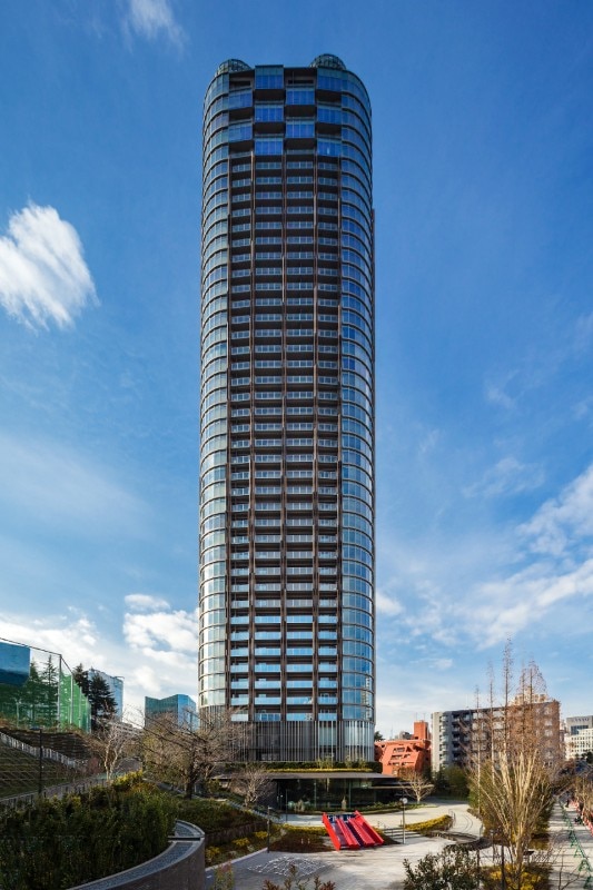
Roovice’s intervention involved the renovation of a flat located on the 30th floor of Hinokicho The Tower, the 322-unit tower and communal spaces designed in 2018 by Kengo Kuma & associates. The building interprets the suggestion that comes from the name of the context in which it is located: hinoki-cho means “cypress grove”, which revives the idea of architecture as a tree in the heart of the city. The tower sits on an artificial hill, which serves as the base of the tree; the roots are composed of eaves and a pool that merge the building into the ground; the trunk – the elevation – is clad in aluminium panels with hinoki bark; the crown features a green canopy from which a spectacular view of the urban skyline is projected.
Living in a signature building: the quest for personality in a Tokyo apartment
In renovating a unit inside an architecture designed by Kengo Kuma, Roovice aims to bring character, warmth, and a modernist tinge to an interior searching for identity.
Photo Kawasumi Kobayashi Kenji Photograph Office
Photo Kawasumi Kobayashi Kenji Photograph Office
Photo Kawasumi Kobayashi Kenji Photograph Office
Photo Foto Kawasumi Kobayashi Kenji Photograph Office
plan before renovation
plan after renovation
View Article details
- Chiara Testoni
- 25 October 2023
- Tokyo, Japan
- Roovice (flat refurbishment); Kengo Kuma & Associates (building project)
- residential
- 2018

The building’s completion is recent, so the studio was not faced with issues of dysfunctionality or decay, but rather with the client’s need to customize an anonymous, limited-sized space that was a blank canvas to be reinterpreted.
The project has involved a few works aimed at allowing, compared to the previous state, a more fluid and luminous layout, and a stronger characterization of the rooms. The flat in fact consists of two bedrooms with bathrooms, located at opposite ends of the floor plan, and a large central common area with living room, dining room and kitchen.
The wall of furniture in the kitchen and the adjacent door, which created a dark and fragmentary distribution, were removed to allow a direct connection between living area, entrance hall and corridor leading to the main bedroom.
The bedrooms, unchanged in size, have been enriched with new supporting elements, such as a walk-in wardrobe in the smaller one and a built-in wardrobe in the master bedroom. In the corridor, the dark glossy melamine veneer doors have been replaced with matt white elements.
Meticulous attention to materials makes the space warm and elegant.
The fil rouge in the interior design is cherry wood, which gives homogeneity and materiality to the rooms, punctuating all spaces with modernist suggestions, in a lively contrast with the immaculate surfaces of walls and ceilings, repeated in the entrance wardrobe, in the large sliding door of the master bedroom, in the finishing details of the services, the kitchen worktop and in the living room furniture, like the custom-made TV board requested by the client.
A minimal renovation that, through a few gestures and selected materials, has given life and warmth to a functional spacethat was nonetheless previously risking a low identity rate.
Photo Akira Nakamura
Photo Akira Nakamura
Photo Akira Nakamura
Photo Akira Nakamura
Photo Akira Nakamura
Photo Akira Nakamura
Photo Akira Nakamura
Photo Akira Nakamura
Photo Akira Nakamura
Photo Akira Nakamura
Photo Akira Nakamura
Photo Akira Nakamura
Photo Akira Nakamura
Photo Akira Nakamura
Photo Akira Nakamura
Photo Akira Nakamura
Photo Akira Nakamura
Photo Akira Nakamura