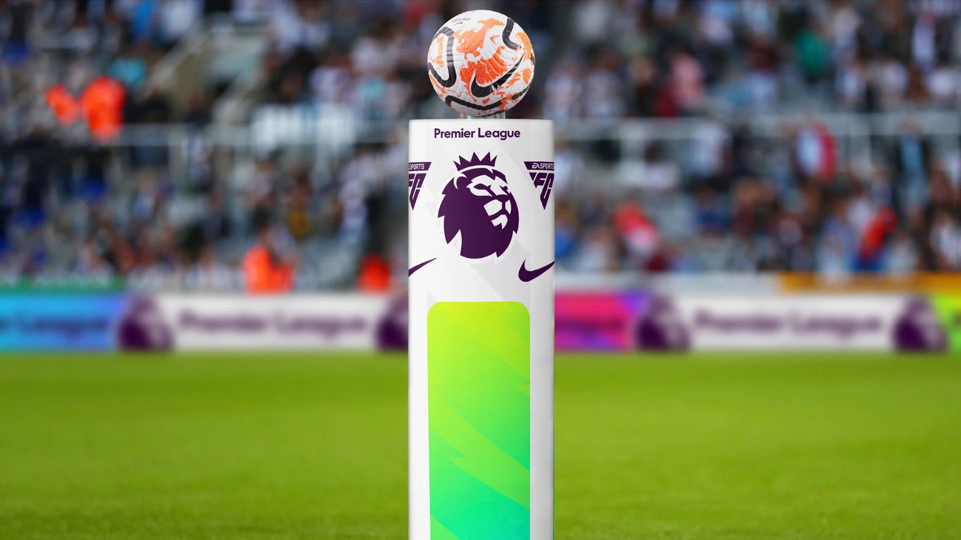
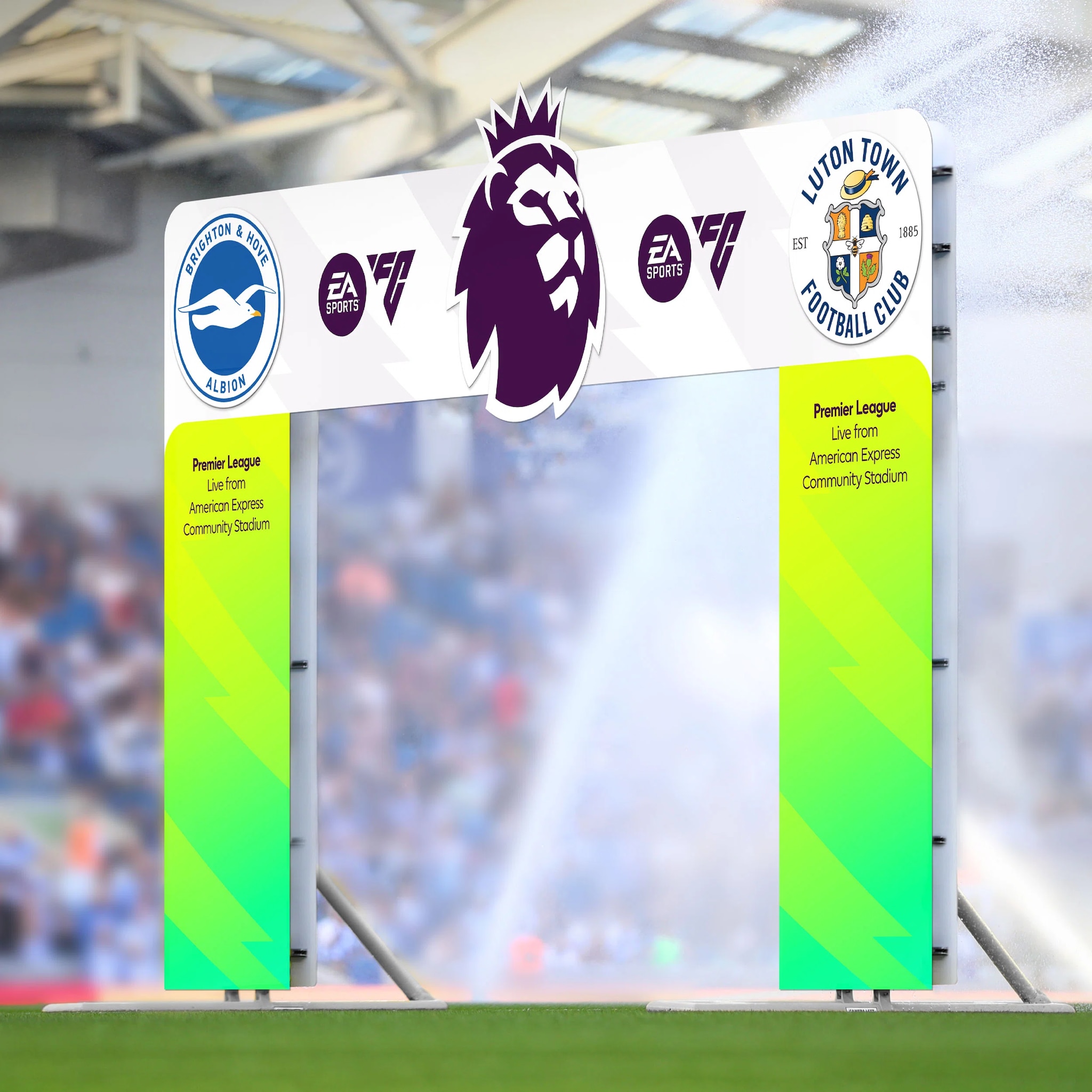
In the last year and a half, the Premier League, the top division of the English football championship, has been working on the renewal of its image together with Nomad studio. Nomad has taken up the image of the lion, with the intent to make it more iconic and emphasize the best features of the league, including the courage and heroism connected to sport. This is why the lion was enlarged and placed in the center. The writing on two lines is also more readable, as well as easier to insert in various communications.
In general, the studio said that all elements were simplified to create a sharper and more impactful image. For this reason, the six colors that characterized the previous logo have been merged into three shades through the use of gradients, to maintain a sense of movement and at the same time allow the brand to remain immediately recognizable. The idea is the logo evolves to be always modern, as well as exciting and significant for fans around the world.

A new world of Italian style
The result of an international joint venture, Nexion combines the values of Made in Italy with those of Indian manufacturing. A partnership from which the Lithic collection of ceramic surfaces was born.


