by Ramona Ponzini
Tim Burton, now 66, is one of the most iconic directors in contemporary cinema.
He was born in Burbank, Los Angeles, and has been working as a director since the mid-1980s. Burton’s visual universes are marked by an original blend of gothic aesthetics, surrealism, and dreamlike influences, creating worlds with a dark and unsettling fascination. His poetic vision emerges through stylized sets, contrasting colors, and distorted figures, while his characters, often outsiders and unconventional, reflect a preference for eccentricity, becoming symbols of a unique and deep sensitivity.
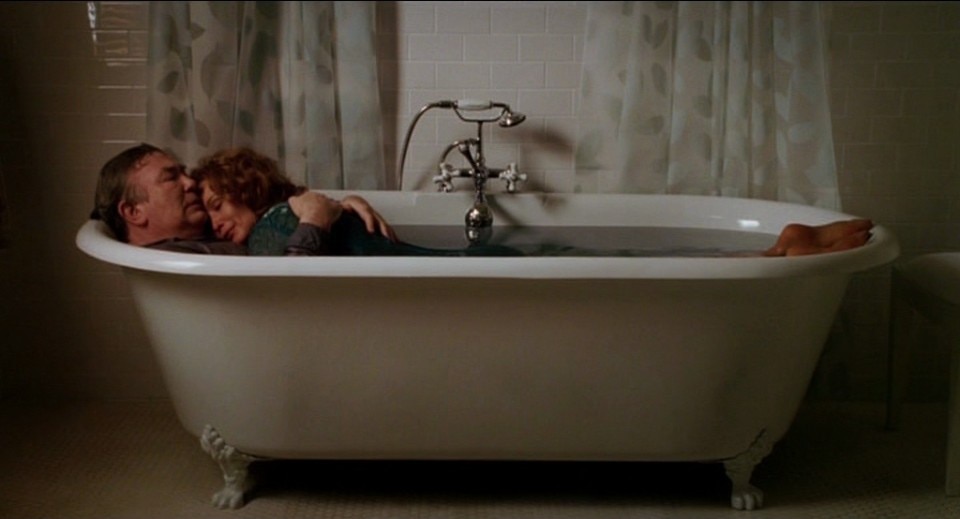
Over the years, Burton has developed a distinctive style that fuses the macabre with the fairy-tale, blending lightness with unease. This style has allowed him to explore universal themes such as alienation, identity, and the fear of anything that differs from the norm. He has explored these themes in both live-action and animated movies. With the recent release of Beetlejuice Beetlejuice, an immersive exhibition that is touring globally, and a show dedicated to him at the Design Museum in London, Tim Burton is more than ever a significant figure of our times, even though many of us associate him with the incredible run of his movies that defined the 1990s, with Big Fish (2003) as a later highlight.
We have selected seven key titles to understand his cinema, analyzing them both for their aesthetic qualities and unique settings.
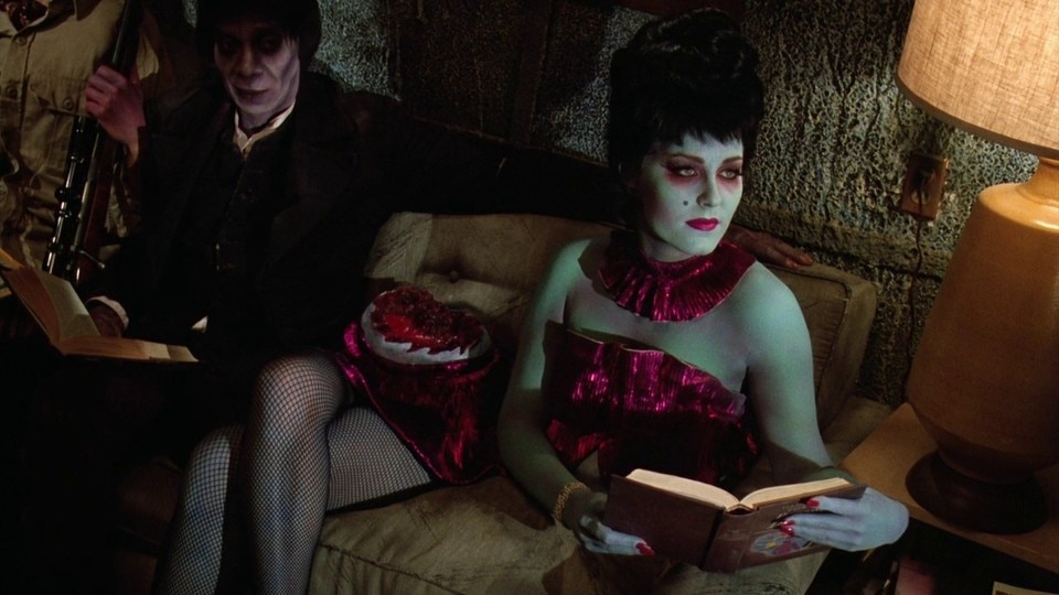
The domestic surrealism of Beetlejuice (1988)
The set design in Beetlejuice, the movie that established Burton’s international reputation, is characterized by a rich blend of contrasting styles where surreal and grotesque merge seamlessly. The movie presents a universe in which reality and the afterlife are portrayed with equal eclecticism, adding an irreverent tone to the theme of death. The house where the story unfolds transforms from a rustic, idyllic setting to a sharp, sterile modernism after a renovation, reflecting a detached yet playful postmodern aesthetic. This visual dualism, before and after, is highlighted by intentionally distorted spaces, with irregular geometric lines and out-of-scale architecture.
One of the most iconic elements of the movie is its portrayal of the otherworldly dimension, where visual irony subverts expectations: the world of the dead is depicted with vibrant colors and unusual textures, breaking away from traditional, dark imagery of the afterlife. The bureaucratic office of the deceased, with its endless corridors and eccentric employees, builds a visual language where dark humor intertwines with social critique, presenting the afterlife as a bureaucratic process of administrative procedures.
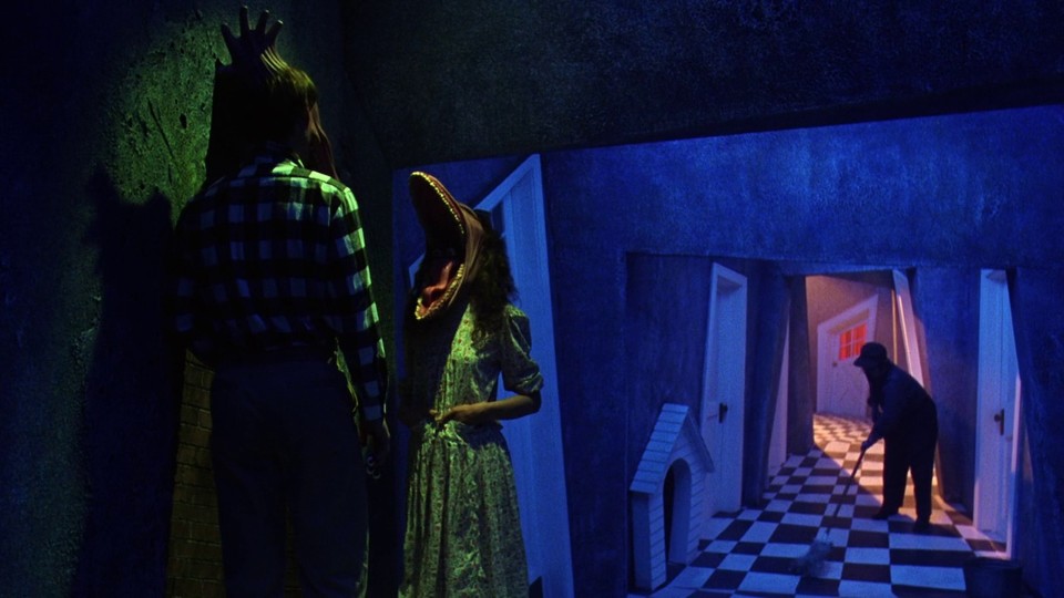
The character of Beetlejuice (brilliantly played by Michael Keaton), with his black-and-white striped suit and eccentric makeup, embodies the movie’s blend of grotesque and clownish elements.
Through distorted forms and saturated colors, the Californian director creates a unique universe, combining nightmare with playfulness and immersing the audience in a cinematic experience that challenges stylistic conventions and traditional narratives. Sadly, the sequel falls short of innovation, with a sleepy storyline and visually offering only a mild homage to Christo and Jeanne-Claude, featuring the ‘mourning-wrapped’ house as a lackluster reference.
Between gothic expressionism and art deco: Batman (1989)
Tim Burton’s Batman is a milestone in the superhero genre. His Gotham City, a dark, decaying metropolis, perfectly reflects the gothic and claustrophobic atmosphere so dear to the director.
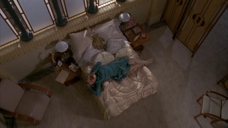
The set design combines art deco with the dystopian visions of expressionist cinema, featuring towering skyscrapers that seem to compress the city. Distorted buildings, damp streets shrouded in constant fog, and dim lighting all help construct a world where crime and chaos are inextricable.
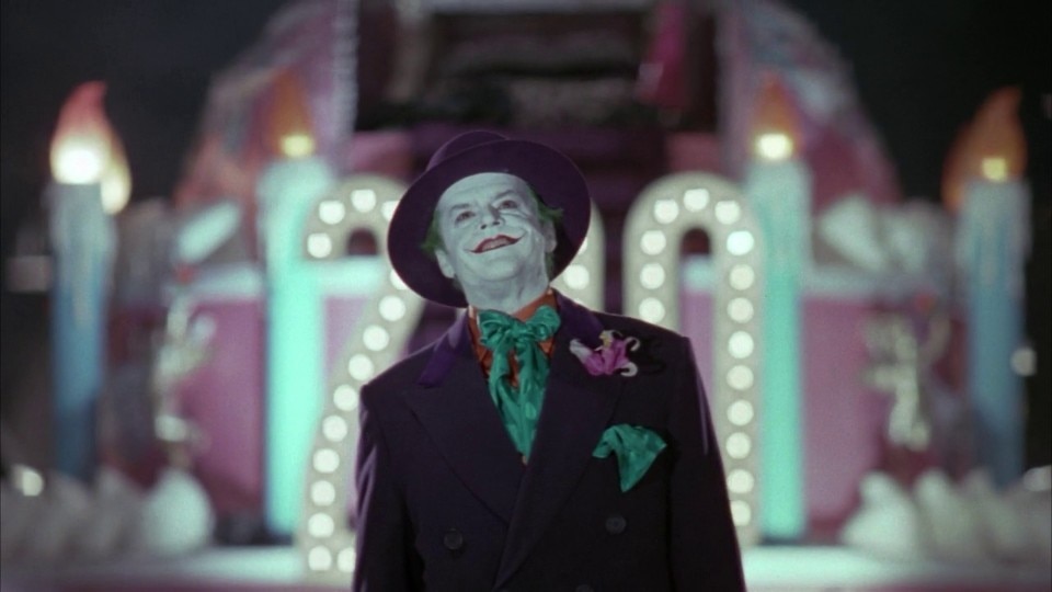
The contrast between light and shadow is a crucial element of the movie’s visual language. The chiaroscuro effects highlight the characters’ ambiguity: Batman, cloaked in black, literally blends into Gotham’s shadows, underscoring his role as a solitary, enigmatic vigilante. The Batcave, a symbolic space of isolation and alienation from society, mirrors the protagonist’s inner world. Opposing Batman’s monochromatic austerity is the Joker, played by Jack Nicholson, whose vibrant colors and exaggerated, caricatured forms embody chaos and madness. The Joker’s theatrical gestures and vivid color contrasts break Gotham’s rigid geometry, subverting its order.
Also noteworthy is the design of the Batmobile. With its sleek, futuristic lines, it conveys a hyper-stylized vision of technology that perfectly aligns with the movie’s noir aesthetic.
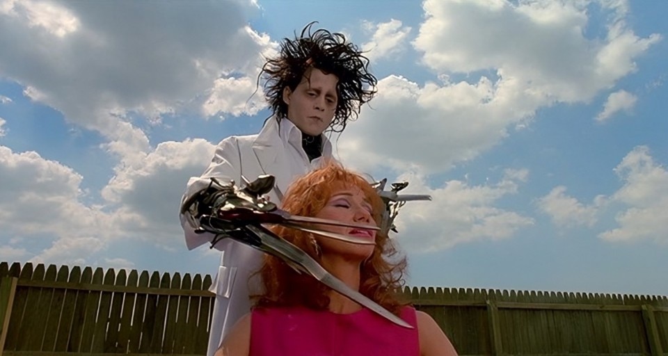
Pastel Suburb vs. Frankenstein’s Castle: Edward Scissorhands (1990)
Edward Scissorhands is undoubtedly one of Burton’s most successful movies, a modern fairy tale that continues to age gracefully. Its aesthetic serves as a means for a deep reflection on marginalization, innocence, and the nature of human artifice. The movie is characterized by a sharp visual contrast between Edward’s world and the suburban community he is placed in, creating a dichotomy between a dark, gothic, baroque aesthetic and an excessively bright, standardized, and superficial town setting.
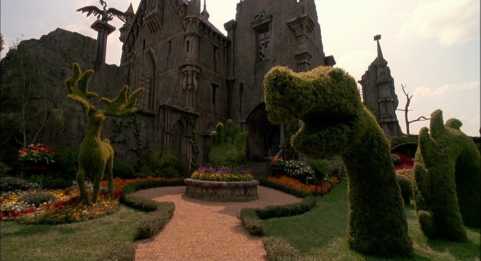
Edward’s castle, with its decaying beauty, mirrors the protagonist himself: distorted architecture, sharp spires, and elongated shadows pay homage to German expressionism, a recurring inspiration for Burton. Dark walls and sharp metal objects reflect Edward’s fragmented soul—a flawed creation that, despite his monstrous appearance, is deeply innocent and sensitive. This cold, bare environment not only physically isolates Edward but visually separates him from the outside world, as if he belongs to another realm.
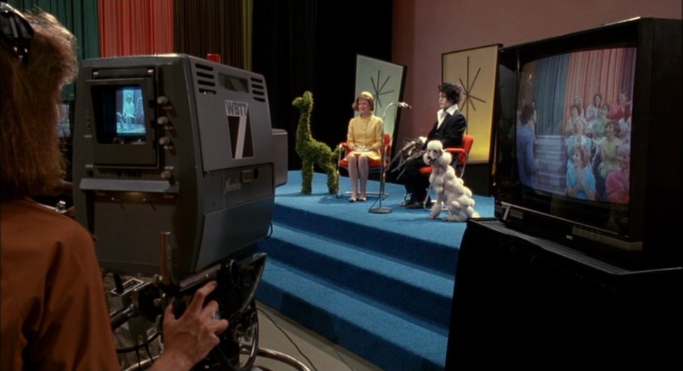
In stark contrast, the suburban town where Edward is taken in features colorful, orderly set designs reminiscent of 1950s American middle-class aesthetics. Pastel-colored houses arranged symmetrically and perfectly manicured reflect a microcosm of conformity and monotony. Burton uses this setting to emphasize the artificiality of a society that, beneath a facade of perfection, harbors prejudice and superficiality: the streets are spotless, the hedges impeccably trimmed, and the residents seem to live in a bubble of social conventions and hidden falseness, standing in opposition to the protagonist’s authenticity.
The final sequence, set once more in the castle, returns the movie to its gothic roots: as snow falls heavily while Edward carves ice, it becomes a powerful visual symbol, a metaphor for the protagonist’s solitude and tragic beauty, an unforgettable icon of diversity and romantic loneliness.
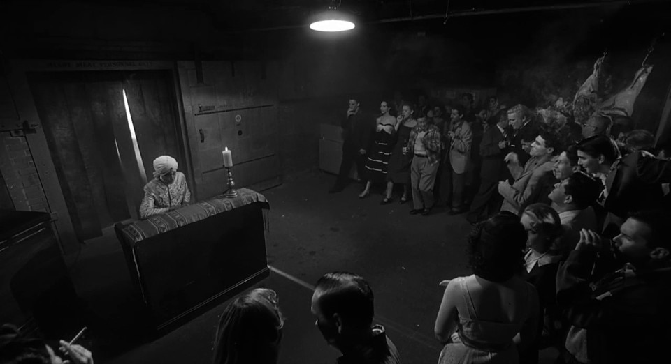
The iconic black and white tribute to the king of B-Movies: Ed Wood (1994)
Ed Wood marks a turning point in Tim Burton’s career, not only for its subject matter but also for its aesthetic. Here, the Burbank director leaves behind his usual fairytale tones to immerse himself instead into the black-and-white palette of classic cinema to pay homage to Edward D. Wood Jr., often considered as one of Hollywood’s worst filmmakers. The choice of black and white is not just a stylistic tribute; it becomes a means of evoking the charm and nostalgia of 1950s Hollywood—a time when the dream of cinema, even in its rawest form, could be made a reality.
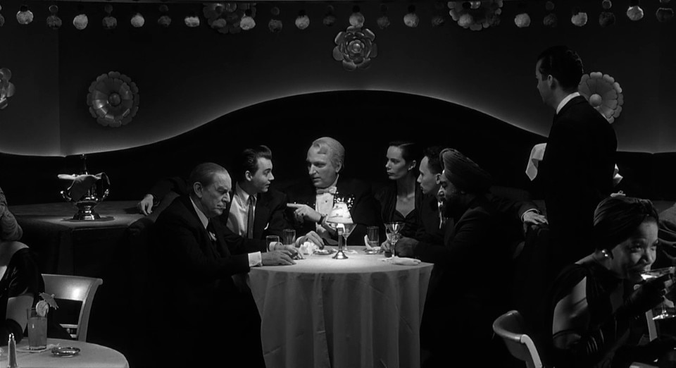
The set design by Tom Duffield, Okowita, and Cricket Rowland accurately recreates the mid-century film industry, with its dilapidated studios, papier-mâché sets, and kitschy interiors. The depiction of these spaces is intentionally handmade, mirroring the style of Wood’s movies, highlighting the dissonance between his ambition and the limited means at his disposal. Studios are cramped, poorly lit, and sparsely equipped, with visibly fragile, fake sets. This is especially evident in scenes that recreate the sets of Wood’s most famous movies, like Plan 9 from Outer Space, where spaceships dangle on visible strings and cardboard cemeteries convey Wood’s clumsy yet unshakable love for cinema.
Burton captures the heart of a neglected, faded Hollywood, far from the glamorous lights of the big studios.
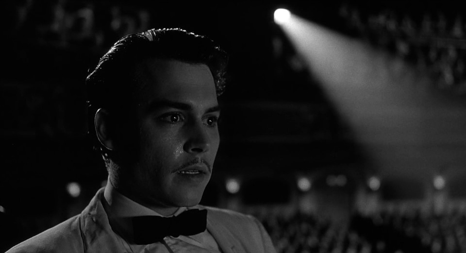
Costumes and makeup are crucial in crafting the movie’s aesthetic: Ed Wood, played by the ubiquitous Johnny Depp, with his shiny, outdated suits, appears visually out of place within the ‘serious’ Hollywood he aspires to join. The contrast between his exuberant personality and the restrained atmosphere of traditional film sets accentuates his outsider status. Burton’s camera captures Wood’s quirks, mimicking the director’s own rough, rudimentary film style, yet with a clear affection for his subject.
A key element in Ed Wood’s visual universe is the portrayal of 1950s Los Angeles: through reconstructions of nightclubs, dive bars, and old studios, Burton captures the heart of a neglected, faded Hollywood, far from the glamorous lights of the big studios. It is a world that serves as the perfect stage for the failed dreams and clumsy ambitions of characters like Wood and Bela Lugosi, who desperately cling to a vision of cinema that no longer has a place for them.
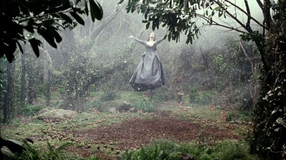
Provincial and horrific America in Sleepy Hollow (1999)
Sleepy Hollow stands as one of the stylistic pinnacles in Tim Burton’s filmography, where gothic and surreal elements find full expression through meticulously crafted set designs and an aesthetic deeply inspired by classic horror. Set in a fog-shrouded, isolated village of the late 18th century, the movie immerses viewers in a world of cold tones, looming shadows, and a persistent sense of dread.
Rick Heinrichs’ set design, with dark wooden buildings and muddy roads, captures the image of a community steeped in mystery and fear. The forest, the pulsating heart of the story, draws from expressionist cinema’s dark and distorted landscapes, evoking an overwhelming sense of threat; twisted, barren trees resemble living creatures, part of a hostile environment saturated with death.
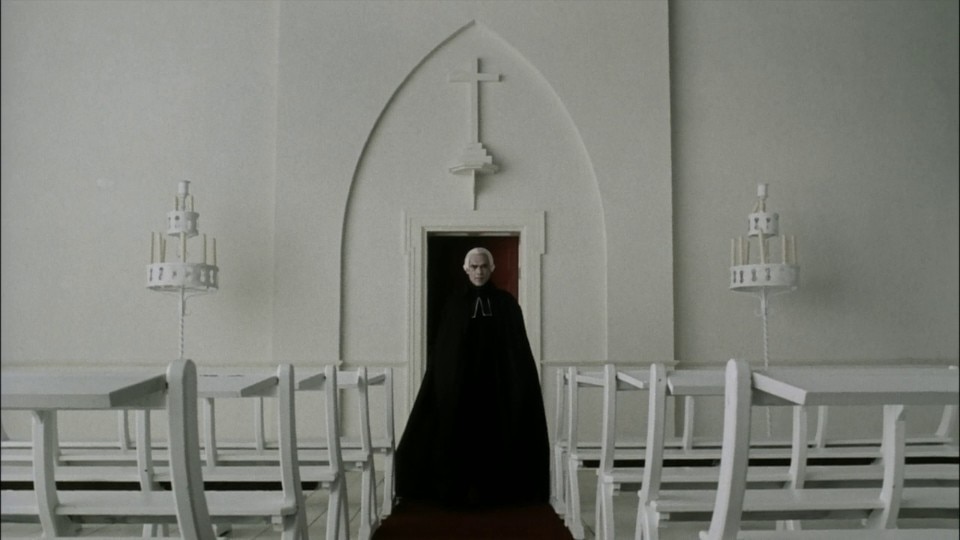
A nearly monochromatic palette dominated by grays, blacks, and blues gives Sleepy Hollow an ethereal quality. These muted colors contrast sharply with moments of violence, where vivid blood becomes a visual rupture that emphasizes the story’s raw brutality. Lighting plays an equally crucial role: Burton employs chiaroscuro to create stark contrasts that enhance the horror’s mystery and dread. Interior scenes are just as significant; the village’s homes are gloomy and cramped, dimly lit by flickering candles and filled with heavy, austere furniture, reflecting the rigid, repressed atmosphere of the community. Ichabod Crane’s character fits seamlessly within this setting, embodying the pivotal conflict between reason and superstition.
However, it is the Headless Horseman—whose appearances, amplified by deep, menacing sound effects, serve as the true symbol of the movie—that captures Burton’s visual conception of terror. Both captivating and terrifying, the Horseman represents the ultimate visual embodiment of fear in Burton’s gothic masterpiece.
The magical brightness of storytelling in Big Fish (2003)
In Big Fish—perhaps Tim Burton’s masterpiece—the director partially sets aside his gothic darkness to embrace a brighter aesthetic that skillfully combines realism with a magical exuberance. The narrative unfolds on two levels: the real world, marked by a gentle, everyday simplicity, and the fantastical, where imagination runs wild, transforming Edward Bloom’s life into epic adventures, brought to life through masterful set design and cinematography.
The town of Ashton is characterized by its understated simplicity, with soft tones and pastoral landscapes that highlight everyday life’s ordinariness. In contrast, the fantasy sequences burst visually; Burton crafts settings rich in symbolism and wonder, such as the extraordinary, carnival-like world of Karl the Giant, where vibrant colors, glistening lights, and eccentric ‘freaks’ create a unique atmosphere.
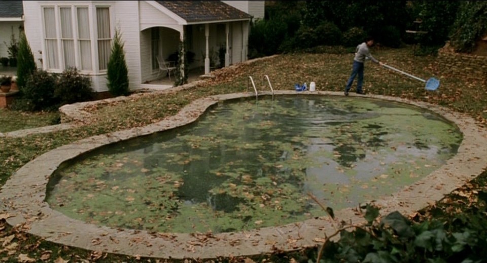
One of the most fascinating visual elements of Big Fish is the hidden town of Spectre, initially portrayed as a paradise with lush green lawns, neatly kept houses, and constantly smiling residents. This idyllic setting evokes the utopian American dream, but it later transforms when the village appears abandoned and in decay. Burton shatters the illusion of perfection through a shift in color palette—from brilliant and idyllic to desaturated and ghostly.
In Big Fish—perhaps Tim Burton’s masterpiece—the director partially sets aside his gothic darkness to embrace a brighter aesthetic that skillfully combines realism with a magical exuberance.
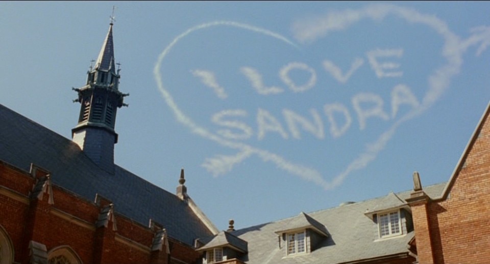
Water also serves as a recurring leitmotif in Big Fish: from young Edward Bloom’s first encounter with the legendary catfish to the river he poetically returns to in the end, water becomes a metaphor for life’s cycle and the inevitability of change.
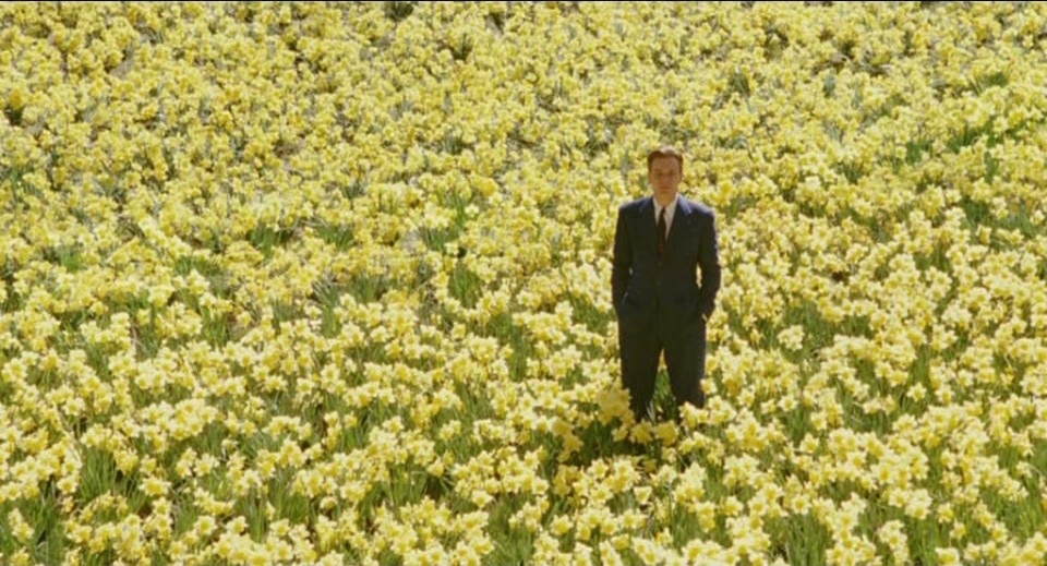
Color plays an essential role in differentiating reality from fantasy: the fantasy sequences are drenched in vibrant hues, like the red of tulips or the brilliant yellow of daffodils, contrasting with the more muted, earthy browns and grays of the real world. This use of color not only separates the two levels but represents how Edward Bloom, through his storytelling, transforms reality into something extraordinary, turning his life into a moving, timeless tale.
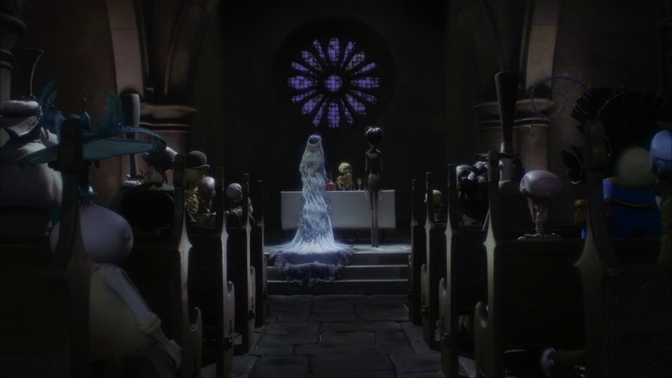
Tactile stop-motion details: Corpse Bride (2005)
Corpse Bride stands as one of Tim Burton’s most refined and mature expressions of his artistic vision, where stop-motion animation becomes the perfect tool for bringing to life a world suspended between the macabre and the romantic. The set design hinges on a striking dualism: the stark contrast between the world of the living, which is rigid and sterile, and the world of the dead, which is vibrant and colorful, reversing the conventional association of death with dark, somber tones. The land of the living is portrayed with a cold, monochromatic palette dominated by greys, blacks, and muted blues, creating an atmosphere of oppression and stasis.
Architectural lines are rigid, and the homes and streets are represented with exaggerated formality, reflecting a society obsessively orderly and devoid of vitality. The Van Dort family, with their elongated figures—characters seemingly crushed by their own formality—perfectly embodies this rigidity. In contrast, the world of the dead is depicted as lively and dynamic, bursting with bright colors and fluid movement. Burton envisions the afterlife as a festive space where characters find freedom that life never allowed them. Oranges, greens, and purples reflect the vibrant energy that permeates the realm of the dead, with a playful design where buildings and settings almost appear to dance along with the characters.
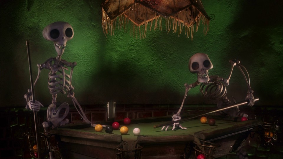
The forest, a liminal space where the boundary between life and death blurs, serves as one of the movie’s most evocative settings. The bare, twisted trees that resemble living creatures—a recurring symbol in Burton’s work—conjure both a gothic atmosphere and a sense of mystery and magic.
Stop-motion animation gives the movie a tangible quality: every detail—from the texture of costumes to the nuanced facial expressions—is meticulously crafted, creating a rich, tactile world where even death takes on a playful, enchanting appearance. This technique, immediately reminiscent of The Nightmare Before Christmas (2003), conceived and produced by Burton, allows him to explore the physicality of characters in ways impossible in live-action cinema, enhancing their expressiveness and symbolic depth.


