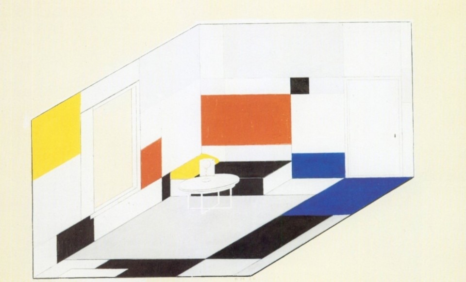
Fifty years after the death of Dutch painter Piet Mondrian, in 1994, his work was celebrated by an exhibition in The Hague, and his design for the salon of a wealthy patron in Dresden was published on Domus in an unedited colour presentation with a research essay by Maristella Casciato. It was 1925, Mondrian had founded De Stijl movement – also known as Neoplasticism – eight years earlier with Theo Van Doesburg, bringing together artists and architects around a poetics of abstraction and geometric rigour in lines and color blocks. Gerrit Rietveld would express the principles of the movement in material terms, first with the Red-Blue chair, then with the Schröder house in Utrecht, just as Van Doesburg would do in 1929 with the Café de l'Aubette in Strasbourg, which in 1994 was being rebuilt. Mondrian – in a higher orthodoxy of the orthogonal line compared to his comrades who had soon introduced the use of the diagonal in their compositions – added to his famous paintings this project of a domestic interior which, beyond the De Stijl manifesto, had the value of his own personal cultural programme, centred on the interaction of horizontal and vertical, as we read in the pages of Domus 766, published in December 1994.
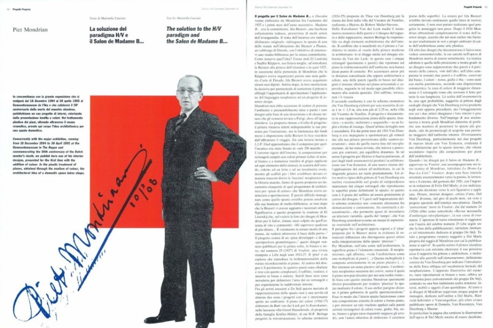
The solution to the H/V paradigm and the Salon de Madame B...
The project for the Salon de Madame B... à Dresden was elaborated by Mondrian, between the autumn of 1925 and the first months of the subsequent year. Madame B... was the client, a wealthy German collector Ida Bienert, protector of many avant-garde artists. The engagement’s subject was unquestionably original: to redesign the spaces in two rooms in Bienert’s house in Plauen, a suburb of Dresden, so as to fit in for the client a personal studio-library. How was the idea born? It had been El Lissitzky and Sophie Küppers, his future wife who had introduced in that 1925, Mrs Bienert to the Dutch painter, during a personal exhibition of the artist which Küppers had organized in a well known gallery in Dresden. Ida Bienert had purchased some of his paintings. Immediately afterwards, their mediation was decisive, enabling her to contact the painter and to offer him the opportunity to experiment the use of his Neo-Plastic style for an interior design project.
Mondrian did not have the opportunity to personally see the rooms, and presumably based his design drawings on a description and some measurements which had been sent to him in Paris where he was then residing. The proposal remained on paper, since the painter retained his presence indispensable to execute the design. But the limited sum of money Bienert made available, made him turn down the engagement and a visit to the place.
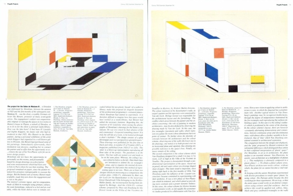
The interior’s extreme rigour, and its composition, made of filled in rectangles using primary colours, the scant furnishings, reduced to a bed and an oval table, whilst the book shelves were to remain con- cealed behind the neo-plastic facade’ of a walled in library; make this proposal an eloquent document of the architectural programme’s “coloured planes” which Mondrian had started to experiment. It is therefore difficult to imagine how that space would have worked as a studio-library, had Bienert had added the necessary furniture. Regarding this, the reaction of El Lissitzky when seeing the photographs of Mondrian’s drawings for the Salon is significant. He was very struck by their absence of life and commented: “I expected something clearer. It is truly the still life of a room, to be looked at through a door’s keyhole”. The design consists of a plan développé and two perspectives géométriques.
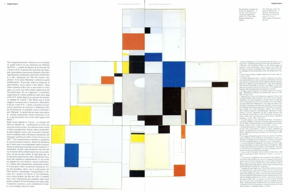
These drawings were published for the first time in black and white, in number 25 of Vouloir (1927), a magazine published from 1924-27 in Lille. The ‘plan’ is a blown up representation reproducing all three sides of the project. The pavement is in the centre. The four walls are turned over and made to be on the same plane. Whereas, the ceiling's layout is fitted in below to the left. Thin black lines are introduced to delimit the six rectangle’s areas, and to organize the internal division. Amongst De Stijl artists this method of representing space is not new. There are at least two designs which are interesting as a comparison: the “colour plan” (1916-17), elaborated by Bart van der Leck for the Kunstkamer in the luxurious Groot Haesebroek Villa belonging to the Kröller-Müller family, the reconstruction having been designed by Berlage. And the (1924-25) “colour scheme” proposed by Theo van Doesburg for the flower room in the Villa of the Vicomte de Noailles in Hyères, by Robert Mallet-Stevens. The colour treatment of the Kunstkamer’s walls, its carpet’s pattern and the tapestries were conceived by Van der Leck. Berlage instead was responsible for the architectural layout and the furnishings. The conflict which arose between the painter and the architect concerning “the role of painting in modern architecture”, may be also deduced by observing the drawing made by Van der Leck. In this case, the five rectangles (pavement and walls) which represent on a plane the room’s three dimensions have no point of contact. To further stress the diversity of concepts between the architecture and the colour scheme, observing one of the walls (the lower one in the drawing), one notices it is both pivoted over on its horizontal plane and capsized, thus denying any possible reference to the space’s box. Finally, no traces remain of the ceiling.
The second comparison is the colour scheme which Van Doesburg designed for a small 1 m may 1,5 m room, 2,25 m high in the Villa of the Vicomte de Noailles. The project is documented through a uni-dimensional representation of the space, traced out in pencil, ink and water colour on a lozenge shaped sheet of paper. This latter detail is important, since dating right back to the first months of 1924, Van Doesburg under the influence of the “counter-construction” became committed in experimenting with their aesthetics. It was a new phase of Neo-Plasticism which he initiated, and which aimed at provoking more contrasts and a greater dynamic balance. In this sense, the colour scheme for Hyères became a representative work, as did equally the axonometric studies produced in collaboration with Van Ees- teren. Here a new vision in applying colour to architecture is seen, in which the diagonal has a predominant role. Another typical motive in Van Doesburg’s paintings may be recognized furthermore, through the degree of independence maintained by the five rectangles each reproducing flat surfaces delimiting a space. In this case it is the ceiling’s surfac e’s which is positioned in the centre of the drawing. In the colour scheme’s layout, there are however “constantly alternating demarcations and connections, between continuous areas and discontinuous ones” wich almost allow a further variable to be introduced, that of ‘time’ which Van Doesburg considered essential to architectural expression.
The comparison between the designs just displayed, and the ‘plan’ proposed by Bienert evidences the substantial differences which distinguish these artists in their sculptural interpretation of ‘plastic’ space.
For Mondrian, in art as in architecture, the plane surface is an essential element. Neo-Plasticism, he asserts “sees architecture as a multiplicity of planes (...). This multiplicity is abstractly composed in a plastic plane (...). To obtain a plane’s plastic sense, Neo-Plastic architecture needs colour, without which, the plane for us cannot become a vital reality”.
In keeping with this axiom Mondrian experimented with diverse procedures to render space ‘plastic’ by using colour. His Parisian atelier became the first workshop for these experiments. He set it up, so that the entire space would works as an abstract composition using colours and flat surfaces. And to achieve this result he applied red, yellow, blue, black and grey cardboard rectangles to the walls (not even the furniture was left out) with the sole objective of reinforcing the flatness of the surfaces. Ida Bienert’s room should have continued along this line of research. Certainly not having been able to implement the design, he was rather grieved. After 1926 Mondrian completely abandoned interior design as a theme, except in his ateliers.
The other two drawings which document the Salon are axonometric views. It is worth stressing that amongst Mondrian’s production they are unique. The system chosen is that of a thirty degree projection. In one design, the room’s two walls and the pavement are represented, as seen from above.
Whereas in the other, the remaining two walls and the ceiling are seen from below. The colours red, yellow and blue are very sparingly used, following an asymmetric layout and the largest coloured area is a red rectangle, positioned on top of the bed right across its full length. The choice of an axonometric view very probably suggested itself to the painter when seeing similar drawings which Van Doesburg had produced in the preceding years. But the two painters approach when designing interiors is profoundly different. In using a thirty degree axono-metric view, Mondrian proves his preference for a way ofpenetrating space more gradually, in order to be able to reveal a larger portion of the internal space. Diversely, Van Doesburg, specially in the two maisons designs he ideated with Van Eestern, evidences his disinterest for the interior spaces, considering their relevance to be secondary for the architectural composition made up of planes. When the two drawings for the Salon de Madame B ... appeared on Vouloir, they were accompanied by a the oretical text by Mondrian. It was entitled Le Home - La Rue - La Cité.5 The magazine Vouloir after having initially being orientated towards poetry, literature and the cinema, after January ’26 when Felix Del Marle entered its editorial staff, it became decidedly more orientated towards the figurative and applied arts. Del Marle7 painter, interior designer and art critic became in a few months a veritable champion of the Neo-Plastic cause. This ‘conversion’ was reflected in Vouloir, which from the (1926) number 24, had as its subtitle “Revue mensuelle d’esthétique néo-plastique”. As a spokesman of this cause, the apotheosis of so much enthusiasm was reached with the celebrated number 25 issue, entitled: Ambience (which also marked the end of the publication), entirely dedicated to the De Stijl group. Specifically Mondrian’s essay which prefaced the issue8 had suggested the title and the programme to Del Marie. In that essay the Dutch painter very clearly expressed his ideas concerning the relationship between painting and architecture, thus putting an end to the querelle on elementarisme, a definition coined by Van Doesburg to indicate the introduc tion of the oblique line in the formal vocabulary of Neo-Plasticism’s. Five pages of illustrations fol lowed Mondrian’s text. These were respectively dedicated in the following sequence: to Del Marle, Rietveld-Schröder and Vantongerloo, and works furthermore by Domela, Van Ravesteyn, Van Doesburg and Huszar.
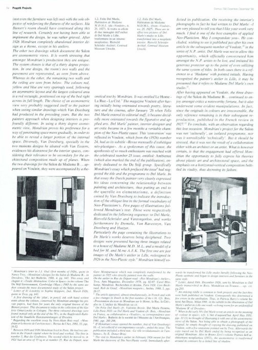
Particularly the page containing the illustrations to De Marle’s works deserves being deciphered. Two designs were presented having three images related to a house of Madame M.D. M.L. and a model of a bed for M. and M.me A.F.K. The first one are just images of De Marle’s atelier in Lille, redesigned in 1926 in the Neo-Plastic style.9 Mondrian himself so licited its publication. On receiving the interior’s photographs in fact he had written to Del Marie: “I am very pleased to tell you that I like your work very much. I find it one of the best examples of applied Neo-Plasticism. May I congratulate you”. He concluded, wishing to see it published just after his own article in the subsequent number of Vouloir,10 in the series of N.P. artist. Del Marle was not to allow this opportunity, which officially consecrated him amongst the N. P. artists to be lost, and imitated his generous protector up to the point of even utilizing the same system of titles. In both cases there is a reference to a ‘Madame’ with pointed initials. Having recognized the painter’s atelier in Lille, it may be presumed that it refers to Madame Del Marle’s own studio.
After having appeared on Vouloir, the three drawings of the Salon de Madame B. .. continued to enjoy amongst critics a noteworthy fortune, but it also underwent some evident manipulations. In fact, since the originals in colours are irrecoverable, the only reference remaining is in their subsequent reproduction, published in the French review in 1927.12 To conclude, with an observation regarding this lost occasion. Mondrian’s project for the Salon was not ‘culturally’, an isolated programme, nor was it unrealizable ‘technically’. But it should be stressed, that it was not the result of a collaboration either with an architect or an artist. What is however certain, is that the engagement had offered Mondrian the opportunity to fully express his theories about plastic art and architectural space, and the emphasis on a horizontal-vertical composition belittled its vitality, thus decreeing its failure.
Dopo essere apparsi su Vouloir, i tre disegni del Salon de Madame B... continuarono ad avere una notevole fortuna critica, ma subirono anche alcune evidenti manipolazioni. Infatti, data la irreperibilità degli originali a colori, per le successive riproduzioni si continuò a fare riferimento unicamente alle immagini pubblicate dalla rivista francese nel 1927.12 Una considerazione conclusiva a proposito di quest’occasione mancata. Quello di Mondrian per il Salon non è un programma isolato (culturalmente) e tantomeno un progetto (tecnicamente) irrealizzabile, benché vada sottolineato che esso non era il risultato della collaborazione né con un architetto, né con un altro artista. È certo però che, se da una parte quell’incarico offrì a Mondrian l’occasione per esprimere compiutamente le sue teorie sul rapporto fra arte plastica e spazio architettonico, l’enfasi sulla composizione orizzontale-verticale lo rese poco vitale e ne decretò l’insuccesso. Come non ricordare, allora, che la realizzazione del Café Aubette a Strasburgo, il più grandioso e rilevante fra i progetti di interno di Van Doesburg, aveva inizio proprio alla fine del 1926. L’Aubette non è solo l’espressione più completa degli ideali estetici e plastici di Van Doesburg, ma segna anche il momento conclusivo, senza ammissione di replica, di un dialogo ormai fra sordi.


