


In March 2011, on issue 945, a transitional period created the opportunity to publish a lettering study, more precisely a study on its history and the possibility of reinterpreting its meaning. The one to tell such story could only be Italo Lupi, graphic designer, art director at Domus between the 1980s and 1990s, who remained linked to the magazine in an exchange that extended over the following decades: his irony and inventive spirit could enter into a specific resonance with the simultaneously provocative and cultured spirit of another graphic designer, this time a Dutchman, Anthon Beeke.
It’s time for a break after Giuseppe Basile’s ten outstanding feats of graphic design conceived to introduce the magazine’s rich and ample book review section.
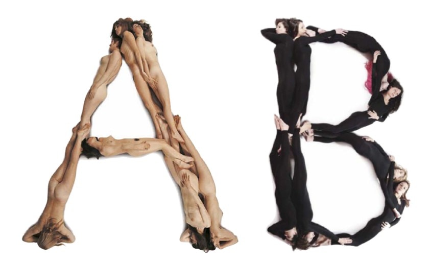
As Domus bids farewell to its editor-in-chief Alessandro Mendini, there’s space to indulge in a bit of designer citation by creating a new typeface referring to Anthon Beeke’s famous Naked Ladies Alphabet. It was 1970 when the self-taught graphic designer interpreted the spirit of the times with his composition of nude girls artfully arranged on the floor to reconstruct a 23-letter alphabet that was then photographed by an overhead camera. This project symbolised the years in which freedom of expression and behaviour was the hallmark of a more liberal “creative” culture. Anthon Beeke is a down-to-earth yet vigorous Dutchman with a lively talent for powerful representation and an expressive language that doesn’t shy away from the explicit – albeit controlled and cultured. While there’s nothing obscene about the nude alphabet, intelligent sexual connotations are clear and provocative in some of his posters for the Toneelgroep Amsterdam Theatre Company and for the ballet. This interpretation of phenomena seems to derive – through power and “affront” – from the Flemish painting tradition, with black magpies flying over fields dotted with gallows erected by Spanish conquerors in Bruegel paintings. The result is an irreverent Beeke reminiscent of Till Ulenspiegel, the hero of Dutch literature.
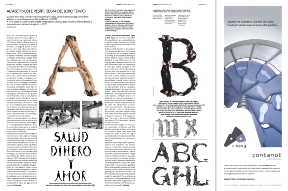
Presented on these pages is a more chaste interpretation of Beeke’s work. The alphabet girls are clothed, and wisely so, because in today’s Italy power and conformism offer a brand of vulgar, unbridled nudity on a daily basis that has been trivialised away from a critique of behaviour.
Alphabets have always been representative of eras and places. The intrinsic richness of each letter and its possible modulations are a culture’s freely expressed instruments and materials. Serif or sans serif, typefaces have often sought a kind of anthropomorphism, especially in the late gothic and baroque periods, until the modern figurative alphabets by Ursula Huber-Bavier in 1961 and Armin Haab in 1967, which were so gracefully drawn, so graphically absolute and Swiss as to be chosen by Bruno Munari for a greeting card. The question remains: will this new self-produced dressed alphabet be serif or sans serif? The very feminine composition – the gentleness with which the letters are formed – suggests that the font will certainly be serif, and perhaps, today, free of copyright.