

If, after an accelerated decade, we have not yet come to terms with the decline of the Apple aesthetic – not the iPhone: we are talking about Jony Ive's minimalism, Dieter Rams and Helvetica Neue – it will do us good to note that even Pepsi, a brand whose only rule is to express the present, to be the backdrop for the most popular images on the planet, has switched to a new logo for the past year or so.
Is it perhaps the idea of visual identity, seemingly evoking twentieth-century terms such as “graphic identity” and “advertising agency”, that has disintegrated in the year of the brat summer, in the aftermath of the first cracks in the temples of influencer marketing? The answer, quite plainly, is no.


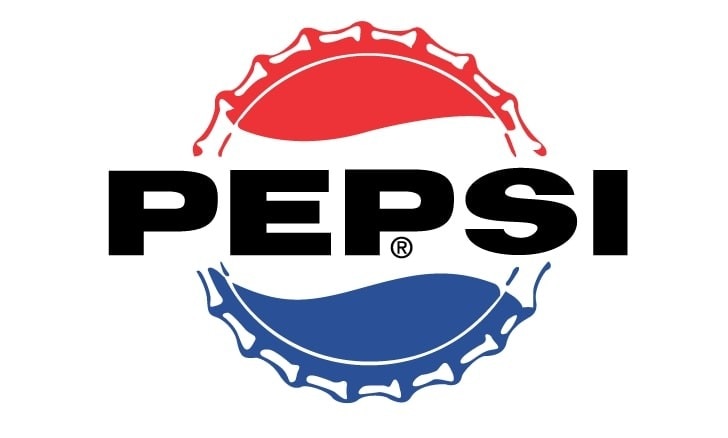


The 2024 brat phenomenon – Charli XCX's acid-green cover with its new brutalist font and language – an instant archetype of virality, is a design project that invents a world through signs, not far removed from certain art direction projects that made aesthetic revolutions back in the day, such as Mendini's for Alessi in the late 1970s. The flattening of the big names in fashion into logos that are all the same, whether Celine, Burberry or Balenciaga, as long as they are sans serif on a white background, has told us a similar story. And Pepsi, too, is doing its own thing, in its own way and in its own language: from white backgrounds, opaque blues and thin lines, it has returned to black, a lot of it; the line is strong, the font muscular, with vintage touches.
What is behind a revolution in visual identity? How much influence does it have on the social presence of its content? A lot. And a lot depends on its reception. Mauro Porcini, a product designer trained at Milan Polytechnic and now the first Chief Design Officer in the history of Pepsico, the global parent company of Pepsi and other brands, told us. He made his in-house debut at a critical time, in 2012, when the task was to unite a global audience around an identity that was struggling to gain traction, that of the 'minimalist revolution' launched by Peter Arnell in 2009 by separating a slender typeface from the iconic two-tone globe.
The first thing I did," says Porcini, "was what I learned at the Polytechnic: I went out and talked to people. Bottlers, managers, customers, consumers. The result was that Apple-style, Braun-style minimalism didn't work for our brand. Pepsi is strong, maximalist. It is contemporary, not timeless like Coca-Cola, it is energy. The claim was 'Live for now', today it is’Thirsty for more’”. The blue is brighter, the logo is bigger, the type a little stronger. I'm an industrial designer, not a graphic designer, so I've always been used to looking at objects in three dimensions": repeating logos on the surface of a bottle or can becomes more annoying than visible, so the secondary logo became vertical, with the little globe in the second "p".
The Big Ball Blue was launched in 2013 and the whole world embraced it. What followed was a decade in which each collection, each event, was an opportunity to test new ideas, until just before the Covid, when it was decided that the time was ripe for a total redefinition: “In years of research, we asked people to draw the logo they would like to have today, with reasons, and the majority drew a globe with the word Pepsi in it, even those who had not yet been born when the logo was created. The brand itself was born before all of us, over 125 years ago, a beloved language: we need to protect it, but project it into the future”.
So, digital. A visual identity that works on digital, that is “almost a button”, with a black and blue pulse that radiates. So, zero sugar. For them, it means the future, and all communication is focused on it: and in Pepsi, zero sugar means black. The master brand brings the whole identity together, so all the touch points, the fountains, the trucks and so on, will be black, with a big logo, less blue and red. On the other hand, says Porcini, "you always have to understand the timing of what you are doing, innovation is the right idea at the right time. And design plays a big role here, it is the code of communication, in a world where everything is communication, as Eco and Jacobson already tell us”.
The brand becomes the sender of a message that is summed up in the claim: “Thirsty for more”. But the people on the receiving end are radically different from those in the pre-social era. The medium through which the message is channeled now takes a variety of forms, from cans to temporary diners – like the one opened in Milan in June. In a world where content is consumed at the speed of light, code is fundamental: “Today you have to have a strong code, and that's what everyone is counting on. There was not the competitive pressure there is now”.
In years of research, we asked people to draw the logo they would like to have today, with reasons, and the majority drew a globe with the word Pepsi in it, even those who had not yet been born when the logo was created.
Mauro Porcini
In 20 years there has been an epochal change in branding, from a top-down, unidirectional dimension on passive receptors, mainly through TV as the first channel of contact with the world of celebrities, often backstage, to a contemporary dimension where it is the celebrities themselves who have their own channels.
“Nowadays you have to create a 24-hour experience, we shifted from buying to earning the right to be a conversation topic for everyone", confirms Porcini, "and that is where touchpoints come in, cans celebrating world cities, music, sport and now fashion and design. Then cinema. All this becomes potential user-generated content, and this only happens today: the urban temporary diner, 30 or 20 years ago, would never have reached as many people as the TV commercial with Michael Jackson or Britney Spears. Today, however, it is the people who share it, who create the content themselves, and the same is happening with fashion partnerships. This is powerful content, for Porcini, because it is authentic, real. And influencer culture is in crisis as soon as the content produced is merely the result of a sponsorship deal, when the artificiality of the message becomes apparent.
In just over a year since its launch, the new Pepsi logo is said to have a 99% positive sentiment out of 7 billion impressions, even from the inside, even from those bottlers who have to apply the brand.
Finding oneself at the head of such a complex process is also a kind of typical case study that helps us to shed light on a “design system” that is increasingly stratified between individual and collective actors, creators and companies, about which today's students are confronted with less and less information, precisely because of its abundance: “I was educated as a product designer”, says Porcini, “at the Politecnico I was lucky to have Branzi, De Lucchi, Meda as professors; I met people 10-15 years older than me, the likes of Fabio Novembre, Karim Rashid, Philippe Starck and Marc Newson, who are now friends, but I had no specific influences, either in graphics or in other fields. I would say that I am closer to maximalism than to minimalism”. References to Novembre, Rashid, Giovannoni, the language of manga return. “But what inspires me is the ability of these people to think innovation. I am inspired by innovators, I like to meet someone who is doing great things, who is thinking big. I could sit back and enjoy the position I have created, an already well-oiled machine, I have other things in my life”. Still.
In Porcini’s view, talent and luck are key. And timing. A talent that is not just technical, a human talent that he has broken down into 24 characteristics of so-called "unicorns" and that grows by constantly putting it into play: teaming up with better people, going to events not just to listen but to speak, to talk, to ask, to create collisions. To increase the statistical chance of things happening. “When I was 23, I left so much of my life behind to go to Dublin to study English, as I didn't know; I washed dishes in the school café in the meanwhile. Then I went and met Stefano Marzano from Philips: I was very scared, but I did it". Think big and make your own luck. On the other hand, Porcini likes to quote Stefan Sagmeister's Beautiful Numbers, the data mining, visualization and 'propaganda for the living room' project telling us that no, we are actually better off than we were 200 years ago: it is up to us to understand that we can design the future, a design thinking that can change the world, even if not overnight.
Opening image: Photo Alessandro Garofalo