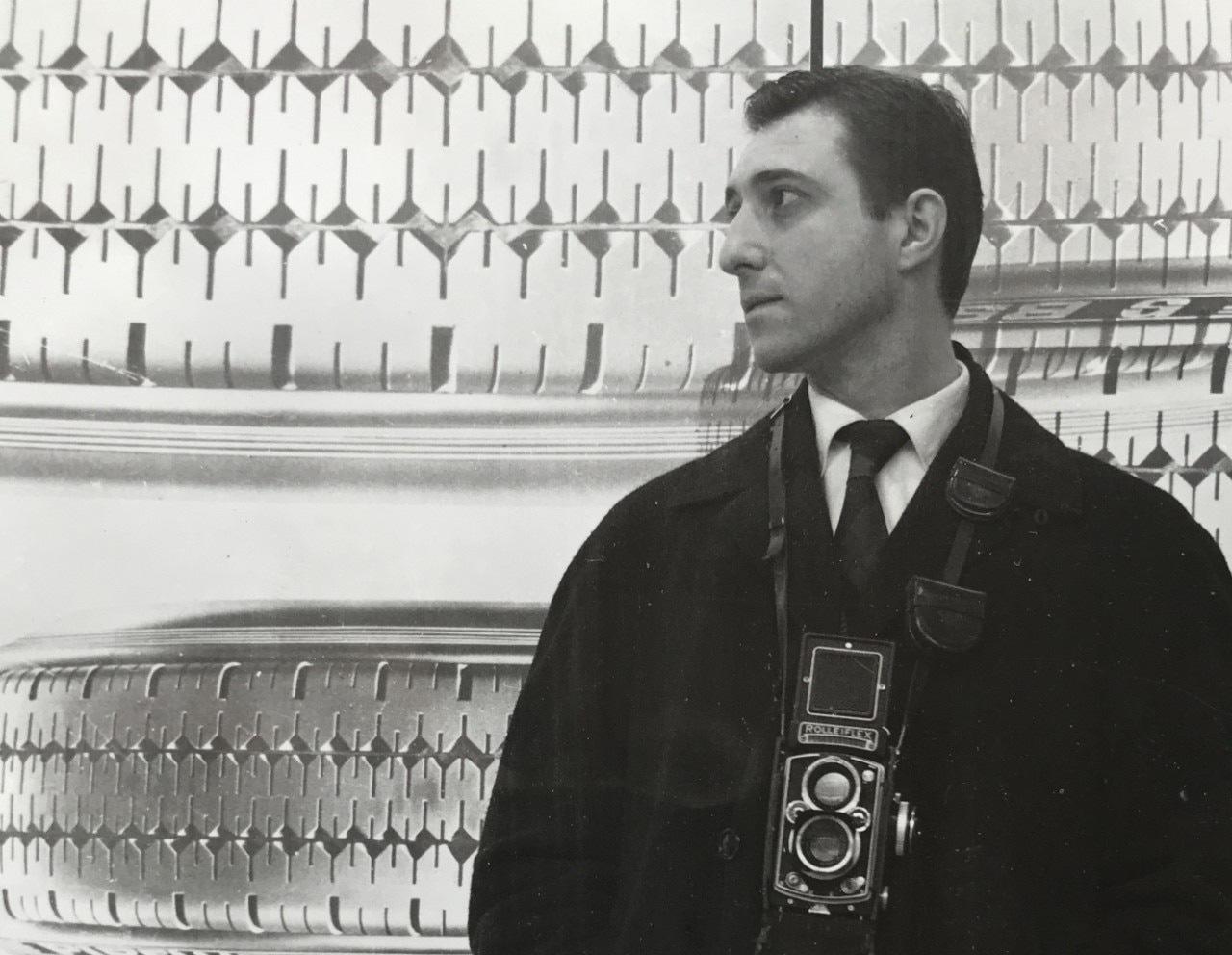
Fifty years after the passing of Ilio Negri, one of the greatest postwar Italian graphic designers whose work marked an era of fervent creativity in advertising and poster making, his work is presented at BIG − Biennale Internazionale Grafica in Milan this late May. “No to civilization if this is civilization,” curated by Luca Negri, celebrates Ilio Negri’s contribution to social graphic art with a complete series of 13 posters. Fifty years after their first presentation at the Rimini Biennale, these 1970 original posters printed on photographic paper address issues of great relevance even today.
And this is what a graphic designer must do [...]: give shape to content, in other words communicate a message, which will be all the more successful and piercing in the measure in which the form interprets and accompanies the spirit of its different content.
Ilio Negri
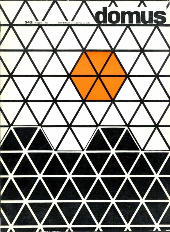
Born in 1926 in Milan, Negri approached graphic design thanks to his childhood experience in his father’s printmaking workshop, Arti Grafiche Negri. In 1944, after the untimely deaths of both his father and brother, he devoted himself entirely to the family print shop in Via Brera 5. His geometric thought process, inspired by the visual forms of squares, triangles, and circles, sprouted out of this fundamental experience, which Negri often goes back to with affection.
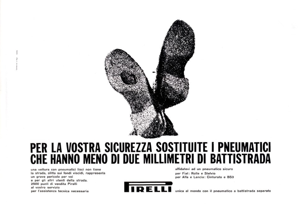
Pino Tovaglia, an Italian graphic designer and scholar as well as Negri’s colleague, called him the “geologist of graphic design” given his thorough passionate and methodical research. His geometric thought process is finely tuned, meticulously studied down to the smallest detail, stemming from an almost philosophical contemplation, in contrast to his friend Giulio Confalonieri, whose approach was more instinctive and focused on painting. The collaboration with Confalonieri, which began in 1956, brought graphic designs for major brands such as Pirelli, Cassina, and Boffi, as well as the covers of Domus and Stile Industria, and graphic contribution to books by Lerici publishing house. The group expanded by involving Pino Tovaglia and Michele Provinciali, met at the Umanitaria school in Milan where they taught technical-artistic courses (they called themselves CNPT group). The studio dissolved in 1965, and Negri continued his solo career creating the visual identity of numerous brands such as Autobianchi, Recordati, Giuliani, De Cardenas, and Troncon.

For Negri, graphic design means creating interactions between two different sensory experiences: the first is related to communication and the temporal process in which it takes place; the second is the vision, the sign, the composition that deciphers and reports what we perceive in that instant. “And this is what” Negri claimed, “a graphic designer must do [...]: give shape to content, in other words communicate a message, which will be all the more successful and piercing in the measure in which the form interprets and accompanies the spirit of its different content.” Negri’s graphic thinking is about creating interactions and communicating a change of behavior in the approach to a product, and from this approach stems a desired change in society. It was therefore a natural evolution of his thinking that led him to engage in social communication.
His research was sparked and inspired by his participation in the 1970 Rimini exhibition entitled “Aggressiveness and violence of man towards the environment” for which Negri crafted 13 posters entitled “No to civilization if this is civilization.” In these posters Negri channeled his talents as a creative, photographer, writer, and communicator, giving light to effective and pungent compositions. The works feature photographs of his 4-year-old daughter, Silvia Negri Firman, in front of the “NO” logo. While playing in her backyard, the child mimics the meaning of the words − foreboding indictment of mankind’s ravaging of nature. “My father was an exceptional man with a visionary and modern mind. He worked following a Renaissance approach, overseeing every aspect of his work, from conception to practical implementation, and he loved involving all of us in his projects, including me.”
Silvia Negri Firman reminisces, “One such example is precisely ’No to civilization if this is civilization.’ Realized during the summer in the garden of our mountain home, I found myself unwittingly modeling, attempting to interpret the various scenarios depicted in the posters. Meanwhile, my mother, an exceptional costume designer, ingeniously fashioned attire from household items and salvaged objects. At barely four years old, my curiosity was boundless, mirroring the intrigue of passersby who pondered what exactly Ilio Negri was concocting in our garden.”
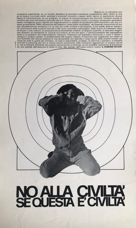
Negri’s approach in the posters resonates with the 1970s Italian Visual Poetry, yet his rational graphic style amplifies the communicative power of the message. Unlike implicit suggestions, Negri’s words boldly and scathingly articulate the contemporary threats: ignorance, noise, unconsciousness, air – crucial topics. Over fifty years later, his concise yet multifaceted manifestos remain not just relevant but prophetic, encapsulating timeless truths. These compositions, which captured a historical moment, have transcended time. Ilio Negri’s 13 posters represent a timeless motto that speaks to our origins, our identity, and our future trajectory − “No to civilization if this is civilization.”
Opening image: Ilio Negri

The design of well-being according to Caimi
Two new products ensure the highest level of environmental well-being through acoustic insulation.

