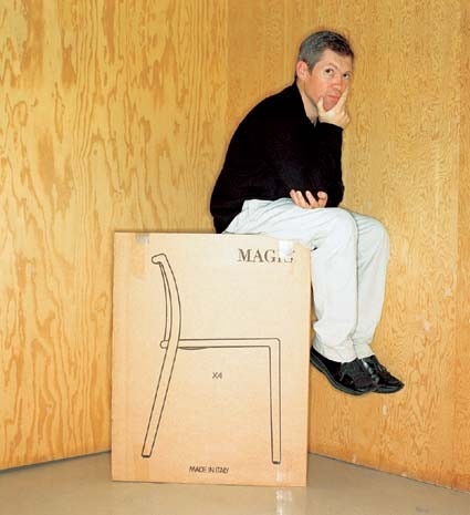
Jasper Morrison explains himself While I was in Berlin preparing ‘Some new items for the home’, I used to meet up with Andreas Brandolini and we passed quite a few afternoons in a bar near his office, discussing Design and Architecture and how useless most of it was. We came up with the term ‘Uselessnism’ to describe an approach to design or architecture which seemed to ignore the fundamental goal of being useful. It seemed to us that a lot of projects were being made with the sole aim of courting publicity and raising individual profiles, without any genuine effort to be helpful.
Our theorising was serious and not so serious, because we were ourselves guilty of seeking publicity and raising our own profiles, but we wanted to have fun doing it and not to take ourselves too seriously.
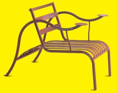
The first chance we had to put our thoughts into practice came through an offer from Roman Soukup to do a project for the Frankfurt Art Fair. We discussed what might be useful and decided on a project which would provide seats for foot-sore art lovers, which we thought might show our design in a useful light next to what we considered ‘uselessnistic’ Art. A year later with Axel Kufus we made a second project for the Art Fair consisting of display stands for the art magazine publishers and an information stand. ‘Utilism’, as we named it, quickly developed as a process which was anything but dry. In our thinking there was plenty of room in it for humour, for irony and for a charm which is usually found in situations which have not been planned, but which have evolved through necessity and the kind of quick-fix mentality of people who have enough to do without worrying about how things look.
In one sense we were being smart-arses who thought we knew enough about the world to put things right and in another sense we genuinely believed that this more practical approach of providing a useful service could also result in improved atmosphere and quality of life.
Around this time we came across the writings of Christopher Alexander, whose book A Pattern Language seemed to express similar goals to ours, if a little less ironic and possibly a little dry. Anyhow it was confirmation that we weren’t alone in thinking of design as a tool for improving daily life and the appreciation of human existence. We followed these early projects with some urban planning in Vienna, organised by Gregor Eichinger and Christian Knechtl, where we tried to defend an old-fashioned Viennese locality from the invasion of high street shopping and rising property rents. It went very well at first, with plenty of praise for our approach and words of intention from local politicians, but in the end it went the way of most urban projects, as the politicians, once out of the spotlight, quietly moved on to the next press conference.
One project which went particularly badly involved the design of signage and street furniture for a ‘parc national de France’ to the south of Paris, where our attempts to suggest that people living within the park’s boundary should have the right to a normal existence, and not be treated like animals on a safari, were mistaken for an insolent and negative approach to the briefing. In the end it turned out that they were looking for some fancy metalwork. In any case we never had much luck with these urban projects. Another project, code-named ‘0-5 metres’ in East Berlin shortly after the wall came down, set out to avoid architecture (and the cult of monument building) as the solution to social problems, in favour of dealing with the city’s surface, with local services, from shopping to street cleaning. This project’s presentation drew angry shouts from some of the audience who again assumed that we had taken a cynical approach to the briefing.
There were others which went the same way but Utilism’s greatest urban triumph is probably a project for Fisch Platz in Graz, Austria, where we succeeded in removing travel company stickers from the windows of the bus station café, so passengers could see if their buses had arrived, and installing a couple of speed bumps to allow them to get to the buses in safety. You may laugh about it, but the sense of freedom at making decisions which were 100% practical was enormous, as if all the nonsense which we put up with in our daily existence were swept away and replaced with a very simple system where practicality and common sense are more important than all the stupid reasoning which normally shapes the world. There were other angles to it than pure practicality. The driving force of our thinking was the human experience of the situation. The café was a nice place to be, it was just a pity that you couldn’t enjoy it for worrying about missing the bus. The inspiration was the atmosphere of the place and the realisation that with the application of a little sensible thinking we could make it work again. This was an exceptional success.
On the whole, it seemed like the powers entrusted with such projects were reluctant to stoop to such low levels of practicality and consideration for the human element, almost as if these were secondary to the aesthetic evidence of money being spent. It’s probably not that bad anymore and recently urban planning issues have become more fashionable with younger architectural practises, but after the disappointing results I decided to concentrate these Utilistic principles on designing objects, whose existence doesn’t depend on politicians or decisions by committee and where there seemed to be a higher success rate.
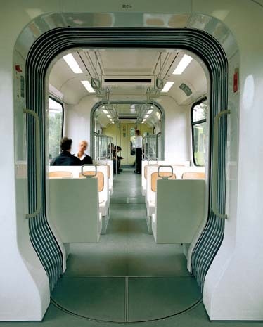
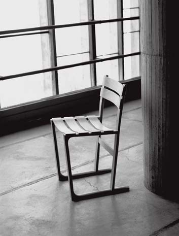
I started to notice that successful objects, that is, objects which are good to live with, seemed to share certain characteristics. They were never the result of aesthetic decisions alone, nor were they purely functional. They always balanced these two extremes with the additional consideration of the appropriateness of materials and their combination, of the human experience of using and living with the object, of the object’s effect on its surroundings and of the communication of its purpose. I realised that certain less noticeable objects could over time become the objects of daily choice by virtue of charm, stealth and efficiency. In the long term they just had more character for the job than others of the same class. Most of these objects were not ‘designed’ in the marketing sense, probably because of marketing’s simultaneous demands of uniqueness and sameness, which seems to prohibit practicality and any genuinely well meant problem solving.
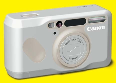
It’s a sad fact that marketing is often the motor of unnecessary change, replacing satisfactory products with products which may be less efficient but which are easier to sell.
I doubt a comparison of everyday objects of previous decades, even previous centuries, with those available today would show an improvement in overall quality. Technologies and new materials may improve performance and design; they may bring things up to date and occasionally innovate, but the experience of living with an object seems to have cheapened. Furthermore, it appears that the more ‘developed’ a society becomes the more value is placed on useless objects and the less appreciation there is for something useful. We need to keep this appreciation alive or we may lose touch with reality.
