X–raying the everyday
A good part of the latest projects by Kazuyo Sejima and
her followers might possibly be seen as variations on Mies's
principle of the plan libre, taken in terms of an open space
free from internal structural hindrances. The space itself is
emphasised by the transparency of the external walls and
the positioning of all vertical supports around the building'speriphery, reducing their structural cross-section to the absolute minimum.
Architecture "made in Japan" has never forgotten to copy
Mies. One of many such instances is the replica of the
Barcelona Pavilion designed by Yoshio Taniguchi as the
entrance to the Kyoto National Museum. In this example, the
explicit similarities to the master clearly reveal the complex
cultural and ideological journey that led to Taniguchi being
preferred over Herzog & de Meuron, Holl, Koolhaas and Ito
in the competition for the MoMA renovation in New York
(even compared to Taniguchi's Gallery of Horyu-ji Treasures
at the Tokyo National Museum, which is so often evoked as
a precedent for the American museum's renovation). The
outcome of the MoMA competition, held in the late 1990s just
as the Guggenheim in Bilbao was opening, was made public
with the gallery's reopening at the end of 2004. Thanks to the
recognised values of Japanese essentiality (in stark contrast
to the Basque monster and many of the archistars' bizarre
contrivances), the West was once again able to propose the
refined modernism that had been rejected by the masses and by the rediscovery of history and regionalism.
This premise is not intended as an introduction to a discussion
about style, but rather serves as a useful springboard for
evaluating three recent buildings constructed in Tokyo. Designed by Sou Fujimoto, Ryue Nishizawa and Kazuyo Sejima,
they were chosen for this article as examples of how to deal with
verticality, a recurring theme and condition of metropolitan life
in the Japanese capital.
The plan libre is perhaps one of the few basic concepts of
modernism—and certainly the only one of Le Corbusier's famous five points of modern architecture—that has actually taken root and achieved widespread popularity. It is readily visible, for example, in the concept of luxury lofts. Making reference to it here helps to divorce the principle of verticality from the more prosaic desires of "living on the upper floors" or "having a wonderful view", and from other such clichés generally
associated with skyscrapers.
Tokyo's vertical thresholds #1: Kazuyo Sejima
Three new projects by Sou Fujimoto, Ryue Nishizawa and Kazuyo Sejima make dramatic use of verticality and spatial theatrics to escape the constrictions of a notoriously dense city.

View Article details
- Roberto Zancan
- 14 December 2011
- Tokyo

The concept of the plan libre allows one to approach the notion of verticality as a specific architectural typology, in both residential and public applications, and takes into account a series of issues: the relationship between high- and low-rise patterns of building; the encounter between the markedly antiurban aspects of modernist canons and the city of today; and the actual rapport between public and private, individual and collective social structures. In this sense, the three cases presented here have no direct relationship with the former master from Aachen. For them, Reyner Banham's remarks about the modernist houses in Los Angeles designed by Craig Ellwood, Pierre Koenig and the Eameses might be more appropriate. Namely, that "when compared with the works of Mies van der Rohe... these buildings are not monumental steel structures" and thus reveal "a total absence of the heroic style's creative anguish typical of the European modern movement". If anything, as with these Californian Case Study Houses, the genesis of the Japanese buildings under review must also be traced to the evolution of local typologies. In all probability, the features described here have evolved from earlier experiments conducted by architects like Toyo Ito (such as his project for the headquarters of Mikimoto in Ginza, because of its structural perimeter, or maybe even the Sendai Mediatheque, for the use of extremely thin horizontal planes).
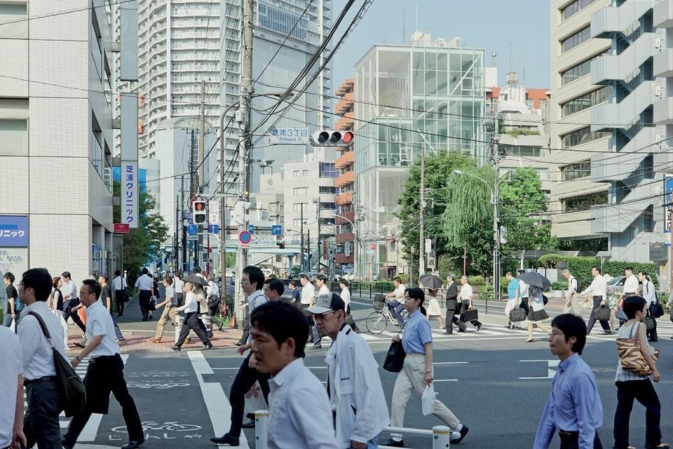
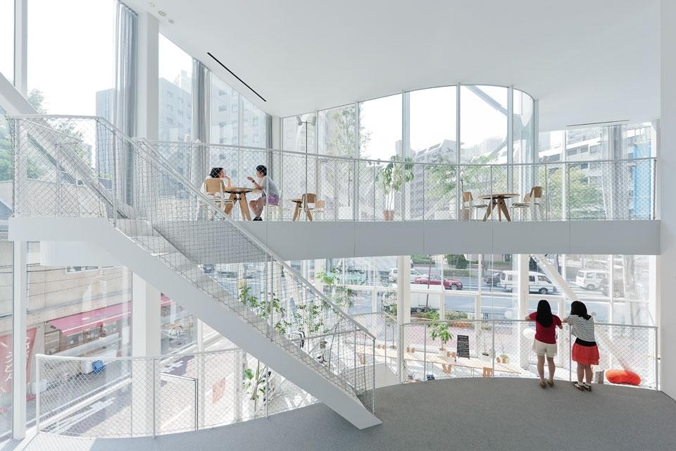
Starting our analysis with Shibaura, it might seem reasonable to associate this building with other recent works by Kazuyo Sejima. Deliberately awkward and disjointed, almost unstable in appearance, these buildings look like the survivors of an earthquake that has shattered the elegantly superimposed, refined and subtly articulated concrete slabs of the Dior boutique in Omotesando, or showered it with the ethereal matte finish that sets it apart. Limiting ourselves to comparisons with the New Museum, where the feeling of instability stems from the trick of haphazardly stacking boxes on top of each other, the dishevelled character of Shibaura emerges by exposing its asymmetric structure. Through a play of double-height volumes, it seems as if this small tower had re-stacked the "boxes" from the American museum, encompassing them within its interior and removing the cladding to show off the inner workings of its lateral bracing systems.
The plan libre is perhaps one of the few basic concepts of modernism—and the only one of Le Corbusier's famous five points of modern architecture—that has actually achieved widespread popularity.
In reality, the building is structurally very different from its American cousin and is based on an elementary sequence of alternating floors, obtained through the use of double-height volumes accentuated by diagonal beams, which look like a big K when seen from the street. This remarkable simplicity is complemented by the curved shapes cut out of the floors which set up a rhythm of solids and voids, expansions and contractions, lending a very airy appearance to the building. A rudimental familiarity with local building and fire codes helps to explain the other solutions, such as the semispiral staircase and the external openings framed by mullions. The former is required by law to ensure a redundant system of escape routes; the latter to provide adequate air circulation.
Taken together, these solutions lead to a purely "vertical"
distribution of the programme, again similar to that seen in the
New Museum, but used here for a different purpose: to achieve
an "assemblage" effect. In this private building, for example,
visitors have access to all areas; each place offers a view outside
and each place can be seen from the outside as well. It is merely
the sum total of the liveability of its floors, internal differences
being created by the curved sectioning of the floors to form
meeting rooms, terraces, offices and a projection room. This
pattern is not rare in the Japanese capital. The building is the
headquarters of a printing and publication company, which
makes its spaces available for many cultural and children's
activities, like a sort of community centre. The corner where
it is located is extremely busy (next to one of the case studies
surveyed by Yasutaka Yoshimura in his manual to an "extreme
understanding" of Tokyo, Super Legal Buildings). Whereas in
the mornings and evenings the building remains completely
indifferent to the comings and goings of the employees, during
the day and on weekends it is animated by the local population,
who, granted access on the ground floor, are then taken to the
upper storeys where many activities are carried out, "freed
from the ground".
[continued]
Shibaura Building, Tokyo
Design Architects: Kazuyo Sejima & Associates
Design Team: Kazuyo Sejima, Rikiya Yamamoto, Nobuhiro Kitazawa, Satoshi Ikeda
Structural Engineering: Sasaki structural consultants, Mutsuro Sasaki, Toshiaki Kimura, Hideaki Hamada
Construction supervision: Shimizu Corporation Ikeda
Client: Kohkoku Seihan Inc. Ikeda
Built area: 950.61 m.
Design phase: 2008–2010
Construction: 2010–2011