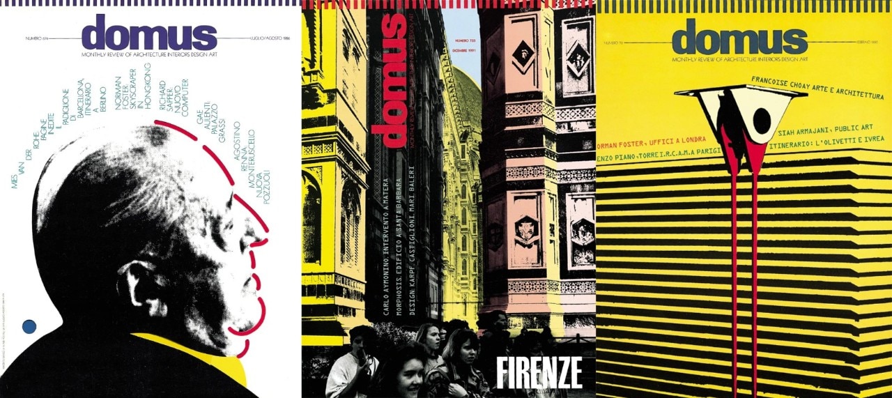
A graphic designer by vocation, it can be said that Italo Lupi was indeed an art director by his very nature. His story is linked to the name of another important Italian magazine, Abitare, but by the mid-1980s the foundation was laid for another experience, destined to leave a major mark. Mario Bellini, along with whom Lupi had joined the development office at RInascente 20 years earlier, took over as editor of Domus, and for six years Lupi became the magazine’s art director. It was the advanced phase of a postmodern era where the visual language of the previous Domus – directed by Alessandro Mendini – had renewed a spirit of deconstruction of preconceptions, of openness to imagination and aesthetics that had already been carried out by Gio Ponti: Lupi would explore these new open paths and work the miracle, of finding a common ground between an editorial line putting design back at the center, the postmodern spirit of redesign and citation, and the rigor of a communicative clarity that could almost make one hail to a major comeback of Bauhaus.
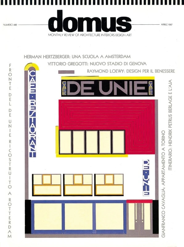
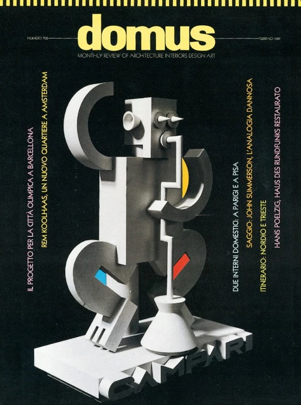
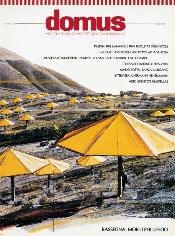
The covers of his Domus work by primary color blocks as capable of creating a bespoke lettering for the Musée d’Orsay as they were to give a literal restitution of Oud’s café De Unie; they portray Mies and Le Corbusier in their “augmented”, re-designed versions; they mix different media as if they are combining masses and solid colors, or they associate abstract constructivist-flavored aesthetics with debut projects such as those signed by Mecanoo in the early 90s. Leaning on the work of other artists such as Christo and Jeanne-Claude, using architectural details – Renzo Piano’s facades – as page layouts, or generating entire graphic worlds from the blank sheet, Italo Lupi’s Domus covers not only tell the story of an era, but unveil the founding act of an aesthetic destined for long success.


