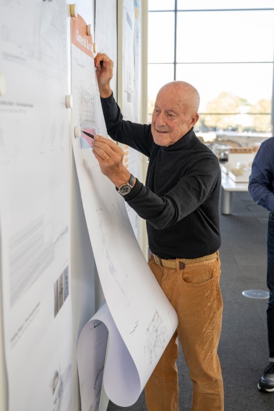
Marcel Breuer and Norman Foster are not the only architects to have been fascinated by bicycles, but both made more direct use of their passion for cycling than most. Breuer bought his first machine as a 23 year-old. He learned to ride his Adler on the streets of Dessau, where he had recently taken on leadership of the carpentry workshop at the Bauhaus. Foster, who grew up in the suburbs of Manchester, was 14 when he bought his first racing bike in 1949. He put together the best components he could afford, opting for a silver finish, and took care to strip off all extraneous branding.
Breuer’s Adler was the inspiration for the Wassily armchair (originally named the B3), the cantilevered Cesca side chair and the Laccio table. Years afterwards, Breuer recalled a conversation he had had with an architect friend in Dessau in 1925 shortly after he had started cycling.
It seemed to Breuer that the bicycle represented an ideal product. Its fundamental form hadn’t changed in 20 or 30 years. His friend asked him, “Did you ever see how they make those parts, how they bend the handlebars? You would be interested because they bend the steel tubes like macaroni.” Breuer went on, “Somehow it stayed in my mind, and I started to think about steel tubes bent into frames, how it was probably the material you could use for an elastic and transparent chair. Typically, I was very much engaged with the transparency of form.”
He has an optimistic view of what the world might be with design and architecture applied effectively.
Norman Foster wrote the essay Handrails and Bicycles in 1989, in which he reflects on the process of steady improvements in bicycle design, new forms of connection between machine and rider, and the impact that new materials such as carbon fibre would soon have. Foster describes the replacement of the old-style leather straps, which connected riders with the pedals through a laborious process of adjustment, by an instant step-in arrangement. He called it “an immensely satisfying combination, both physically to use and aesthetically to contemplate.” He went on to explain its relevance to architecture. “I can sense similar satisfaction in the process of architectural design when for instance the old order of separate systems to hold up a building and to make it thermally comfortable is superseded by one system of more eloquent simplicity.”
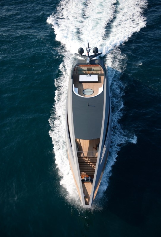
Almost a century after Breuer bought his Adler, it was Foster’s Canadianmade custom-built Cervelo bike, weighing just 900 grams (less than an Apple laptop) that became the starting point for another furniture series, the Cosmos family of tables. Both Breuer and Foster took an entrepreneurial approach to turning their ideas into finished products. Breuer began by suggesting to Adler that it diversify its manufacturing from bicycles to furniture that he would design. When the idea was rejected, Breuer set out to make his own prototype chair. He ordered lengths of two-centimetrediameter extruded tubular steel bent to his specifications direct from the Mannesmann factory. His next step was to hire a plumber to weld the tubes together. Computational and modelling techniques have progressed far enough for much more complex shapes to be possIible than they were a century ago.

Cervelo uses carbon-fibre tubes with a high strength-to-weight ratio. Unlike the old Adler, the cross-section of tube varies in thickness along its length, concentrating material where it is needed for strength. Foster was intrigued enough by its potential to explore what a table made from the same material might be like. With advice from Spain’s national composites research centre that works for Airbus, a team at the Norman Foster Foundation in Madrid prototyped a design as part of their materials research programme. It achieved an ultra-slim profile weighing only 5 kilos but capable of supporting a load of 400 kilos. Unlike many carbon-fibre furniture designs, which use the material in sheet form or as a shell, the Cosmos has a tubular structure.
Prototypes were used to furnish workspaces at the Foundation and, there, caught the attention of Tecno – the producer of the Nomos table and desking system. It proposed an aluminium-andsteel version that performs equally well and is better suited to volume manufacturing. Breuer and Foster both span the apparently narrow, but actually quite sharp divide between architecture and design. Foster bridged it by working with the sensibility of a designer and an architect. From the start of his career, Foster practiced architecture with an unusual degree of collaboration with specialists from multiple disciplines.

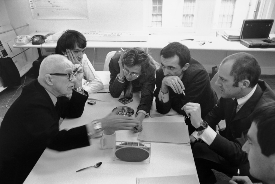
One of the most memorable early photographs of Foster shows him with Buckminster Fuller. They are sitting at a table working on Fuller’s plan for the Samuel Beckett Theatre, sunk under the quadrangle of St Peter’s College in Oxford (1971). They share the table with Tony Hunt, the engineer who designed the Sainsbury Centre in Norwich. Foster has always seen a table as a symbolic expression of his collaborative approach to design. From the beginning, engineers and designers have worked alongside architects in his practice, not as external consultants but as integral members of the team. They include Martin Francis, who trained at the Central School of Art and Design as a furniture designer and David Nelson who studied industrial design and is now co-head of design at Foster + Partners. They did not work specifically as furniture designers, but took part in shaping broader architectural solutions, along with Loren Butt, an environmental engineer, and John Walker, a cost consultant.
That early mix of skills and specialisms is reflected in Foster + Partners today. It has, for examples, an extensive workshop to make huge physical models; recording and digital film studios; and a team that uses Unreal Engine, a programme developed by Epic Games to create 1:1 virtual reality. Another group is working on applied research and development with a focus on artificial intelligence, robotics, computing and complex geometry.

The issue of how much architects have to offer design and vice versa has been the subject of passionate argument at least since the days of Adolf Loos. His polemic fable The Poor Little Rich Man, published in 1900 in a Viennese daily newspaper, satirised architects, notably Henry van de Velde, who believed in architecture as a Gesamtkunstwerk in which every door handle, light fitting, armchair and table is part of the architect’s role in creating a total work of art. Reyner Banham, the English critic who Foster started reading in 1959 and who was also a keen cyclist, had as jaundiced a view of self-conscious design as Loos. In the catalogue for the exhibition “Modern chairs, 1918-1970” hosted at the Whitechapel Gallery in London, Banham writes in 1970: “Rational appraisal of the way we live now seems to need some such abstract noun as furniturisation to describe how previously unselfconscious and virtually invisible domestic items suddenly become great monumental objects which demand attention, dusting and illustration in newspaper colour supplements. The latest victim is air-conditioning.
This useful service was performed by simple boxes of works that sat neatly on windowsills or lurked in holes in the wall. Now there are two Italian models at least that stand on pedestal bases with crossed legs and casters under. At the next Triennale there will doubtless be fully arted up versions by named designers and another service will have been furniturised, another class of selfassertive objects will have got their claws into the living room carpet never to be dragged out again.”

Banham understood the furniturisation phenomenon as “precedence of appearance over performance”, an aspect of the tension between culture and technology. “Pure technology would probably bring furniture to an end, or at least render it invisible,” he suggests. Such attitude has underpinned Foster’s fascination with designing systems, and his long-term kit-of-parts approach. It is clearly visible in a selection of Foster’s prolific output of drawings that is gradually emerging in the form of a series of facsimile volumes based on his sketchbooks. The first volume covering the years from 1975 to 1980 is particularly revealing, as much for the unbuilt projects as for those that are now lost, and those that were actually completed.
The unbuilt schemes include the house that Norman and his first wife Wendy planned for a site in North London. It would have had a remarkable perforated steel structure, suggesting the influence of Jean Prouvé, and some intriguing, prefabricated bathroom pods that would have been plugged in to service the interior.
There is rich material on the longdestroyed Joseph fashion store on Sloane Street in London that opened in 1979. Foster sketched out a doubleheight space with I-beams, delicately wrought walkways, and ladders inspired by the wall of books in Pierre Chareau’s Maison de Verre in Paris. Foster’s commentary outlines how he planned to take on responsibility for manufacturing and supplying the fittings.
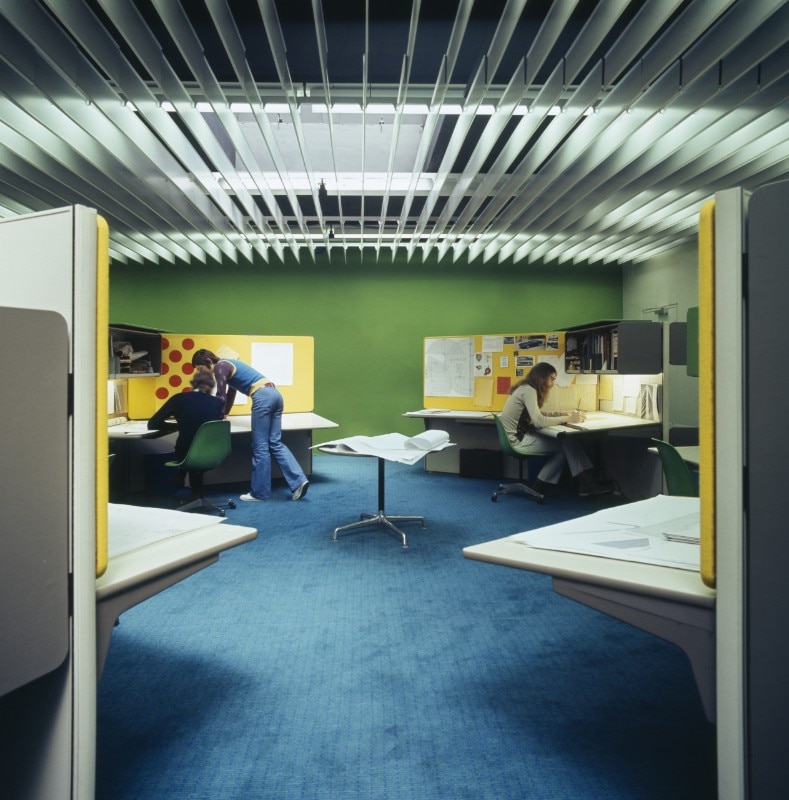
By the time Foster made these drawings, he had already moved office three times. He had gone from a residential flat in Hampstead where he started in 1963, to a floor in the Covent Garden offices of Tony Hunt, the structural engineer. In 1971 he fitted out his office on Fitzroy Street. It had a curtain-wall facade that reflected his design for the Willis Faber & Dumas insurance company – vivid green walls with radiused corners that suggest submarines or aircraft. It was equipped with one of the first installations of Herman Miller’s Action Office 2 system in Britain. Initially it had space for just 20 people including the receptionist, but at the time the office seemed the height of corporate sophistication. By comparison, Foster + Partners today is about 2,000 strong.
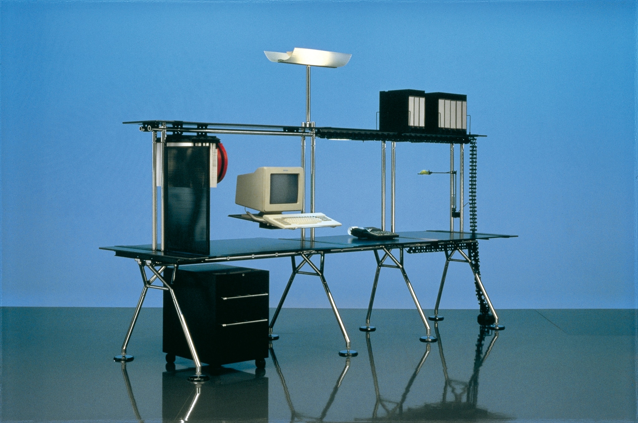
The sketchbooks cover Foster’s ideas for the office on Great Portland Street, where he would move in 1981, and its purpose-designed furniture. It included what in those days was an essential piece of studio equipment, a drawing board. With its adjustable circular feet and braced structural legs, it irresistibly seemed to suggest the lunar lander that NASA sent to the moon. The perforated ribs, however, seemed closer in spirit to the fuselage structure of a World War II Lancaster bomber. It formed the prototype for a range of furniture used for the Renault building in Swindon, which was conceived in Great Portland Street.

Foster had his own tables made specially. He went to the same fabricator to manufacture the larger range of pieces used for Renault, where there were different versions for the reception desk, the glasstopped tables in the staff canteen, and for the office area. One of them was acquired for the collection of the Vitra Design Museum. Not until Foster met the Borsani family, the owners of Tecno, did the designs become fully productionised as the Nomos system, and a simpler structure emerged with a full range of components.
Foster established an industrial design team to work on the Nomos project at the start of the 1980s. While it is still a relatively small element in the overall context of the practice, it has achieved as much as most independent industrial design consultancies. Its work spreads across the whole range of furniture types, with long-term working relationships with Unifor, Walter Knoll, Poltona Frau, Molteni and Tecno. There are now Foster systems for seating, for the office, the airport, as well as cutlery, door furniture, bathrooms and kitchens. What connects them is the quality that Foster describes in his essay on cycling. As he puts it: “Pedal bindings, so obvious and direct, you wonder why it took so long for them to evolve, but simplicity is quite deceptive.” Li accomuna la qualità che Foster ha descritto nel suo saggio sul ciclismo e, come lui stesso ha detto, parlando degli attacchi dei pedali, “così ovvi e diretti da chiedersi come mai ci sia voluto tanto tempo per la loro evoluzione, ma la semplicità è ingannevole”
Opening image: Norman Foster, foto Nigel Young/Foster + Partners

