
The name Braniff can evoke perhaps one of the most “American” stories – in the twentieth-century meaning of the term – in the world of transportation, aviation and creation of an ever-smaller planet: “American” in its origins, rooted in Oklahoma, and “American” in its entrepreneurial epic, with the Braniff brothers launching a first company – in the same years as Domus was born – that grew linearly accompanying the United States along the decades of their global expansion (it would be in operation until 1982), embodying many traits of their lifestyle and visual imaginary. With the 1960s, however, a turning point would come in such linearity: neutrally expressing the language of a society was no longer deemed sufficient, a new language had to be actively proposed in order to remain at the top of the collective imagination (and consequently of the market): advertising executive Mary Wells would then decree “the end of the plain plane” and the adoption of a new image for Braniff International developed with architect Alexander Girard, and fashion designers Emilio Pucci and Beth Levine. Color was the foundation of this new identity, and through the strategy of color Braniff generated a small revolution in design that enshrined it as an icon, moving from air carrier to the graphic and communication design reference for a whole developing industry. Domus would then report about this revolution in October 1966, on issue 443.
.png.foto.rmedium.png)
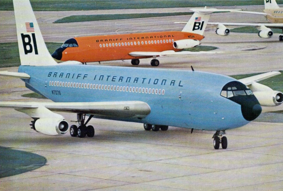
Coloured aircraft designed by Girard for Braniff International
The American airline Braniff International (seat in Texas, flights to South America) is the first and only company to colour its aeroplanes, both inside and out; and not all the same colour, hut with seven different colours so that now every coloured plane is immediately recognizable – amidst the metallic swarm on the air-field, and even more in the sky – as a “Braniff”.
.png.foto.rmedium.png)
And not only the aeroplanes have been differently coloured, hut also the rolling ground equipment. All this belongs to the complete redesign of Braniff’s image which Alexander Girard has undertaken: from air-planes exteriors and interiors, to office and airport lettering, the posters, the symbol of the airline, the passenger lounges interiors. His hand be recognized in every detail. Colours are his tender feast-colours, which noone had thought of applying to the official bluegray-silver world of civil aviation; which no-one ever used on such a courageous scale. And which give expression to the idea of air-travelling as “amusement”.
.png.foto.rmedium.png)
An amusement beginning already in the passenger-lounges, as Girard designed them: a foretaste to the flight, highly coloured, surprising and lavish, already detached from the context and the character of the city of departure and filled with images, objects and symbols of the country of arrival.
.png.foto.rmedium.png)