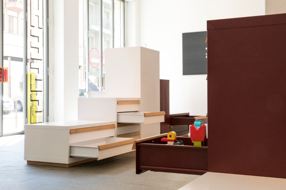
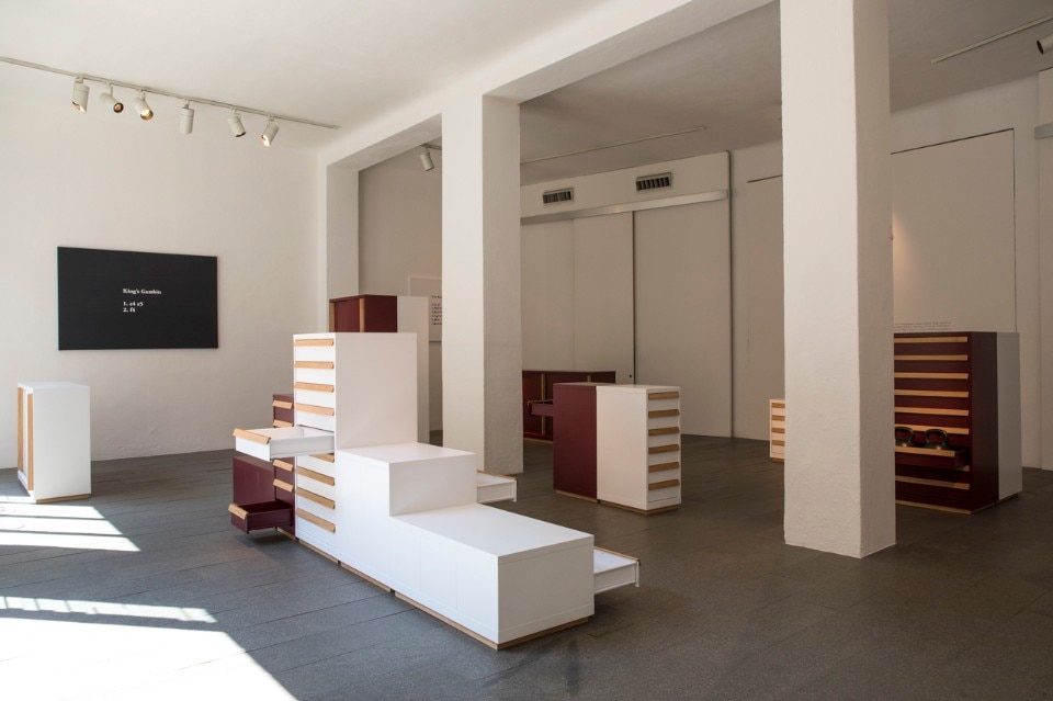
Konstantin Grcic’s severe and simple aesthetic has always been driven by a passion for technology and materials. He has been using metal, often in the form of fine sheets folded to create tables and storage, since the 1990s – see the Refolo table for Aleph Atlantide and most of all the Mono tables for SCP described by Chipperfield as “a very thoughtful design: the coincidence of idea, technology and the tectonic.” With Chess, sheet-metal cabinets and drawer units presented at Spazio Magis in Via Rosales, Grcic goes beyond merely designing an object to intervene in a company’s production process – that of Fami, specialised in metal furniture – to make a technical workshop product with a cold and industrial aesthetic more domestic. It is just one of his designs for this year’s Milan Design Week but a good starting point for a conversation on his new designs.
 View gallery
The basis for the Chess collection was a category of furnishings normally known for being robust and cold – wanting to place them in the home is a fine challenge.
We used a Fami product of the highest quality and efficiency as it was. We had to stay within their standards and conduct a work of analysis to understand where we could intervene in the production process. We adopted the weapon of simplification or clean form and determined the right size for a domestic use extending throughout the home. We then sought these qualities in the company’s production line: height, depth and type of doors. It was imperative not to alter their production process and only make minor interventions.
What was the hardest part?
Finding a solution for the handles and choosing just two colours for the entire collection – so as not to change the paint drying times. The wood applied to the doors as well as the plinth raising the piece above the ground helped with the “domestic turning point” while we found a colour balance in the white (neutral) and amaranth red (warm). Being able to conduct many tests – because the company can work on new prototypes very quickly – was a great help.
 View gallery
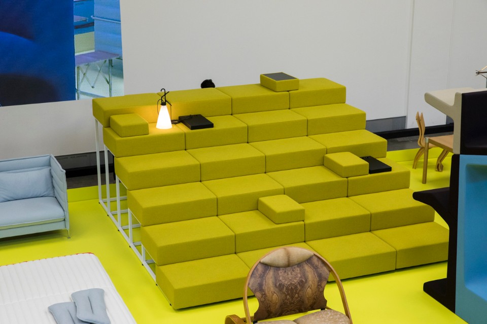
You have worked on a research project into shared spaces for Vitra called Communal that comprises six designs, including your Scala.
I worked vertically, starting from an existing Vitra for shop fittings. Scala is suited to public spaces as well as offices and there has already been a positive response from the architects. I like to rethink types or respond to a change in people’s behaviour.
You have always liked working with details...
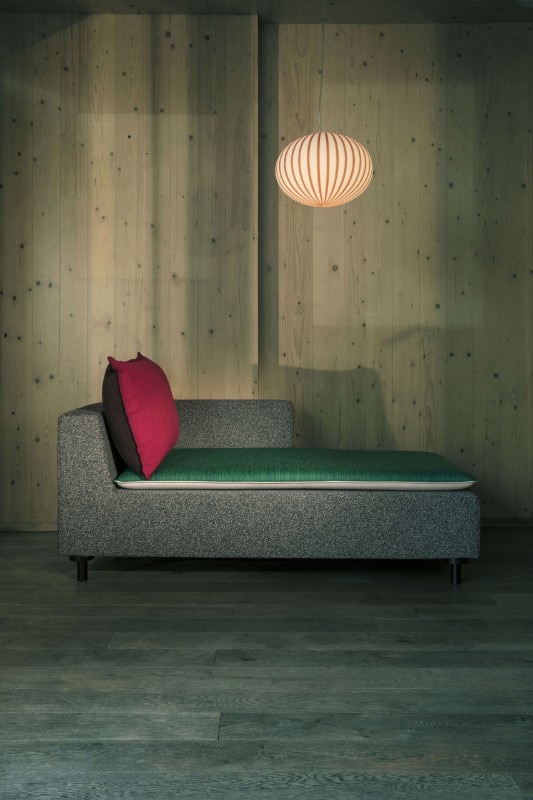
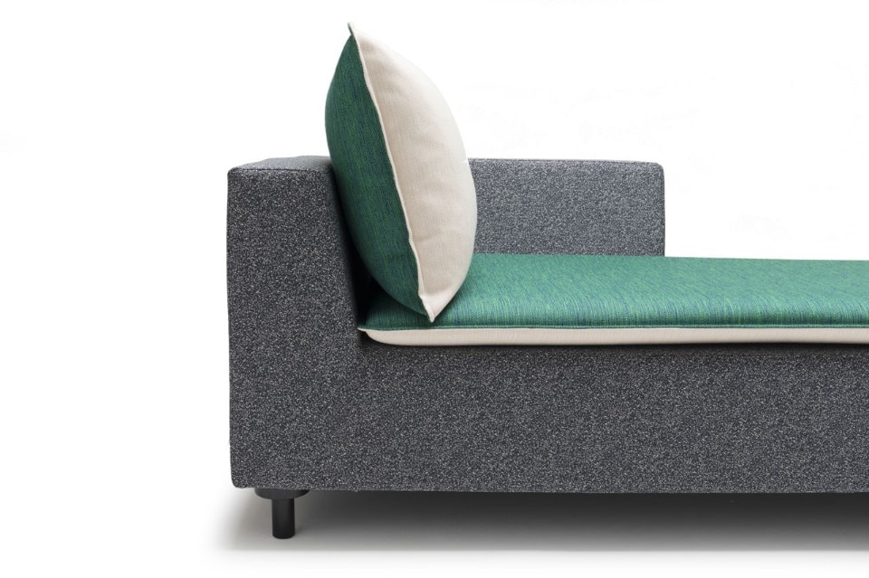
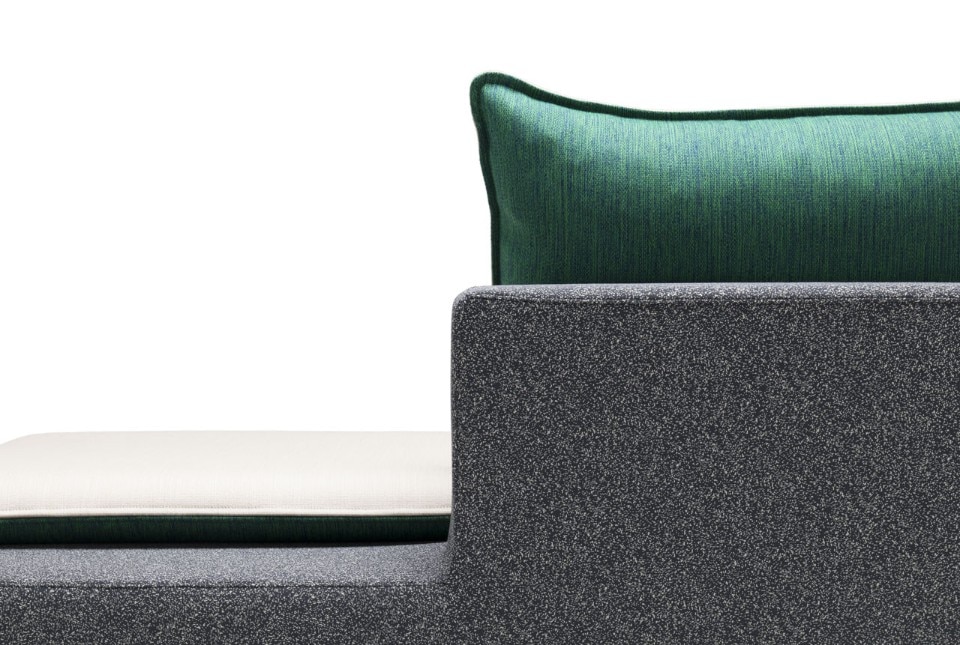
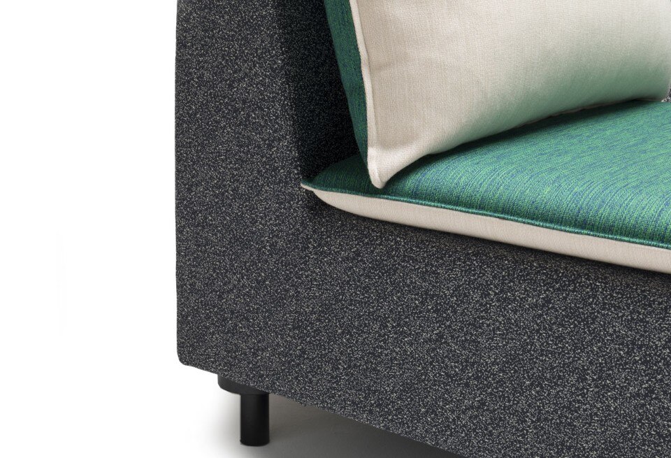
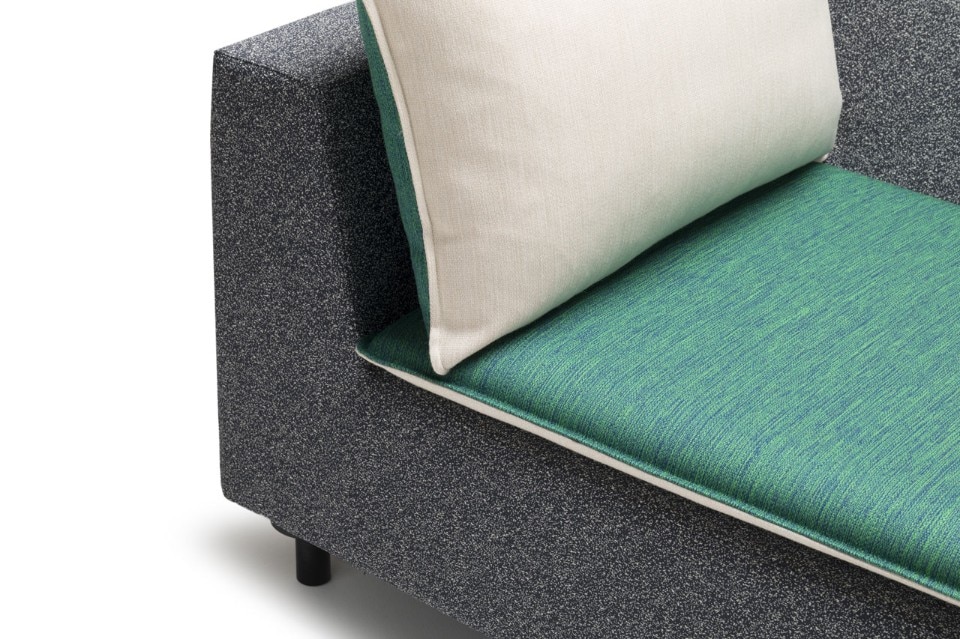
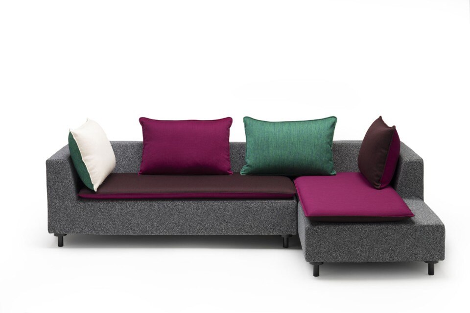
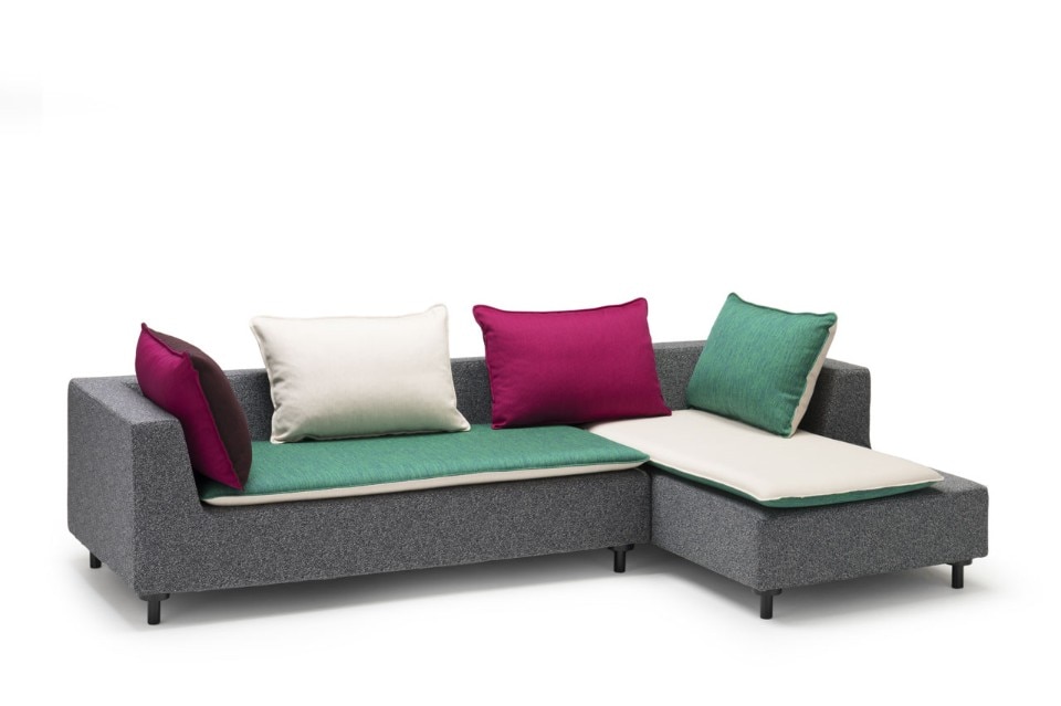
I did so with the new sofa for Established & Sons, a very standard design – I had no revolutionary ambitions – made of just a few pieces put together. We worked on its small size and a thin mattress added to the seat padding to being added comfort. I was inspired by American hotels which add these to their beds.
You have been doing this job for nearly 30 years. What has changed in the design world? What has been gained and what lost?
This could become a very long conversation… I shall simplify. There are more opportunities and the tools are better but the market has accelerated. We have to finalise new products much faster and achieve equally rapid financial returns. They think we can do this because of the quality tools we have available but it just isn’t true. Everything has become more complicated as we have to work for a global market with different cultures and backgrounds using multiple means of communication.
I always try to pursue what fascinates me, not necessarily what is innovative or radical. Something that stands out for its strong points, is well made and will stand the test of time.
Do you believe this acceleration was prompted by the economic recession?
I don’t think so. Paradoxically, we worked harder to cut production and sales costs in the 1990s than today, save for specific cases – e.g. the Bouroullec chair for Hay on sale for Euro 50. What I do know is that this change is causing a crisis of creativity and leading to standardisation. Personally, I always try to pursue what fascinates me, not necessarily what is innovative or radical. Something that stands out for its strong points, is well made and will stand the test of time.
Just as there is slow journalism born out of frustration with the poor quality of mainstream journalism that is all scoops and speed, there could be a slow design made of fewer but better-quality projects.
Some designers have started pursuing this route and I really hope companies will begin to support and follow them, working harder on distribution, for example. Of course, not everything done slowly is good quality and fast-developed designs can also be well made. What we need is greater awareness of what we do and how we do it.
Any examples in mind?
I am thinking of Plank, a small company that usually produces one design a year and is very focused. I completed my most technologically demanding and ambitious design of the year for them: the Cup chair, with a metal structure and a shell made of polystyrene. The technology draws on German suitcases made of a very thin, resistant but flexible plastic in a 3D mould. The company engineered the chair scrupulously, studied an ad hoc material and produced a light product that is flexible, robust and attractive.
 View gallery
In this case you started from the technology.
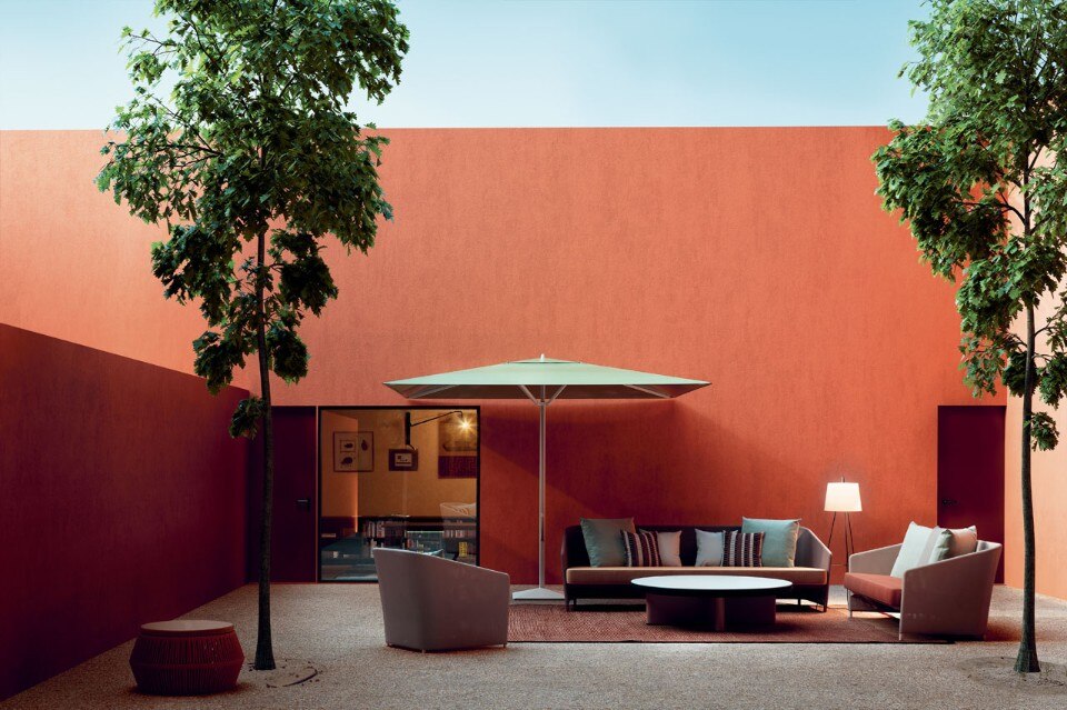
It isn’t always possible to do so and I don’t want to force this but it is certainly a help in the definition of a design. For the Kettal parasol – Meteo – for example, we made a small change to the mechanism adding a gas piston to help raise the screening part.
To end: is sustainability a component of your work?
Of course. It’s a theme that has always been very important for design and is much flaunted today, such that it often becomes a slightly throwaway slogan. To my eyes, it means seeking to economise on the production process and resources employed, being attentive to material lifecycles and their potential recycling and simply creating designs that can be repaired.


