

Besenzoni brings sea reflections to the Fuorisalone
An installation for Milano Design Week 2025 celebrates the experience of sailing between open sea and light, made unique by the innovative character of the Manta helm seat.
“A true technical marvel that propels the city into the future” – this is how Dino Buzzati praised the inauguration of the Milan Metro in the pages of Corriere della Sera on November 1, 1964. His enthusiasm was shared by many, as the entire city celebrated with proud euphoria the completion of the metro, the result of seven years of intense labor, substantial economic investment, and significant sacrifices, transforming Milan into a city capable of competing with Europe's major capitals.
The Metro represents more than just infrastructural success and managerial excellence for Milan. It reflects a clear, forward-thinking vision: to create an infrastructure that not only enhances mobility but also serves as an example of urban excellence for design and functionality.

On that historic day, twenty trains, each composed of three cars, traveled the 12.3-kilometer route between the Lotto and Marelli stations in just 27 minutes, carrying a crowd of proud and admiring visitors from one end of the city to the other. The construction required 241,000 tons of concrete and 40,535 tons of iron, 3 million cubic meters of earth were excavated, 52 kilometers of track and 85 kilometers of pipes were installed, and 67,000 square meters of rubber paving were laid. The project demanded a staggering 2,076,000 days of work and 900 workers contributing to the effort. However, tragically, five workers lost their lives in the process.
Without relying on state contributions, the project was financed entirely by local investment through a bond loan, to which the Milanese citizens enthusiastically and overwhelmingly adhered. The Milan Metro stands as a symbol of modernity and progress for the city and a tangible manifestation of a Milan in motion – moving quickly, confident in its planning and administrative capabilities. By tunneling beneath the streets, Milan reduced travel times across the urban landscape.

By simply watching the scenes set in Piazza San Babila in Ermanno Olmi's film Il posto (1961), we can see how during the construction period, which officially began on June 12, 1957, even this central square was reduced to a vast excavation site, with temporary wooden walkways allowing passage across the gaping hole. Yet, the Metro represents more than just infrastructural success and managerial excellence for Milan. It reflects a clear, forward-thinking vision: to create an infrastructure that not only enhances mobility but also serves as an example of urban excellence for design and functionality.
The overall result was outstanding, so much so that the collaborative design vision of Albini, Helg, Piva, and Noorda − using design as a tool to improve daily life − became a model for many subway systems worldwide.

The task of designing the stations for Line 1 (Red) and Line 2 (Green) was entrusted – through a bold and visionary decision − to the master architect Franco Albini, with the collaboration of Franca Helg and Antonio Piva. Their approach emphasized functionality and simplicity, utilizing innovative materials for the time, such as Silipol, a compound of cement and marble dust. The stations were conceived as welcoming and well-organized public spaces, featuring distinctive elements like curved metal handrails and vibrant colored cladding slabs.
Clean lines and functional forms reflect an architectural vision that promoted aesthetics without compromising usability. Every detail, from floors to ceilings, was meticulously designed to create a safe, inviting, and visually modern environment.

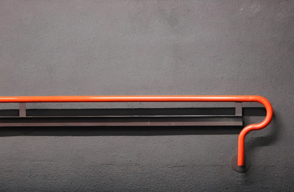
The project’s remarkable simplicity allowed a few key design elements to define the identity of all the stations. The most iconic of these − a kind of Milanese stylistic symbol − is the elegant handrail made of painted metal. Seamlessly extending from the stairs to the parapets, it forms a P-shaped curve, creating an extraordinary plastic effect.
Dutch designer and graphic artist Bob Noorda was brought in to design the signage for the Milan Metro. His approach, centered on clarity and simplicity, led to the creation of a visual system aimed at achieving maximum communicative effectiveness, intuitively guiding passengers through the metro. To this end, Noorda introduced colored bands to identify the lines − red for Line 1 and green for Line 2 (which was to be constructed at a later date) – where he embedded the station names. The colored bands were repeated every five meters, ensuring they remained visible to passengers in all cars, even while the trains were in motion.

Noorda designed the white lettering on a red background using the Helvetica font as the base and then making careful manual modifications to the letters to ensure maximum readability. This attention to detail enhanced the travel experience for all Metro passengers, both regular and occasional. The overall result was outstanding, so much so that the collaborative design vision of Albini, Helg, Piva, and Noorda − using design as a tool to improve daily life − became a model for many subway systems worldwide.
The project’s remarkable simplicity allowed a few key design elements to define the identity of all the stations. The most iconic of these is the elegant handrail made of painted metal. Seamlessly extending from the stairs to the parapets, it forms a P-shaped curve, creating an extraordinary plastic effect.

Not surprisingly, the project’s excellence was recognized with the Compasso d'Oro award in 1964, and even today, sixty years after its inauguration, it remains a landmark in architectural culture. The Milan Metro stands as an unsurpassed example of how design and communication can shape not just the appearance but the essence of a boldly innovative architectural project.

PNA International Forum
An international event exploring the potential of natural stone in modern design and architecture will be held at IUAV University of Venice.