“Quality”! This is the word Michael repeats most often. Against the consumerism and anxiety of a society that, out of fashion or boredom, constantly buys and throws out things. The remedy is to force ourselves and create new contemporary classics. Light and strong, lasting over time. And today, when his spectacular LED modular system Arrangements for Flos has finally been put into production, the lesson of poetic subtraction – by the designer who in these years has influenced the style of domestic lighting the most – displays all its potential by winning over other product categories as well. But the approach to form remains the same: a series of parameters to achieve by streamlining and refining ideas. And always with that personal touch of instilling magical properties to structures. With visual interruptions, for example; or with balances from an apparent absence of joints. The important thing is to keep the familiarity of the object, “while pushing it into the future”.

A wallsystem, taps, a table and an installation in the Flos showroom. It was a rather engaging Salone del Mobile for you. Let’s start with the wallsystem: how did you meet B&B Italia?
We met briefly at last year’s Design Week. Then, afterwards, when we explored the possibility of working together. Developing the project was a super exciting adventure.
Did you have a free hand at choosing the product?
The indications were open, but with a focus on living areas, in which the design idea was for a partition, a bookshelf.

So how did you develop the design?
It’s hard to describe as work. At times you start spontaneously, while at others according to a process that analyses the parameters of quality, which is the moment in which the product starts to emerge. Let’s say that when I’m more spontaneous, the form I obtain is decisive, like an icon. But with the Jack wallsystem the opposite was true.
At first glance, it seems like an object with a highly technical look ...
Not just technical. When I start working on a design, I was saying, I immediately establish the qualities that allow me to transform the creative process into an exercise, to be refined. In the Arrangements system for Flos, for example, I wanted to achieve a certain modularity and combinability. At the start I didn’t know what shape it would take, but those parameters allowed me to narrow the field.
Jack is impressive for the evident absence of support elements and joints, masked and enclosed, just like in the structure’s frame. How do you obtain this quality?
Yes, the magic consists in resolving all the technical problems in an invisible way. Jack appears like a series of elements that are resting on or alongside one another. In substance, Jack is like scaffolding for restoration work, only that in this case, all joints have disappeared.
If there’s a word that can describe your work, could it be effortless?
Effortless, right. Even lightness is OK. Because I seriously think that good design avoids heaviness. So you need to adopt a minimal approach, which however doesn’t mean lacking values, but using expressive capacities to the max. This is what happens with objects for outdoor survival.
Is this what you want to achieve: objects that offer a certain type of stylistic survival?
I want them to be timeless. Lasting a long time. In fact, there’s the problem that people are obsessed by change. Out of boredom, and because today everything is appearance. What you can do is point out a way, the way of quality.
A philosophical approach to classic design, the bearer of timeless and universal values, always pertinent beyond trends ...
True. When I started working with major brands I tried to avoid being crushed by their technological potential. You need to master it. With String Light by Flos, I transformed electric cables into a pencil with which the client may draw space. The same for Arrangements, even though the act is more spontaneous here: a circle joined to a drop-shaped element, and so on. Both designs allow you to change the form.

What’s the difference between the Arrangements installation at Miart and the one for Corso Monforte during Design Week?
At Miart the approach was more domestic. While in the city centre, I created “Jewels after Jewels after Jewels”, a fantastic installation with a modular screen on the ceiling that “falls” and divides the room, composed of various Arrangements elements, and two columns made with the same system.
Instead, as far as AA/27 for Boffi e Fantini is concerned, how did you face the design of your first tap?
The tap is part of the Aboutwater collection. Working with stainless steel interested me a lot on a creative level. The shape came to me through an approach, as always, of subtraction. The tap is made up of a knob and spout paired with an almost invisible joint. But the most innovative factor is the fact that the spout is suspended from the counter.
When discussing familiarity, do you also refer to images and memories from your past?
I mean a form you see everywhere and always, reproduced to infinity. I like starting from this to define my object. It’s a way of approaching a classic form and pushing it even further ahead.
So how did you modify the familiarity of the rectangular table with Ordinal for Cassina?
By exploring a new relationship between support and counter, which I altered by sloping the leg 45 degrees, starting from the table’s corners and moving towards the centre. In essence, it’s a study of the relationships which I like to call an exercise.
In summarising all these designs, in your opinion was this a great Salone?
This edition of the Salone del mobile was particularly exciting. Even if I’m still very interested in lighting. I’m still attracted to it very much.
Do you consider yourself a light designer or has the public decided to label you this way?
The people decided this, but in the end, people define you on the basis of your actions. And I have mostly designed lights, which remains my passion.
What relationship do you have with commissioned designs and the limited edition market?
I make only commissions I’m interested in. I believe design should be democratic, and affordable. The collection I made for Nilufar Gallery is special for the materials and unique style, which justifies the expensive price tag.

Are you a collector?
Let’s say I like being surrounded by beautiful objects, including art. Quite often I exchange things with artists who like design. More than an artist, I feel like I’m a creative person, a designer, and this makes me happy. What I love about artists is their freedom of expression, something I’ve always looked for.
What do you think about contemporary design?
It was exciting, but in my opinion, everything has been polluted by consumerism. There are too many brands and designers: rather than doing research, they imitate their rivals. So, in the end, there really is no independent language – not even representative of the times. It’s almost as if all ideas have dried up. In fact, people search through archives. Obviously, there are people today who are making contemporary classics: the Bouroullec brothers, Konstantin Grcic, Jasper Morrison. But as far as 2018 style is concerned, I’d say anything goes.

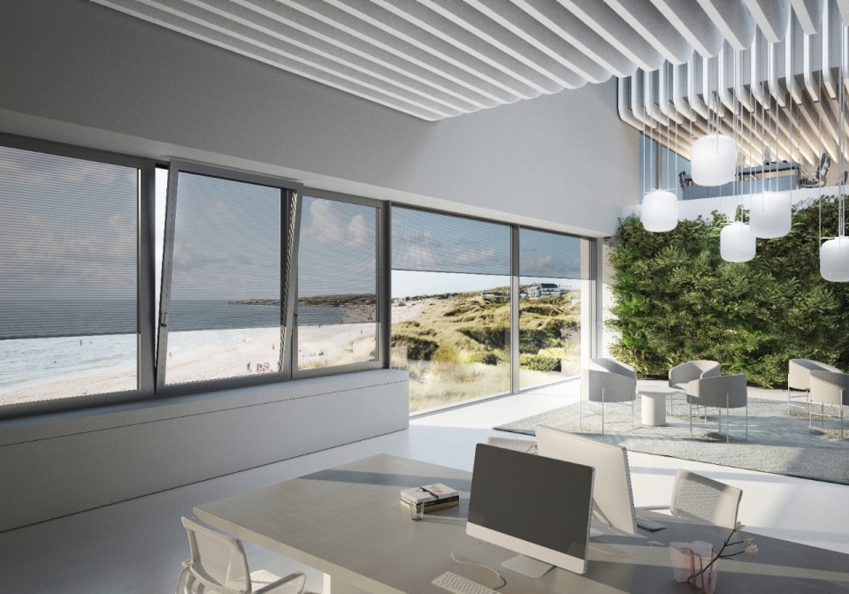
Tailored light: Schüco’s integrated shading
Schüco's Integralmaster integrates the blind into the window frame, adjusting light and privacy with a gesture and without visual clutter.


