


Innovation and sustainability in building materials
The new range of lime-based thermal plasters by Röfix is designed to provide advanced insulation solutions.
If there is one thing that unites the disparate group of young(ish) designers who are now beginning to set the pace in British graphic design, it’s an ability to deliberately foster a memorable mood or attitude through an unsettling juxtaposition or unexpected change of pace that makes the viewer sit up and think. There’s a certain knowingness, too – an awareness of the conventional rules combined with a tendency to twist them to achieve new ends. Slowly but surely, this generation is beginning to develop its own character and agenda; its nearest touchstones are high fashion and music videos, and although its work is urbane and sophisticated, it consciously avoids being slick or glossy. This is not to say that there’s a prevailing, identifiable ‘British style’.
All kinds of influences are apparent, everything from versions of cool Swiss modernism and the Dutch avant-garde to a free-form illustrative approach reminiscent of New York’s Pushpin Studios in their 1960s heyday. What they all have in common, however, is that their work is executed with passion and panache, with a real commitment to design values and a thorough understanding of audience expectations. Craft skills are once again coming to the fore. The handling of image and typography is more skilful and rigorous than it has been for some time, and materials, bindings and physical formats are selected with intelligence and imagination. Graphic ideas and wit are also more evident.
All this in uncertain economic times, with tight budgets and a tendency among many clients to play safe. This is undoubtedly why much of the more interesting work is currently being produced by smaller studios that are less constrained by corporate dictates. Many of these outfits sit on the fringes of the mainstream, working mainly for galleries, art institutions, publishers, furniture designers and the like, which give them the freedom and encouragement to express themselves. Occasionally, though, they will be lured into more corporate territory, when established companies want something to make them stand out from the crowd.
Then there are the brilliant mavericks, the uncompromising individualists who apparently refuse to kowtow to clients, whose signature design is instantly recognizable. Such designers include the innovative studio Graphic Thought Facility, the letterpress evangelist Alan Kitching, the polemical Jonathan Barnbrook and the idiosyncratic Vince Frost. Graphic design has become an increasingly universal language, with what was once seen as fashionable becoming a new mainstream, propagating every stylistic nuance and making genuine originality and surprise more difficult to find. Against this background, the work of the four very different design studios illustrated here is all the more impressive.
Made Thought
MadeThought’s partners, Ben Parker and Paul Austin, studied graphic design at Ravensbourne College before working for Sean Perkins’ design consultancy North, which made its name through its trademark use of Helvetica. ‘We’ve always naturally designed in that way’, admits Parker, ‘but part of the challenge of setting up our own company was developing our own visual language’. Within reason, of course. MadeThought’s East London offices are testament to its founders’ natural, minimalist instincts: concrete floor, white walls, shelves lined with rows of immaculately labelled, identical box files, the room divided by a single long table bearing the weight of a pair of streamlined computers. On the wall there’s one outsized framed photograph, a rather grey, desolate view of a quarry by Dan Holdsworth. MadeThought’s heritage, evident in its controlled, disciplined approach to typography and the rigour of its thinking, runs deep. Even when the duo does produce something uncharacteristically decorative, it’s usually a deliberate statement, a kick against what’s expected of them. One of their first jobs, JAM: Tokyo-London, a book featuring artists’ work from the two cities, was purposefully designed to subvert expectations. Columns of type cascaded down the pages on the diagonal; they used a succession of different paper stocks, from a high white gloss to thin Bible and brown Kraft paper; a muted brown ink was offset by punchy silvers and fluorescent pinks; and they even introduced the typeface Preset-F to prove they could live without Helvetica. There’s often a rogue element thrown into the mix to add interest: an unusual fold, a juxtaposition of scale, a slightly unexpected choice of material. Their strength, however, lies in having the confidence to question and jettison the established visual language in a particular sector. For the health drink MangaJo, for example, Parker and Austin created a bold sans-serif graphic logotype, used large enough to virtually wrap around the whole bottle – this in a market where rather effete, flower-based imagery is the norm. For an identity project commissioned by the MTV Base cable channel, they eschewed predictable gritty urban imagery, instead opting for a neutral typographic solution, which cleverly didn’t compete with the higher-budget content. MadeThought’s mix of clients is also a sign of its versatility. The team is just as comfortable creating animated on-screen identities for MTV as fabrics for fashion designer Stella McCartney. It would be too easy to pigeonhole MadeThought as the latest in a long line of British design groups – including Cartlidge Levine, Sea, North and Struktur – that have explored and exploited modernist theory. As Parker and Austin have honed their approach, their aesthetic has opened up enough to embrace a certain level of self-expression.
Tom Hingston Studio
Tom Hingston first got noticed for his work for the trip-hop band Massive Attack’s third album, Mezzanine. The cover he designed featured an arresting black-and-white image of a beetle by the fashion photographer Nick Knight. It is difficult to make out the exact nature of the tightly cropped image. You can discern the odd pincer or fragment of shell, and there is a powerful impression of shine and texture, but the overall effect is one of sinister abstraction – of fascination and repulsion in equal measure. Closer examination of the photograph reveals it to be made of tiny cut-up fragments, a collage of carapace, echoing Massive Attack’s eclectic use of sampling, its densely layered patchwork of musical influences. Hingston works almost exclusively for music and fashion clients: Dior and Levi’s, the giant EMI and the tiny dance label Nuphonic. After graduating from Central St Martins School of Art and Design, Hingston had a three-year spell at Neville Brody’s studio, which proved a far more illuminating experience. ‘I learned a lot from the way Neville did things, but also a lot from the way he didn’t’, says Hingston. There are also strong comparisons to be drawn with Mark Farrow, who emerged from the Factory Records stable in Manchester a few years later. What these designers have in common is an almost obsessive attention to detail, an immaculate eye for art direction and an uncompromising clarity of purpose. It’s futile to compare a massive commercial production like Robbie Williams’ Sing When You’re Winning album, which used witty photographic montages by the artist Paul M. Smith, to the purely typographic treatment afforded the cult house artist Justin Robertson – each is successful on its own terms. However, if you look closely, there are certain running themes evident in Tom Hingston Studio’s portfolio. Mysterious, empty landscapes are often overlaid with bold type, spelling out a title or band name that may complement, counterpoint or raise questions about the main image. The cover for the Norwegian duo Röyksopp’s debut album Melody AM, for example, shows a vivid orange cloudscape with just a few treetops visible in the bottom right-hand corner. Dawn breaking, perhaps, or an allusion to the fact that Röyksopp hails from Tromsø, a small city just a few kilometres from the Arctic Circle, where the spectacular northern lights are visible during the winter months. It’s a wonderfully evocative image that perfectly captures the band’s ethereal sound. Intense and soft-spoken, Hingston insists that the arresting images often featured in his work are the loving result of a ‘dialogue’ with a hand-picked photographer, and that this is what gives them their essential edge and originality. It’s this kind of understanding that underpins the colourful Dior womenswear campaign Hingston art-directed for Nick Knight. ‘Working together, we were able to achieve a mood, a certain irreverence and energy’, he says. The book Porn?, published by Vision On, takes the notion of collaboration and artistic trust to extremes. Edited and designed by Hingston, this was a three-year project that involved briefing 56 photographers, illustrators and image-makers to react to the title and its significant punctuation. The results are eclectic and lateral, far more intellectual than erotic. Hingston, as usual, has discreetly let the images do the talking. The book’s title, set in one of Louis John Pouchée’s decorative alphabets, is embossed into a pink leather cover, quietly suggesting that Hingston has masterminded the whole circus.
NB: Studio
NB: Studio is one of the many younger companies to have successfully peeled away from Pentagram, still one of the world’s most respected and influential design studios. Its principals are appreciative and humble enough to say they ‘served their design apprenticeship there’, but they also feel they’ve done enough in five years to set them apart from their extended family. ‘We like to try and stay young’, says Nick Finney, the ‘N’ of NB. ‘We’re quite individual’, says Ben Stott, the ‘B’. ‘Quirky’, adds Alan Dye, who by dint of having been doing some freelance work at the time of the studio’s founding missed out on an initial. It’s true, there is a certain irreverence that informs their work, but they are pragmatic enough to know when to play it straight. ‘We feel we can be up there with Pentagram’, says Stott, ‘but we can also compete with the two guys working in their bedroom for the Crafts Council’. If there’s one thing that characterizes NB’s design – which ranges from posters, books and catalogues to exhibition design, interiors and Web sites – it’s that there’s usually a strong underlying idea driving it. And there’s no intended criticism or suggestion of mimicry in this observation; after all, there are no end of ideas out there. You just have to look at the format of the studio’s ‘portfolio’, a deck of cards featuring handy examples of its work, to see how the designers’ minds operate. It’s memorable, practical and witty, and it gives an instant indication of NB’s design and production values. One of NB’s early jobs for their first major client, the furniture maker Knoll, was a series of posters celebrating the company’s 60th anniversary. The pieces combined self-executed line drawings with quotes from famous chair designers using punchy, vibrant colours and deft typography. Arguably the firm’s most striking work to date has been posters. Examples include one for Tate Modern’s massive Andy Warhol exhibition, for which NB played with the notion of graphic repetition, and others for PolyGram Films, which demonstrate an intuitive understanding of the relationship between type and image and the particular need, in this context, to be sharp and concise. Reluctant to overanalyze their work or business model, Dye, Stott, Finney and the other four members of the studio present an almost happy-go-lucky front: ‘We just do the best work we can and hopefully everything else will fall into place’, says Finney. Certainly, projects like the promotion of the Crafts Council’s Jerwood Prize, which required the full gamut of marketing literature, show that NB is thorough and can create a coherent, attractive system that works effectively across the board. The firm’s book projects, for Phaidon, Penguin and Lawrence King Publishing, also demonstrate a quieter, more cerebral side.
Graphic Thought Facility
Making your way down the corridor to Graphic Thought Facility’s studio, the main thing that strikes you is the smell: sawdust, ammonia, printer’s ink, molten metal. The warren-like Clerkenwell Works, home to an unlikely assortment of jewellers, photographers, printmakers, furniture restorers, animators, textile and even rubberwear designers, is literally humming. GTF’s appealingly scruffy premises may be odour-free, but there’s something fitting about its location. The studio’s work – apart from being some of the most startlingly original coming out of London – has an almost handmade, crafts-based feel to it, its central graphic ideas left brazenly bare and its edges defiantly raw. It also features a rare level of tactility, incorporating a range of strange but wonderful materials – everything from scored metal and neon lighting to electrical wire and moulded plastic – that less intrepid designers would shy away from. Indeed, many of the firm’s projects are the result of collaborations with the various craftspeople (bookbinders and engravers, for example) who share the same building. GTF was founded in 1990 by three graduates of London’s Royal College of Art, Paul Neale, Andrew Stevens and Nigel Robinson (Robinson has since left). Although Gert Dunbar, the influential Dutch graphics icon, resigned as the RCA’s head of graphics the year before they arrived, his legacy lived on, both in a spirit of playful inventiveness and, stylistically, in the application of three-dimensional imagery to two-dimensional graphics. ‘We do need a particular kind of client’, admits Stevens. ‘They need to be interesting to us, but they also need to be able to pay’. Domestic furniture retailer Habitat has been a regular client, resulting in a striking range of posters and printed promotional materials. Habitat’s more adventurous publications, released three times a year to support press launches, tend to feature an engaging juxtaposition of paper stocks and printing techniques together with photography or illustration. ‘The format is as important as the type or photography’, explains Stevens. ‘It can be a good way of changing the pace’ of a piece of design. More surprisingly, perhaps, GTF has also delivered a crisp, economic logotype and rigorous templates for internal communication and press releases. The discipline the designers are capable of is demonstrated in their carefully restrained handling of body copy, a marked contrast to the extreme liberties they take with display typography. Other clients, like the Institute of Contemporary Arts, the Saatchi Gallery and the Design Museum, are perhaps more predictable. In its time, the seven-strong GTF has tackled everything from exhibition design to corporate identity and paper tableware, but despite this breadth of output, its approach remains ingenuous and consistent. ‘We don’t like the idea of each page being a formal graphic problem’, explains Stevens. ‘Instead we tend to develop a concept, whether it’s for an exhibition or a book or a package. Once we solve a problem in our heads, it establishes its own set of rules. That dictates the various component parts. Making an environment might be a way of doing that. You build an environment and then look at it from different viewpoints, literally or otherwise. So yes, we’ve physically built environments, but we’ve also built a kind of context of limitations and operate within it’.

. On closer examination, the beetle is revealed as a collage, not a single image")
")


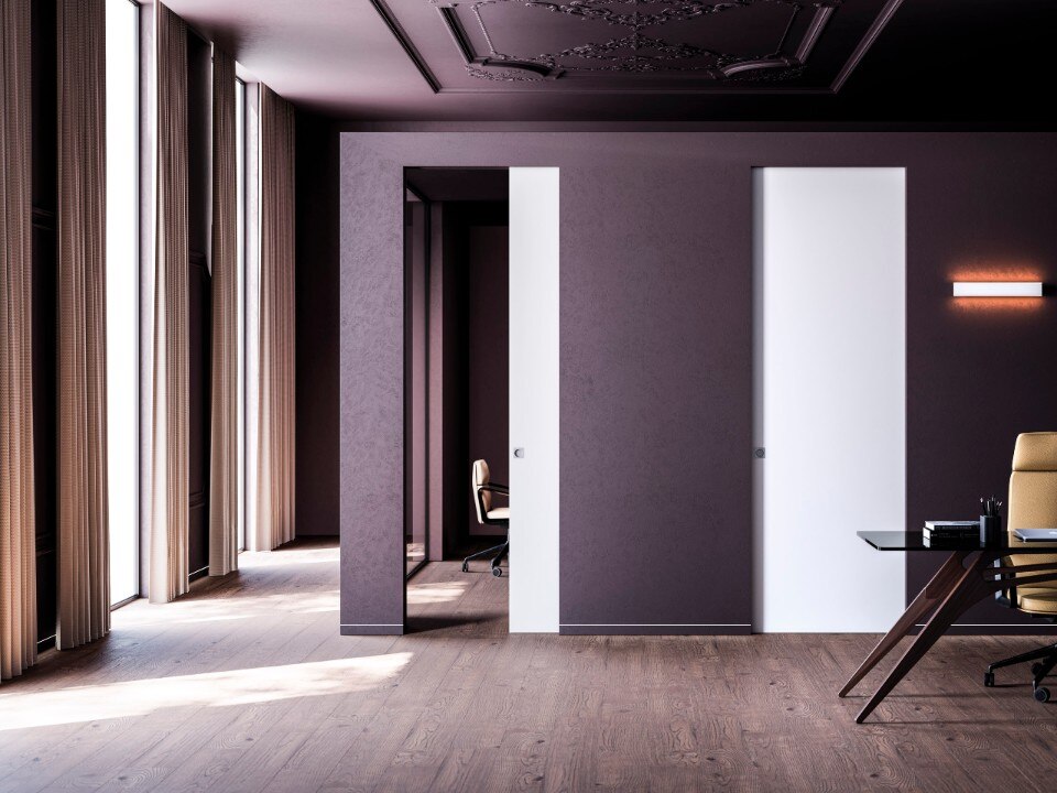
Eclisse: when invisibility art shakes up interior design
A leader in manufacturing pocket door frame systems, Eclisse redefines the concept of living space. Through solutions like Syntesis Line, the company transforms doors into continuous design elements.