This article was originally published on Domus 1083, October 2023.
“If the city is like some large house, and the house in turn like some small city, cannot the various parts of the house – atria, xsti, dining rooms, entrances, and so on – be considered miniature buildings?”
Leon Battista Alberti, On the Art of Building1
Centuries after Leon Battista Alberti published On the Art of Building, his inquiry around the relationship between domestic and urban form still rings true. The work that my practice takes on – through Studio Sean Canty – stems from an interest in developing spatial investigations that reshape domestic spaces and their attendant rituals by working within the typological gaps in the American housing stock. These investigations explore how integrating curvature into multigenerational houses and urban infills allows light to become an active component in shaping the way we live together.
In the United States, there is a growing gap in the housing stock that has been described as the “missing middle”. This refers to a range of multifamily and multigenerational housing typologies that fell out of fashion after World War II with the predominance of single-family houses. We might also look to ways in which the ideology of the heteronormative family (and its associated “family values”) has been leveraged by political parties to gain political power while also exacerbating the pressure to build single-family homes.2

This absent middle in housing reveals a growing demand for walkable urban (or suburban) living, an increasing (and often urgent) need for houses at different price points, and the lack of housing options for the country’s ageing population. The pandemic also brought a new dimension to the demands that we place on housing by creating a need for typologies that can comfortably accommodate spaces for work. Housing typologies such as the duplex or courtyard apartments are rarely constructed in the United States, but are well suited to address the needs of multigenerational households.
Our approach to developing housing typologies that address these questions is a lot like linguistic conjunctions: adding ambiguity to the relationship between two parts and their constructed whole. Working with curvature invites a certain kind of inscrutability, in which formal continuity and its resistance to edges invite all sorts of perceptual slippages within a space. As a result, the limits of form (or where one geometry begins and ends) are called into question. This often results in a gradient of spatial conditions that are animated by light: dynamic common spaces that stand in contrast with carefully delineated private rooms.
Our preoccupation with the intractable relationship of flatness and curvature within the architectural canon has shaped these strategies of formal conjointment. Complicating the stable readings of a building’s enclosure or interior, we look for opportunities to create ambiguity between interior and exterior, old and new, fenestration and aperture, light and shadow. The projects shown here consider distinct ways that curvature, and its dynamic choreographing of light, can lend both specificity and ambiguity to the connections across generations or between programmatic uses.
Three houses
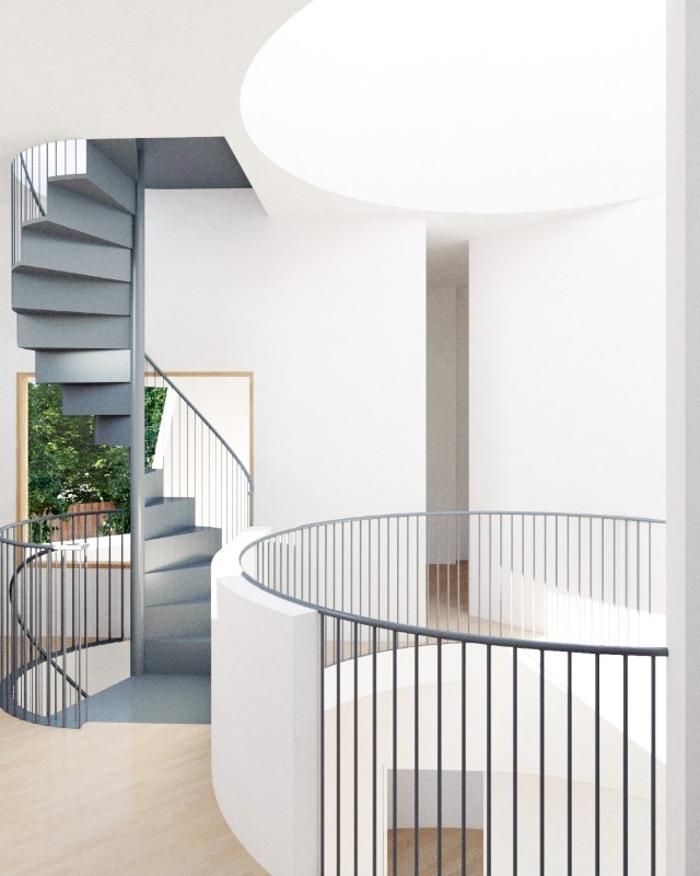
The Tall House, located in Oakland, California, flickers between a square and a circle as we move around it. Inside, illuminated by a circular skylight, a central void organises rooms within a three-storey home. The spaces on the ground floor – an en suite guest room, kitchen and open living-dining area – all face inwards to provide privacy. On the second floor, this relationship inverts. Primary suites and workspaces look outwards to capture views and daylight. The third floor offers a surprise: a spacious living room capped by a large square skylight. The incorporation of this space is an unexpected feature that simultaneously funnels light into darker interior spaces and contrasts the activity of the bustling city streets outside.
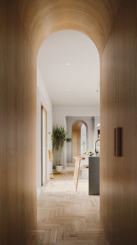
In the Raynor Residence, a historic, colonial-style home, thresholds are inserted between areas for living, dining and cooking. Walls that previously delineated these social spaces were removed to allow more light to move laterally through the first level of the home. Each transition between these spaces is articulated by an arched geometry whose sculptural form compliments the home’s classical elements. This approach was taken as a way of recrafting the ground level of this existing home for a multigenerational family to comfortably age in place.
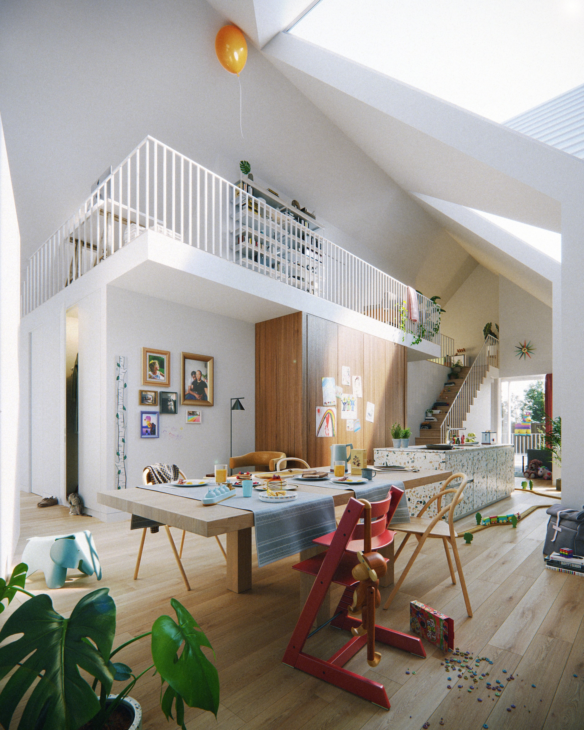
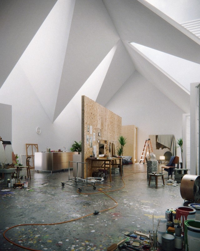
Crown House is a home designed to accommodate non-traditional social structures and multiple uses. Roof peak arrangements oscillate between symmetrical (gable) and serial (sawtooth) to choreograph light into spaces suited for domestic or work routines. While typical American domestic homes – the triple-decker and the shotgun house – create space by increasing density, little attention has been paid to engaging the live-work needs in our absent middle. In response, the Crown House offers a reconfigurable cellar plan with individual access to surrounding bedrooms. The house’s plan allows for easy shifts from a single-family space to three live-work units with a shared communal space.
One exhibition: “Edgar’s Sheds”
“Edgar’s Sheds” is an installation for the 18th International Architecture Exhibition at the Venice Biennale, loosely based on two sheds constructed by my great-grandfather Edgar in Eliot, South Carolina. I called him Bubba. This installation is a retroactive reprojection. It filters fragments of my own knowledge and history through various media in order to present a close reading of my aesthetic inheritance. One shed is a home. It is a space of joy, belonging and struggle. The other is a juke joint. It is a space filled with smoke, rhythm and blues. The beauty laid bare here in Bubba’s sheds is a set of practices steeped in the aesthetics of the black vernacular. In these simple forms, the values of reuse and care are intertwined. There is a sense that these spaces demonstrate how aspiration towards beauty and betterment in the black tradition is entangled with struggle and self-determination.
For me, each space epitomises the thoughtful pursuit of architecture. In the context of this exhibition space, the function of the shed is simple: it offers a series of rooms for display and events. The roof is symbolically overscaled featuring a central oculus to filter light into the interior. The lighting design in the “Edgar’s Sheds” installation plays a significant role in reflecting the contrasting vibes and atmospheres between the house and the juke joint.
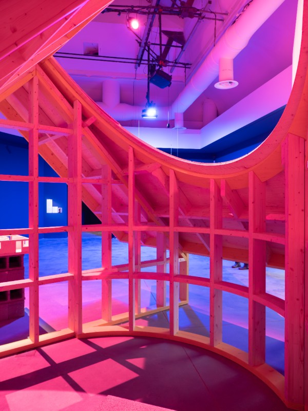
The roof is asymmetrical to provide a backdrop for performances on one side and an entrance on the other. Its interior can be filled with sound or with the quietness of its surroundings. Our explorations in three houses and one exhibition reimagine the connections between urban and domestic forms, echoing the timeless inquiry posed by Leon Battista Alberti. Through our studio’s work, the relationship between light and curvature becomes a central theme, transforming living spaces and reshaping our understanding of architecture. These examples illustrate how design can fluidly shape our surroundings, blurring the boundaries between spatial and programmatic contingencies, and examine how architectural pursuits can be both functional and emotionally resonant through the choreography of light and form.
1 Leon Battista Alberti, On the Art of Building (original title De re aedificatoria), 1452, Book 1, chapter IX.
2 See, for example, Melissa Cooper’s Family Values: Between Neoliberalism and the New Social Conservatism, Zone Books, Princeton 2017.
3 See, for example, Daniel G. Parolek, Missing Middle Housing: Thinking Big and Building Small to Respond to Today’s Housing Crisis, Island Press, Washington, DC 2020.
Opening image: Studio Sean Canty, Crown House. Photo Okdraw


