

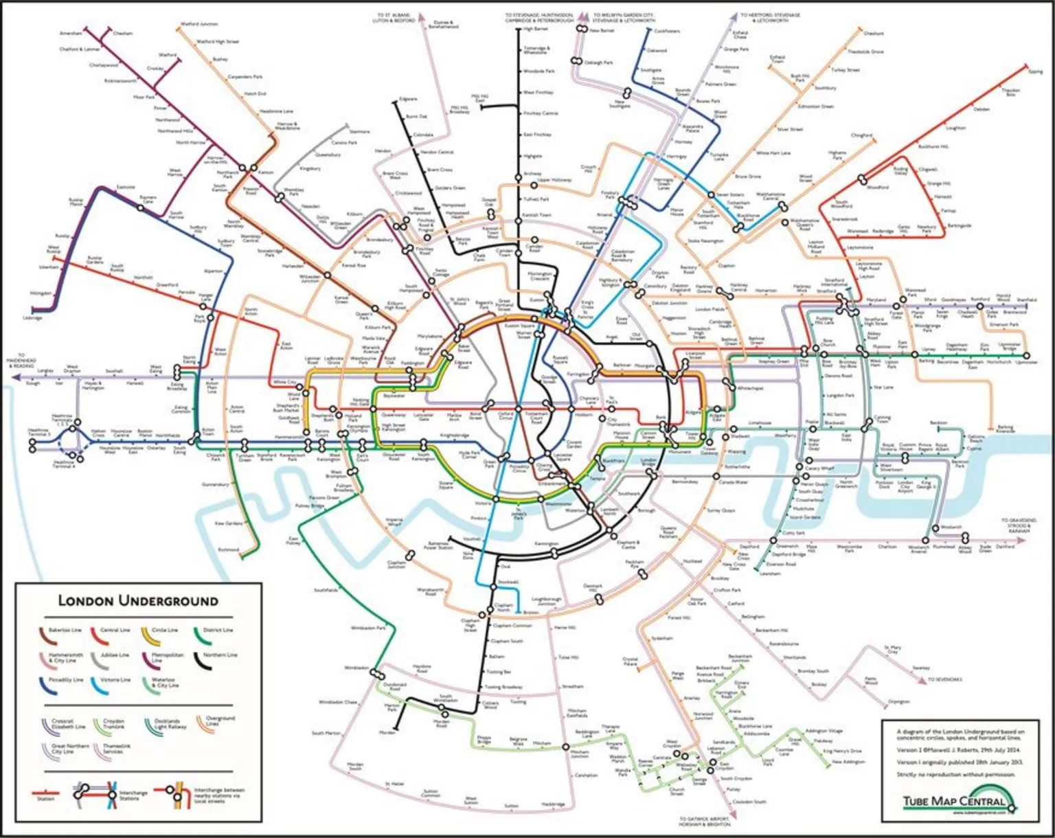
The version of the London Underground map redesigned by Professor Maxwell Roberts of the University of Essex has gone viral, receiving a million engagements on social media in just 24 hours. Roberts originally created his reinterpretation in 2013, and he updated it after seeing the advertising map for smartphones released by Transport for London (TfL), the local authority that manages public transport in London.
Roberts’s map uses circles to show color-coded routes for each of the 11 different Tube lines, and TfL’s map also adopts a circular motif. “Lots of people said to me, ‘TfL have borrowed your circles idea’. And I thought, ‘Let’s not complain, let’s go back to my original circles map and let’s make it better this time’,” said Professor Roberts, who, judging by the number of interactions, has won the challenge against TfL—though they currently have no plans to change the iconic map created in 1933 by Harry Beck.
Opening image: Courtesy Maxwell Roberts.