Timeless icons: the Marenco sofa by arflex
Designed by Mario Marenco, this masterpiece of Italian design has set the standard for over fifty years.
- Sponsored content
This article was originally published on Domus 1090.
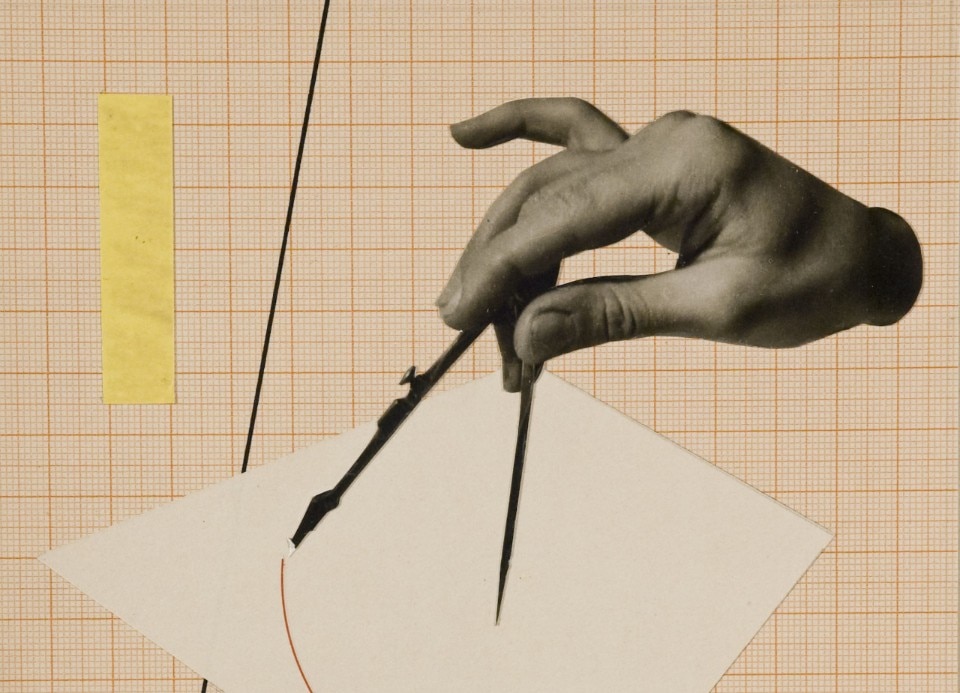
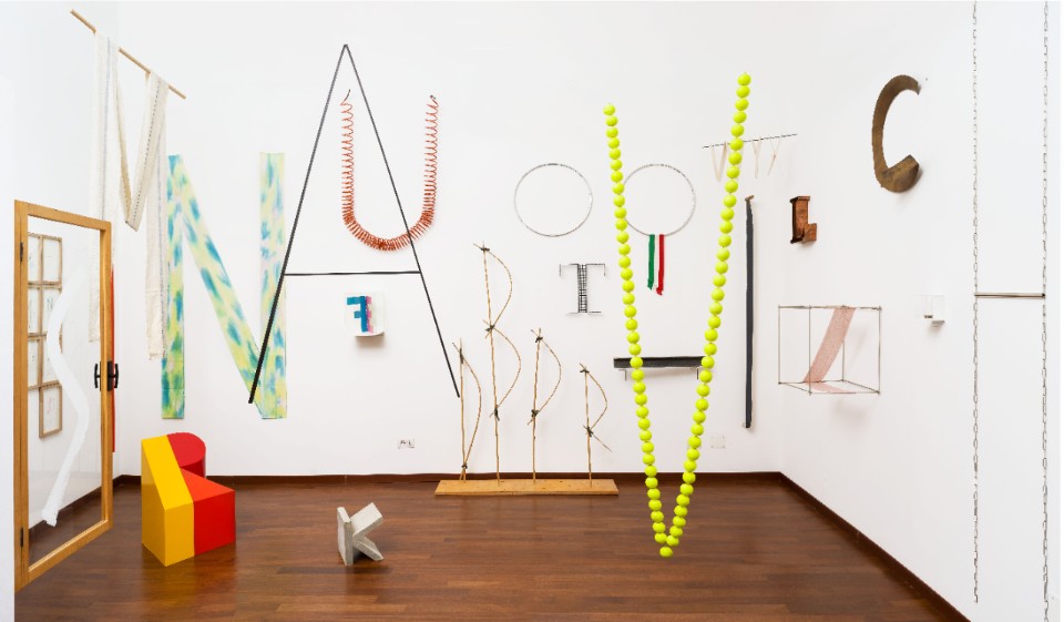
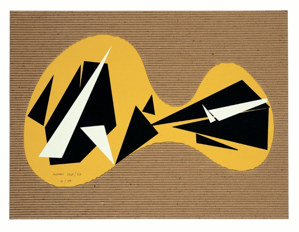
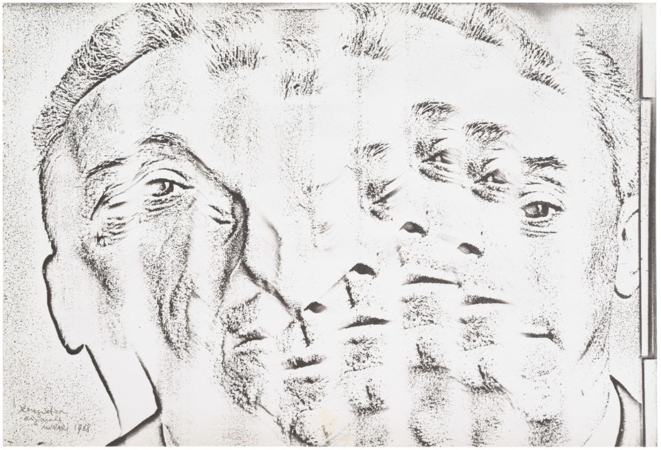
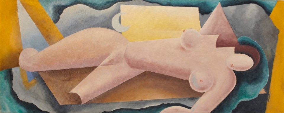
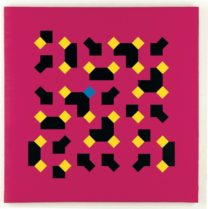
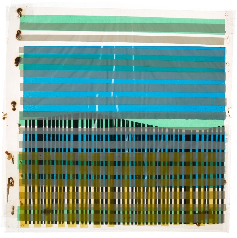
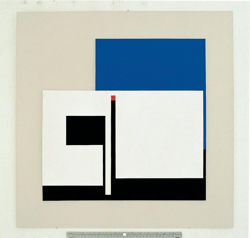
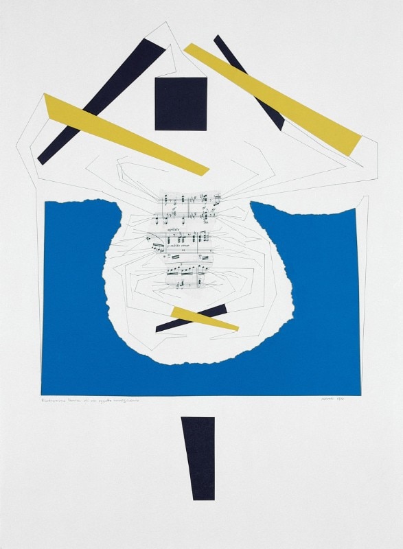
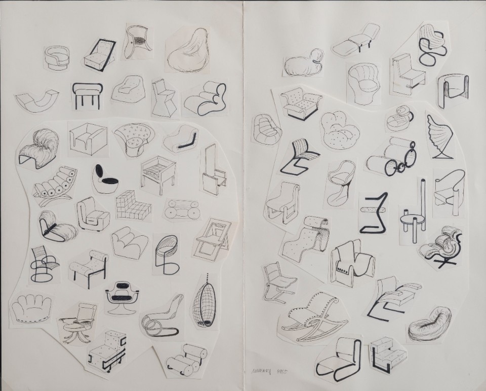
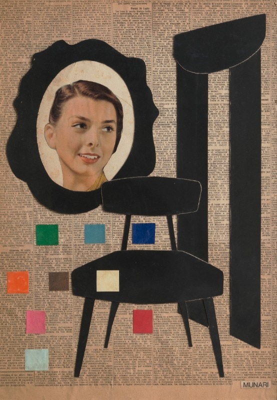
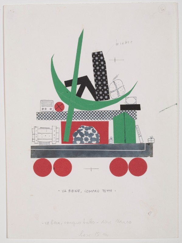
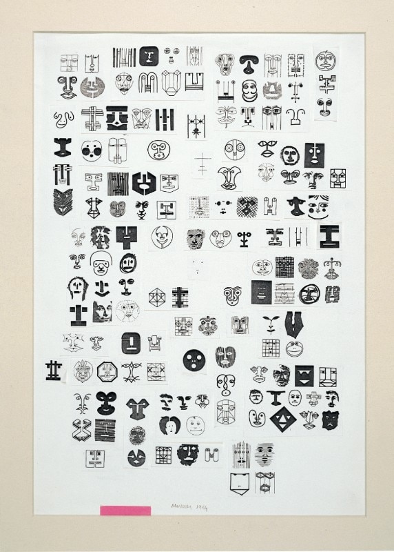
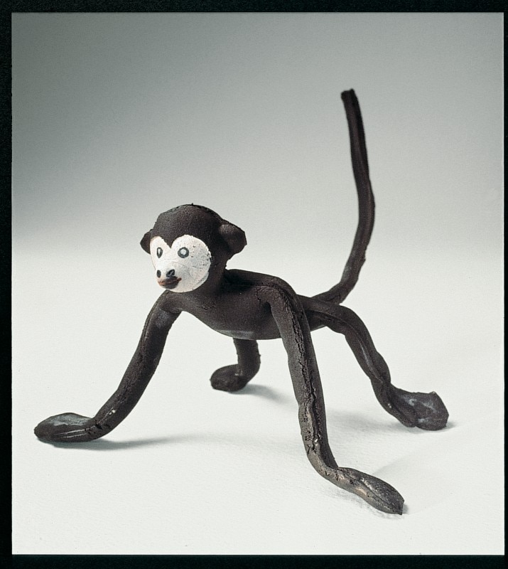
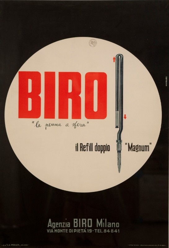
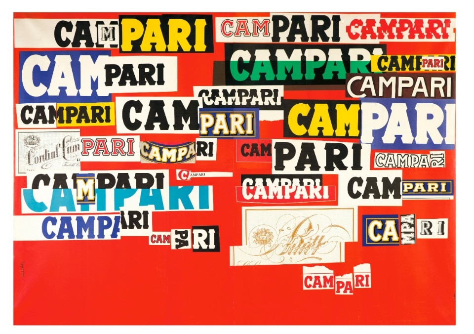
“Bruno Munari. Tutto”, until 30 June at the Fondazione Magnani Rocca, near Parma, is an exhibition portraying this multifaceted figure who translated his imagination into creativity, organising and transforming it into a method that he applied in many fields: design, art, cinema, photography and graphic design. Of his diverse aspects, perhaps Munari’s graphic and publishing work is the most recognisable. Editorial graphics, his true passion, was also a field of continuous self-learning. From the 1920s, his work focused on books and their covers.
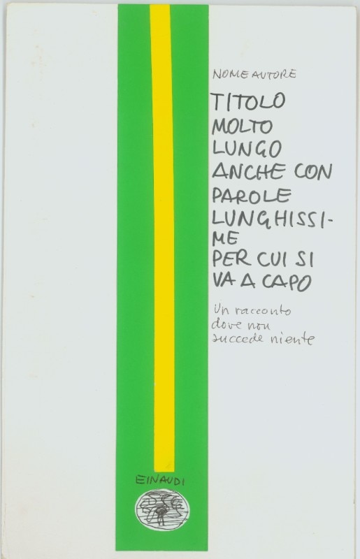
We can therefore get to know this artist from his graphics and various proposals for Bompiani, Einaudi and Rizzoli: different approaches that always combined formal rigour, research, abstraction, illustration, modularity and invention. “It wasn’t that Munari made the covers,” said Giulio Einaudi, “he would come and have a discussion. He’d discuss with the editorial director, the technical director Oreste Molina and with me.”
This intelligence allowed Munari’s graphic designs to become embedded in the style and image of his clients, but also to dialogue on other fronts. Indeed, in his work, one can always identify two levels: Munari the graphic designer and an all-round Munari, whose commitment embraced the whole editorial product.

 View gallery
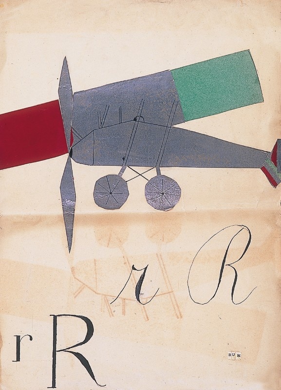
The first was an illustrator, and illustration was his chosen method of representation to tell stories. We find it in Fotocronache, where the story is predominant and there is a single photo to explore, but also in all his fairy-tale books for children. It is noticeable in his cover illustrations, too, such as those for Bompiani in the 1950s, with splendid examples of visual synthesis, abstract games, manipulations and montages of photos, and imaginative and free drawings.

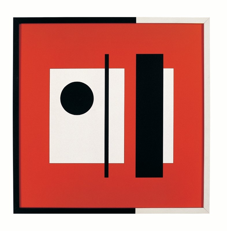
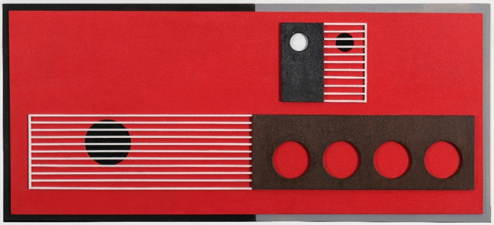
Secondly, we have the kinetic and programmatic Munari, who defined the conditions of a project while leaving the outcome open. He worked in a conceptual dimension, examining the book as a mass-produced object, a series as the syntactic elements of an editorial identity, and the graphics as the text for a design trajectory. So all you need is a red square, five parallel red lines and six squares (to be filled with text or images, but also to modulate down to two). A few thin lines on a white background were sufficient. Munari’s was an open method.
In his work, one can always identify two levels: Munari the graphic designer and an all-round Munari, whose commitment embraced the whole editorial product.
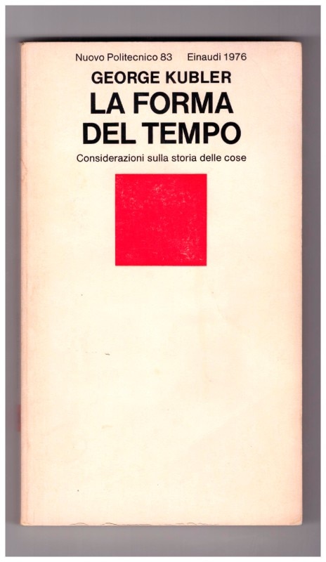
An example is the series for the magazine Menabò by Vittorini and Calvino, where we find horizontal lines within which the titles are written. Another is Bompiani’s I Satelliti series: a large black circle on a white background represented a planet, to accommodate the title, and another smaller circle was added like a satellite for each issue. The covers were composed with the layering of the satellites and, in sequence, they almost became an animated film. This is the all-round Bruno Munari on display in the “Tutto” show.
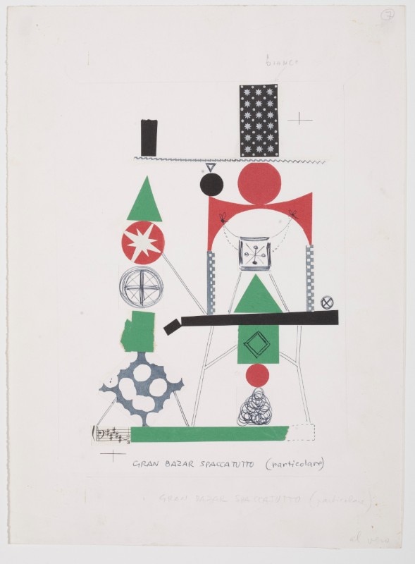
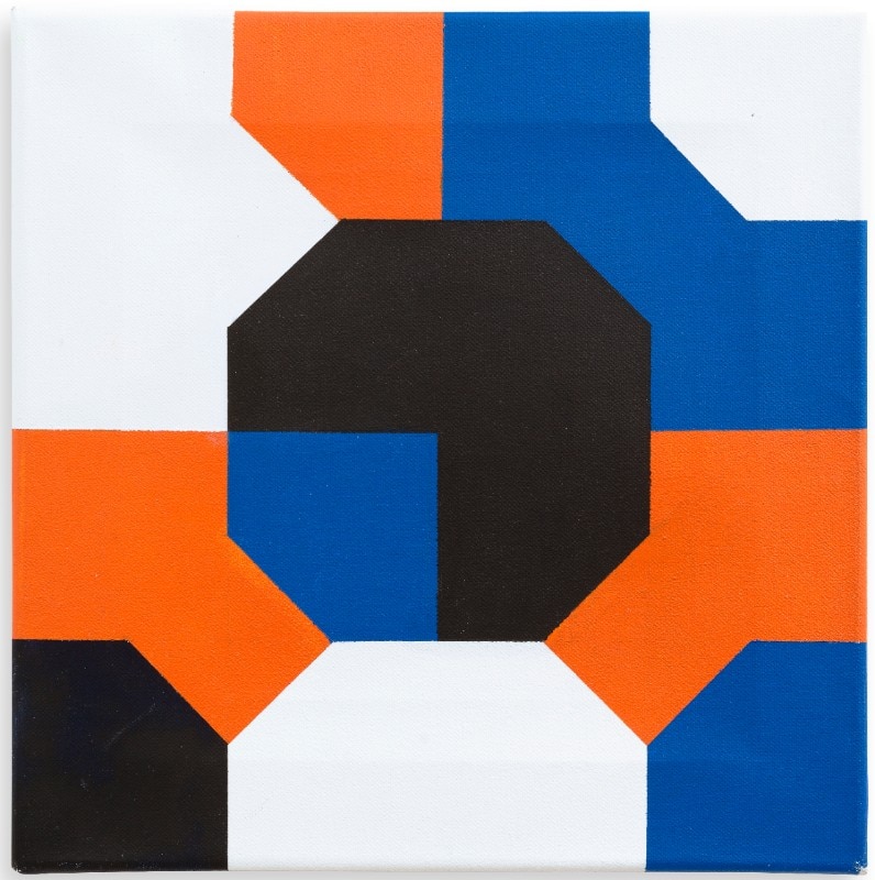
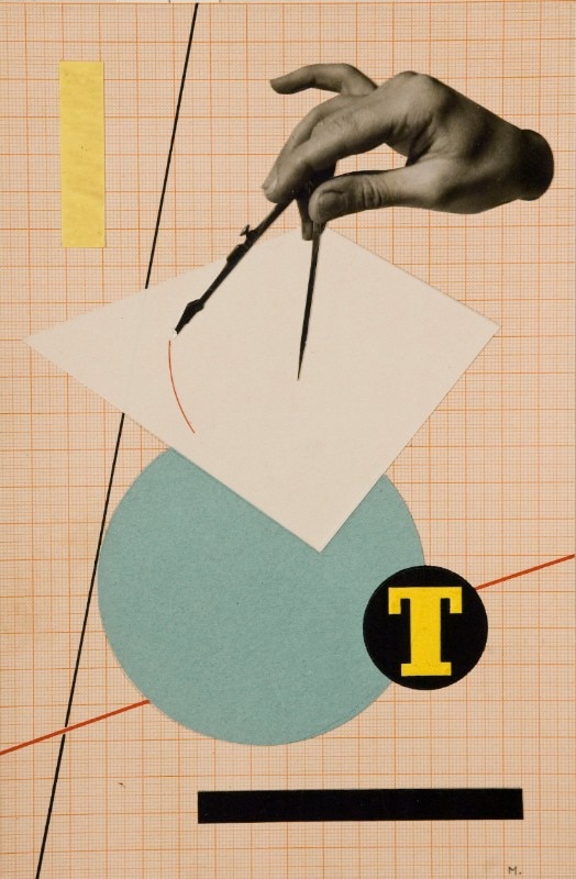
Opening image 3 Bruno Munari, T, preliminary study for an advertisement in Campo grafico magazine, circa 1934. © Bruno Munari. Tutti i diritti riservati alla Maurizio Corraini s.r.l.
- Exhibition:
- Bruno Munari tutto
- Location:
- Fondazione Magnani-Rocca, Parma, Italy
- Dates:
- From 16th March to 30th June 2024

Outdoors: at the Milano Design Week, a new product by Nardi
With a patented system and durable, sustainable materials, Plano is Nardi's signature lounger designed by Raffaello Galiotto.
- Sponsored content

