Enveloped by nature
Conca, by Vaselli, is more than just a hydro-massage mini pool; it is an expression of local history and culture.
- Sponsored content
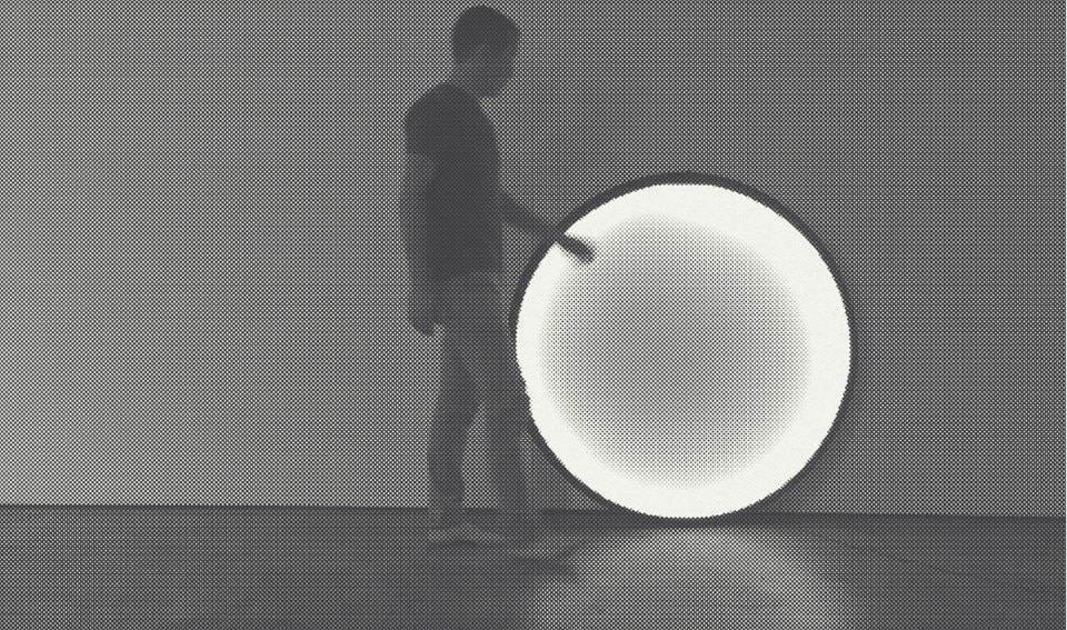
At the beginning of Sleeping Beauties, the book by Stephen King and his son Owen, a female prisoner asks her cellmate if she ever noticed the rectangle of light that appears on the wall in front of the window, glides slowly onto the desktop and finally reaches the floor. I’m not sure if King is a design expert, but the ordinary scene he describes represents one of the most imitated topics of investigation in the past years: the study of objects that can withhold the transience of an atmospheric phenomenon. And the divine grace it oftentimes unleashes. An investigation that from a mere triangle of light recently became the Komorebi table lamp by Leslie Noteboom, a system that can project the light silhouettes of a window interspersed with the shadow of the fixtures and leaves. Komorebi is obviously ideal to initiating an inner monologue. But why a fake window and not a real one? Due to poor exposure and because society itself uses filters to incentivise the seduction of photos, behind closed doors it’s more shy than an adolescent. Distracted as we are by anxieties, data and information – and gone is any sign of epiphany – we search for miraculous calm on command. In short, since the video that in American Beauty showed the dancing of a plastic bag caught in a swirl of wind, nothing has really changed.

 View gallery
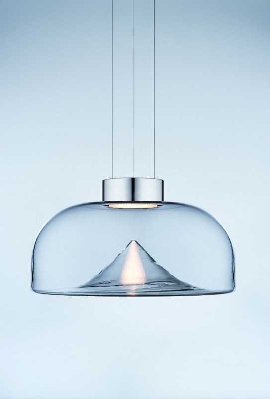
In this sense, the success over the past years of the Aella lamp by Leucos is a resounding example. The vortex that has distinguished it since 1968 has the same hypnotic effect of the one in the Oscar-winning film. Along with the boom of frosted and ribbed glass, to which Glas Italia recently added the screens Rayures by Ronan and Erwan Bouroullec, Aella and the partitions that divide the space into pixels represent the magical acts with which design puts into practice the teachings of Marcel Mauss, author of A General Theory of Magic: to create “something different from convention”. Far from merely utilitarian reasons, of course, and corresponding more with inwardness, of which it aims to be a reflection and, at the same time, the mechanism that leads us to explore, just as if we were holed up for a week on a spiritual retreat. An intentional comparison. Because almost as if homes were Stephen King’s cells, the sentimental ploy proposed by the Japanese design studio Yoy consists, like Komorebi, in a window, but this time as the centre of the room: Wind. A frame with curtain fluttering rhythmically thanks to micro-ventilators hidden inside the structure, to be activated any time you want the pleasure of feeling a breeze. The popularity of this is everywhere: from Bad Land by Alex da Corte, a window with a neon curtain, to the Ombre rug by Mogg where we see one in perspective. And in architecture with Liquidkristal by Ross Lovegrove for Lasvit, glass with texture as if “ruffled by the wind”.

 View gallery
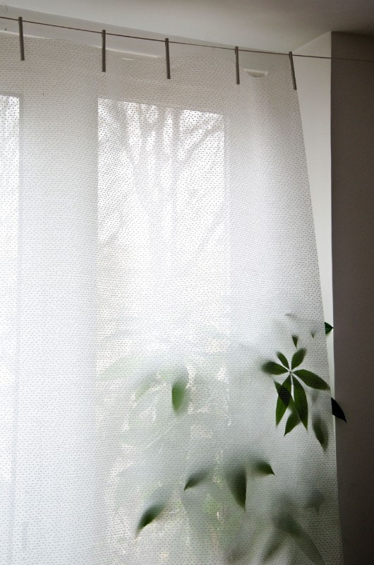
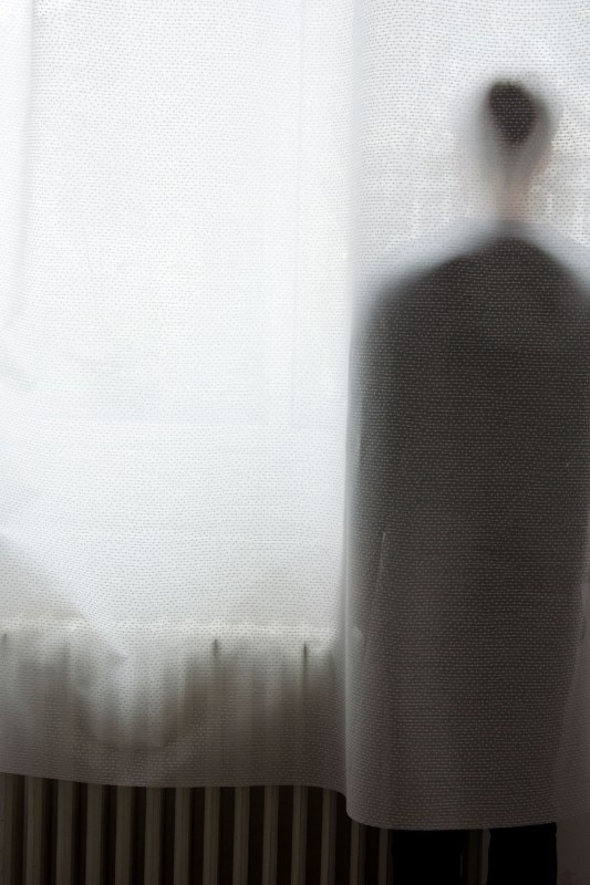
So what about classic curtains? Not even they are the same. In the style of an immersive installation, the stitched fabric of Drops on line that Inga Sempé designed for Almedahls alters and dulls the perception of space by transforming radiators, plants and people into ghosts in the fog. A little like the methacrylate shaft that holds in mid-air the Tetatet Flûte lamp by Davide Groppi, and the “foggy” glass used by Giacomo Moor for his Palafitte storage units. Even in advertising atmospheric “incidents” take place. In Reflections, Gio Ponti’s architectures in Milan are overlapped with the Heritage Collection by Molteni&C thanks to a reflection system typical of urban stacking: a bright idea that adds new freshness to the notion of “travelling while seated”. Besides, as Franco Brevini wrote in Così vicini, così lontani, among the damage of digital geolocalisation there’s also “the end of geography”: a planet perceived as being levelled and stereotyped but where the simulacra of adventure is indeed still alive. It remains to be seen if this is more authentic when it concerns sunsets that in October transform the sky of Milan into a landscape from Mars and make social networks go haywire, or the light of the Mediterranean and the Tropics created to perfection by Coelux skylights.

 View gallery
The fact is that if a rainbow were a desire, the Blush lamp by Formafantasma for Flos would be the accessory that today Pollyanna wouldn’t think twice about buying, with the difference that, being an outgoing person, rather than consulting it like an oracle, like her crystals, she would spread the positive message from door to door. But the impression of Blush and the other designs listed is that of being born mainly to indulge isolation. If we were to heed Philippe Starck, it’s something that is dangerously on the rise. Gym trainer, personal coach and diet consultant, those who, in his opinion, will soon replace designers as we’ve always known them, could draw attention to themselves, chronically. Or not: building a more efficient body in accord with the spirit will place its dynamic relationship with others back at the centre of the debate. In the meantime, degrees in happiness flourish. The one at Yale is sold out. It’s probably the same at other universities, too. And yet, without going back to school, design projects that teach the importance of affection in building good emotional stability still exist. The picture frame Tangible Memory by Yuue design studio is one of these, and it does so by gradually blurring the picture of our loved ones, which becomes clear again only if we touch it, lovingly, once more. A humiliating lesson on indifference, but not as tragic as writing a post-it as a reminder to call a friend. A rare case in which the digital contains more tact than microchips.

Inspired by nature
Fast, a company founded in 1995 in Valle Sabbia by the Levrangi family, is specialised in outdoor furniture, representing the best of made-in-Italy quality.
- Sponsored content


