This article was originally published on Domus 1083, September 2023.
Over the last 12 years or so, I have been closely involved in organising glass exhibitions at the Le Stanze del Vetro (“Rooms for Glass”) on the island of San Giorgio Maggiore in Venice, in collaboration with the Giorgio Cini Foundation. Throughout our 22 shows, light has been one of my main preoccupations, much more than I had ever thought it would. Deciding on the design of each show has involved lengthy discussions and animated exchanges, as well as some heated reactions, but this process has led us to achieve some of the most exciting, nay exhilarating display solutions – whether to use wholly natural or wholly artificial light, or a mixture of the two, and how each of these solutions might or should be implemented: straightforward natural light pouring in from our large windows, or filtered by gauze; diffused artificial light; spotlighting in a lit or dark environment; or a myriad combination of these.
What I have discovered over the years is that each type of glass requires a different solution, as glass can have countless properties and characteristics: transparent, translucent, opaque, shimmering, reflective, refractive, optical and much, much more. Each type and each form must be respected as unique, and treated differently to enhance its intrinsic qualities and reveal its full beauty.

To set against light a piece by Tomaso Buzzi – with its five or six layers of different colours that produce the most delicate nuances of surface hues ever seen in Murano – is, quite simply, to annihilate it. To shoot a set of strong beams through a glass construction by Gerhard Richter is to nullify its multifaceted aim, which is to let you see through several gigantic panes and perceive the image of, say, someone passing opposite you, as in one of his out-of-focus paintings, in a simultaneously fleeting but momentous appearance.
Each type of glass requires a different solution, as glass can have countless properties and characteristics: transparent, translucent, opaque, shimmering, reflective, refractive, optical and much, much more.
At the outset of the Stanze story, I was involved in the frequent clashes between Laura de Santillana – that great and much-missed glass sculptor who wished every piece to be seen only in pure natural light – and Marino Barovier, the experienced dealer and curator with unrivalled knowledge of 20thcentury Murano glass, who often preferred a dark background against which each object would be spotlighted for maximum prominence.

Neither solution was ideal in all circumstances, and slowly we came to the conclusion that our choices must be determined by respect for each work, a profound awareness of the way it had been produced, of the intentions of the designer and the maker as to how its texture, colour and surface should be enjoyed. In a gallery that hosts exhibitions that continue from winter to summer, and are shown against the bright sunshine of a spring morning or the dullness of a rainy November afternoon, a mixture of natural and artificial light is inevitable. You must provide enough light to meet all conditions, including the sudden menacing darkness of a summer storm or that of a short winter’s day.
All objects must be positioned to take maximum advantage of the available natural light, with those that require the most light to show off their colour, for instance, being placed closer to the windows. In the current exhibition “Bohemian Glass: The Great Masters”, the work of the couple Stanislav Libenský and Jaroslava Brychtová desperately needs as much light as possible. Their heavily textured cast works would look dull and lifeless if not bathed in light passing through them, and would not reveal the distinctive structural richness that arises from the method of their production.

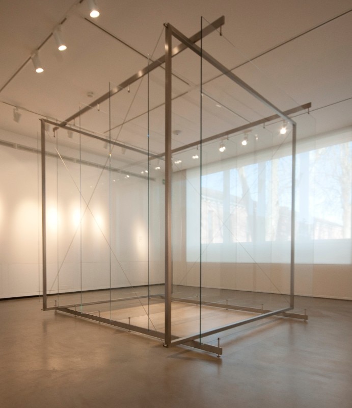
Some works need to be set against the windows so they can be hit by unfiltered natural light, such as an optical glass piece by Václav Cigler, or their specific character would not be demonstrated. By contrast, the complex spatial construction of a Larry Bell glass sculpture required the most diffused ambient light we could possibly obtain in the Stanze in order to reveal its subtle message of interlocking rooms and confounding spaces. But diffused light, however crucial, is rarely the only solution in our ever-changing world of glass exhibitions.
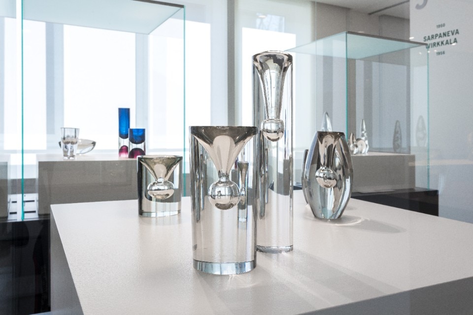
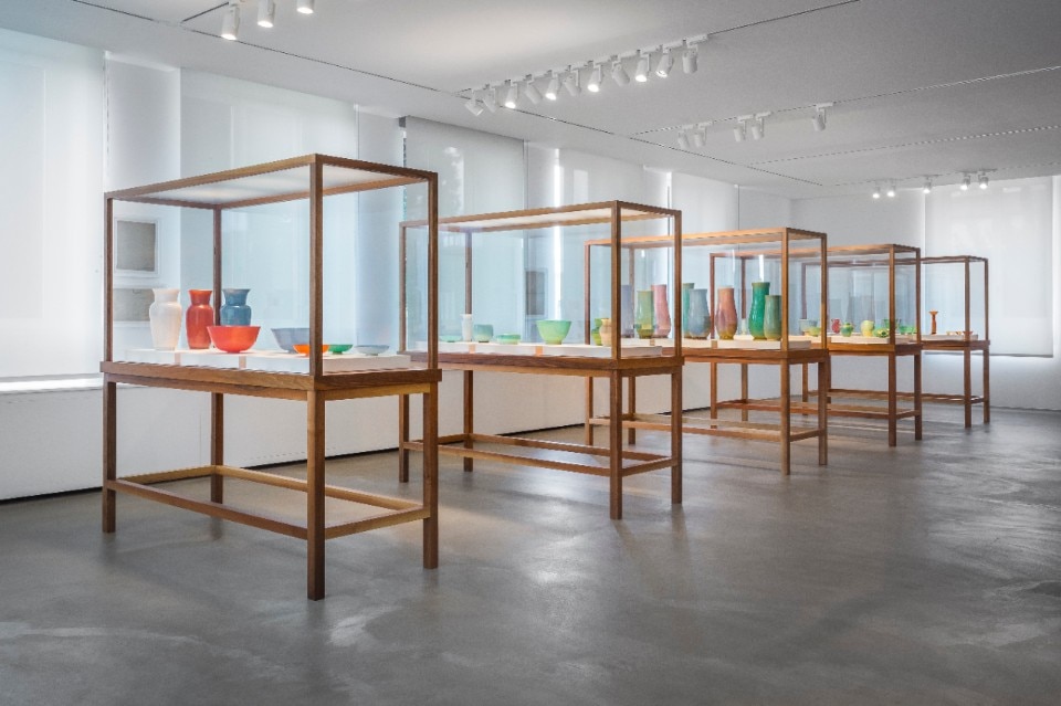
The top of all our beautiful vitrines, all designed by Annabelle Selldorf – as were the Le Stanze del Vetro themselves – is made of etched glass directly spotlighted from above, so that a strong vertical beam is transformed into a caressingly diffuse glow on the surface of each exhibit. If needed, further spotlights can then be angled at the contents to accentuate a particular object, surface or colour. But sometimes all this is not enough.

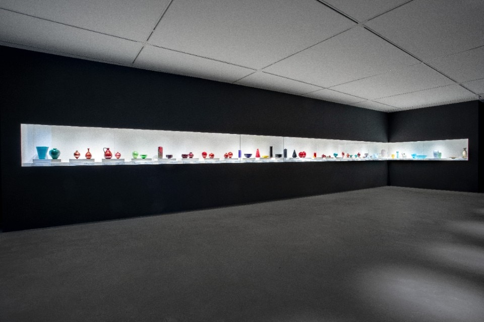
In the case of our Ettore Sottsass exhibition, we realised that only one solution would be capable of simultaneously displaying the richness and variety of both the forms and colours in his oeuvre: an evenly lit white wall of artificial light against which each piece could convey to the viewer its experimental and fantastic nature. Even more challenging was finding a solution for the extraordinary diversity of new colours and shapes conceived by Carlo Scarpa in that intense period between 1926 and 1931, when, with Giacomo Cappellin, he literally reinvented Murano glassmaking.
Each object would ideally have deserved its own room, but failing that, we decided to treat them all equally, democratically, arranging them in one long artificially lit vitrine, where each could contend for its rightful place in the design revolution of which it was a part. Toni Zuccheri’s highly colourful and vibrant Ninfee were shown to great acclaim in a completely dark room, placed on a partly reflective surface and lit from above to reveal the nature of the stracciato glass at its best. A bit of drama always helps!

A similar combination of a black room and a reflective surface below the exhibit was repeated, though on an enormously different scale, in our recent reconstruction of Carlo Scarpa’s immense chandelier made for the Veneto pavilion of the 1961 “Italia 61” exhibition in Turin celebrating the centenary of Italian unity. No other solution could better illustrate the complexity of the details with the simplicity of the whole: thousands of polyhedrons in three different colours – transparent, amber and light amethyst – creating a single daring form that originally reflected itself in a pool of water beneath. Our exhibition “Venini: Light 1921-1985”, of which this gigantic object was a part, has been our most challenging yet. One should never underestimate the difficulty of controlling, directing, cajoling, manipulating and exhibiting light.
Opening image: reproduction of the polychrome polyhedron chandelier, with about 4,000 elements, designed by Carlo Scarpa for the Veneto pavilion at the “Italia 61” expo, Turin. The work was shown in the “Venini: Light 1921-1985” exhibition curated by Marino Barovier (18.9.2022–9.7.2023). Photo © Enrico Fiorese. Courtesy of Le Stanze del Vetro

