The greatest director-architect in operation, Wes Anderson, is expanding his desire to design, plan, furnish and create worlds. He has always done this, in all his films. The many characters that liven up his stories distribute the concentration that there would be if there were only 2 or 3 characters involved, thus ending up highlighting what they have in common. The house in The Royal Tenenbaums, Steve Zissou’s ship, the underground tunnels in Fantastic Mr. Fox or the carriages in The Darjeeling Limited are a few narrow examples. Then the films got bigger. A whole hotel or even an island of dogs. Now for The French Dispatch an entire city.
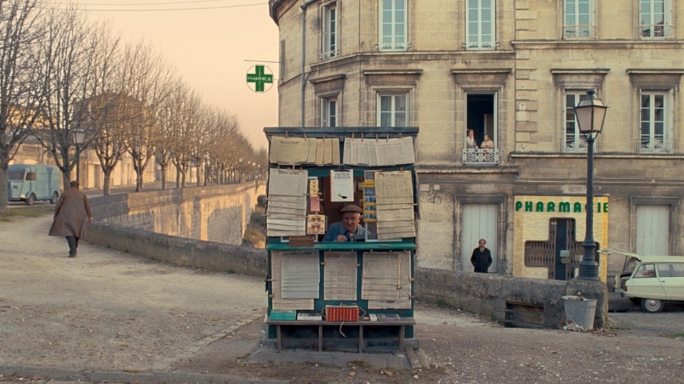
It is called Ennui-Sur-Blasé and it does not exist, Wes Anderson created it for his own pleasure from scratch. The filming was mostly done in Angoulême but it does not matter. It is just a basis to build his own fictional world in which a magazine similar to the New Yorker (called The French Dispatch) closes down because of the death of its editor and so we retrace the pieces of its last issue. It is essentially an episodic film, which dilutes the stories even more and allows Wes Anderson not to go deep into them but just mention them. The greatest concentration is therefore on the settings. Each story is about a different place in Ennui-Sur-Blasé, starting with the first one, which explores the town on a bicycle and tells us about it. This is the peak of perversion: touching everything quickly, going from space to space, drawing or imagining as many as possible. Even outside!

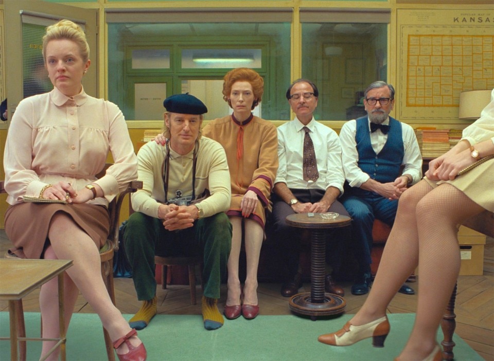
Marvel films always do what is called “world building”, that is going beyond the mere setting of a story, taking care to tell a world and its fictional workings, so that it is possible to make other films that are all connected by following the rules of that world and sharing places or characters from that world. But “world building” is just an expression, a metaphor. On the other hand, Wes Anderson builds his own micro-worlds, working with real and fake sets, models and reconstructions, tapestries, costumes, colours and furnishings to put together spaces that talk about the people who live in them. The first image we got of The French Dispatch (two years ago now) did not say anything narratively, it was some of the most famous Hollywood actors standing still looking ahead. It was not evocative at all. It did not provide the inspiration for a story. To speak it was the place they stood in (a 1970s newsroom), the clothes they wore, the objects they handled.
That was the first taste of a further step forward in a film that will never be one of Anderson’s best (indeed, it is perhaps the least focused, the most redundant, the longest and most boring) but certainly widens the scope of the constructible and its ambition. All the first segment in which we are told about the fictional city is a way of assembling places and locations together to give the impression of a coherent place and in fact put on screen the first “Wes Anderson city” ever seen. French in its colours and style, 1970s American in its decor, quiet in its rhythm and discreet in its appearance. The other stories will move within that world, and increasingly the impression will be that the point is not the plots but the construction of the spaces that house them. More and more the impression will be that Wes Anderson’s pleasure is not in filming something, but in designing places and spaces and then watching them work, that is, watching how the characters, moving within them, establish relationships or give life to facts and situations, influenced by those spaces.

Therefore, we see the auditorium of Ennui-Sur-Blasé where an art critic (Tilda Swinton) introduces an exhibition on a fantastic artist who is nevertheless held in the city’s prisons, and there we see both the exhibition and the love affair between this helpless and violent man (Benicio Del Toro) and the policewoman guarding him (Léa Seydoux). It is a mockery of the exaltation of instinctive art but also a way of working on the brutal spaces of prisons, of imagining one of these as a public school, where the uniform of the prisoners looks like the uniform of the students and the rules can be bent by the malleability of multifunctional environments. In a place where repression can become an artistic installation or a place of exhibition, then imprisonment and isolation can also result in love. The policewoman guards the prisoner in his cell but when they are somewhere else, in the exhibition wing of the prison, she poses naked for him. It is classic Wes Anderson, the animalistic character and the desirous woman less compelling here than ever.
In the second segment, a student uprising inspired by the France’s May 1968 uprising spotlights a student leader (Timothée Chalamet) who ends up having a love affair with the much older reporter who is writing about his uprising (Frances McDormand). We see an impressive number of cramped spaces in which many students work as a military platoon, over-acculturated and over-sophisticated in search of adulthood through objects and fetishes of the time (as Rushmore’s protagonist). Even a motorbike ride (extraordinarily lit and framed) seems to be there just for the pleasure of setting up characters, framing them, photographing them and keeping them as furniture. It is the weakest segment. Devoid of a real narrative and really only functional for the construction of the places that drive the plot forward, it ends with a real (not metaphorical) intellectual chess game closed to what was supposed to be a material uprising.

Finally closing boxes within boxes as a Russian doll, the story of the last article is a story in itself. The magazine’s food critic (Jeffrey Wright), interviewed on television, tells what was supposed to be a review of the dinner prepared by the police cook that has instead become an article about a kidnapping that results in an animated chase. Where are the kitchens? How do they communicate with the dining room? Who works there? What is the logistics of the meals like? The scenes directed by Wes Anderson seem to be the result of questions an architect would ask in designing spaces. It seems that what he wants to explain, instead of the power relations between characters, their desires or their aspirations, is the logic the rooms are built with and then he stands there and admires how well they work.
And this is the main problem with a film that is the best 3D rendered version of a project ever seen. In which perfectly reconstructed spaces contain well-drawn human silhouettes, each one chiselled with visual traits (hair, clothes, means of transport, accessories) that tell their personality. But that is enough. As in a 3D model, they do not really move, they do not really live, they are just the promise of what will happen in that still imaginary space.

Design at the service of water
Combining minimalist design and innovation, Rubinetterie Treemme's W-Smart and W-Touch solutions are at the forefront of the industry, offering precise and intuitive water control.


