According to the locals, London's skyline changes so quickly that, from decade to decade, is completely unrecognizable. In fact, walking around the city, it is impossible not to be struck by the succession of buildings rising skywards, façades being renewed and streets opening onto new squares. Through a number of articles published on domusweb, we have sketched out a route for an unconventional look at London which, winding its way through some of the most interesting architectural examples, highlights its ever-changing face.
Map of London including nine spots selected through articles published on domusweb
Brunel Building

 View gallery
Starting from West, the capital’s most bourgeois and refined area, the first stop is Paddington, a district with an industrial past where modern cafés with minimalist design now stand alongside traditional pubs. A short walk from the station’s railway junction is Brunel Building, the new headquarters of a diverse range of businesses completed last year by London-based Fletcher Priest Architects. Overlooking the Paddington Canal, a favourite spot for office workers in the neighbourhood who enjoy their lunch breaks there on rare sunny days, the imposing Brunel Building has an irregular steel outer structure. It is anchored to the ground with massive reinforced concrete plinths and inspired by the Great Western Railway viaduct built by architect Brunel himself. Read full article here.
Serpentine Pavillion

 View gallery
Continuing in the west side, but moving on to the iconic Kensington Gardens, one of the capital’s proudest parks, a stop at the Serpentine Pavilion, the annual architectural installation commissioned by the Serpentine, now in its 20th year, is a must. Designed by Johannesburg-based Counterspace, a collaborative group of architects led by Sumayya Vally, this year’s pavilion pays homage to London’s diasporic and intercultural communities. Constructed from reclaimed steel, cork and micro-cement covered in wood, Vally’s work evokes different textures and shades of pink. A sound installation with the voices of different London communities embedded in the pavilion transports us to different parts of the city, including Brixton, Hoxton, Tower Hamlets, Edgware Road, Barking and Dagenham and Peckham. Read full article here.
Connaught Patisserie

 View gallery
A stop for a sweet snack is always tempting. If it is the Connaught Patisserie in the Connaught Hotel in the heart of glamorous Mayfair, it is also an aesthetically satisfying experience. The small patisserie has a pastel and geometric interior worthy of a West Anderson set and a mirrored wall at the back that amplifies the room size and its perspective effect. The extra touch is the sweet’s packaging and the staff uniforms in perfect Grand Budapest Hotel style. Read full article here.
Alexandra Road Estate

Discovering Brutalist works embedded in the fabric of the city, but all easily recognisable, is a real mini-tour within the tour of London. One of the most representative works is Neave Brown’s Alexandra Road Estate, built in the 1970s in the north of the city in a heavily residential district famous for being the area frequented by the Beatles at the height of their career. Brown’s design was considered visionary from the outset and earned him the Royal Gold Medal in 2018, the highest honour for British architecture. In perfect Brutalist style and characterised by elegant terracing, the 500-unit complex recreates a small “piece of town” with shops, community centres, schools and public parks dedicated to residents. Read full article here.
VyTA Covent Garden

 View gallery
Back in the beating heart of the city centre, in the bustling market of Covent Garden, a stop that combines great design with a meal or a cocktail is Vyta Covent Garden. Designed by studio Collidanielarchitetto, the restaurant’s interior is inspired by the Italian architectural culture of the 1960s, mixing bright colours with lacquered surfaces and geometric shapes in the style of Giacomo Balla. Alpine green dominates the colour scheme on the stairs, steps and wall panels, recalling the colour of the market structure as a sign of continuity. Read full article here.
Lloyd’s Complex

 View gallery

Overall view showing the model of the project by Richard Rogers Partnership, with the service towers containing plant systems, lifts, sanitation facilities, kitchens, fire escapes and lobbies, all easily accessible for maintenance

Detail view showing the model of the project by Richard Rogers Partnership, with the service towers containing plant systems, lifts, sanitation facilities, kitchens, fire escapes and lobbies, all easily accessible for maintenance

The article published in Domus 680, February 1987, dedicated to the Lloyd’s building in London

The article published in Domus 680, February 1987, dedicated to the Lloyd’s building in London

The building in the historical context of London’s City district, the large entrance foyer, and the Underwriting Room seen from the foyer’s escalators

Overall view showing the model of the project by Richard Rogers Partnership, with the service towers containing plant systems, lifts, sanitation facilities, kitchens, fire escapes and lobbies, all easily accessible for maintenance

Detail view showing the model of the project by Richard Rogers Partnership, with the service towers containing plant systems, lifts, sanitation facilities, kitchens, fire escapes and lobbies, all easily accessible for maintenance

The article published in Domus 680, February 1987, dedicated to the Lloyd’s building in London

The article published in Domus 680, February 1987, dedicated to the Lloyd’s building in London

The building in the historical context of London’s City district, the large entrance foyer, and the Underwriting Room seen from the foyer’s escalators
Now arrived in the City, the capital’s financial and technological hub, an architectural work emblematic of an past era deserves to be included in this tour of the city’s transformation. Designed by the Richard Rogers Partnership, the Lloyd’s Complex soon became one of the canonical examples of the so-called High Tech style: the use of the most advanced technology adopted here with a dual cultural purpose, to encourage new, unconventional forms of art, as well as for marketing, to redeem the image of a private holding company compromised by scandals. Now, with the avant-garde nature of its technological systems irretrievably outdated, the building nevertheless manages to maintain its almost monumental status thanks to the expressive force of architectural choices such as the flexibility of the plan, the vertical distribution systems, the adjacent towers outside the main mass of the building. Read full article here.
The Shard

 View gallery

Renzo Piano Building Workshop, architects, in collaboration with Adamson Associates, The Shard, London Bridge Tower, top detail section. Drawing © RPBW Renzo Piano Building Workshop Architects

Renzo Piano Building Workshop, architects, in collaboration with Adamson Associates, The Shard, London Bridge Tower, London, United Kingdom, 2000-2012. Photo © Michel Denancé

Renzo Piano Building Workshop, architects, in collaboration with Adamson Associates, The Shard, London Bridge Tower, London, United Kingdom, 2000-2012. Photo © Michel Denancé

Renzo Piano Building Workshop, architects, in collaboration with Adamson Associates, The Shard, London Bridge Tower, London, United Kingdom, 2000-2012. Photo © Michel Denancé

Renzo Piano Building Workshop, architects, in collaboration with Adamson Associates, The Shard, London Bridge Tower, London, United Kingdom, 2000-2012. Photo © Michel Denancé

Renzo Piano Building Workshop, architects, in collaboration with Adamson Associates, The Shard, London Bridge Tower, London, United Kingdom, 2000-2012. Photo © William Matthews / RPBW Renzo Piano Building Workshop Architects

Renzo Piano Building Workshop, architects, in collaboration with Adamson Associates, The Shard, London Bridge Tower, London, United Kingdom, 2000-2012. Photo © Michel Denancé

Renzo Piano Building Workshop, architects, in collaboration with Adamson Associates, The Shard, London Bridge Tower, London, United Kingdom, 2000-2012. Photo © Michel Denancé

Renzo Piano Building Workshop, architects, in collaboration with Adamson Associates, The Shard, London Bridge Tower, site plan. Drawing © RPBW Renzo Piano Building Workshop Architects

Renzo Piano Building Workshop, architects, in collaboration with Adamson Associates, The Shard, London Bridge Tower, plans and sections. Drawing © RPBW Renzo Piano Building Workshop Architects

Renzo Piano Building Workshop, architects, in collaboration with Adamson Associates, The Shard, London Bridge Tower, iconic bas-relief. Photo © Michel Denancé / RPBW Renzo Piano Building Workshop Architects

Renzo Piano Building Workshop, architects, in collaboration with Adamson Associates, The Shard, London Bridge Tower, top detail section. Drawing © RPBW Renzo Piano Building Workshop Architects

Renzo Piano Building Workshop, architects, in collaboration with Adamson Associates, The Shard, London Bridge Tower, London, United Kingdom, 2000-2012. Photo © Michel Denancé

Renzo Piano Building Workshop, architects, in collaboration with Adamson Associates, The Shard, London Bridge Tower, London, United Kingdom, 2000-2012. Photo © Michel Denancé

Renzo Piano Building Workshop, architects, in collaboration with Adamson Associates, The Shard, London Bridge Tower, London, United Kingdom, 2000-2012. Photo © Michel Denancé

Renzo Piano Building Workshop, architects, in collaboration with Adamson Associates, The Shard, London Bridge Tower, London, United Kingdom, 2000-2012. Photo © Michel Denancé

Renzo Piano Building Workshop, architects, in collaboration with Adamson Associates, The Shard, London Bridge Tower, London, United Kingdom, 2000-2012. Photo © William Matthews / RPBW Renzo Piano Building Workshop Architects

Renzo Piano Building Workshop, architects, in collaboration with Adamson Associates, The Shard, London Bridge Tower, London, United Kingdom, 2000-2012. Photo © Michel Denancé

Renzo Piano Building Workshop, architects, in collaboration with Adamson Associates, The Shard, London Bridge Tower, London, United Kingdom, 2000-2012. Photo © Michel Denancé

Renzo Piano Building Workshop, architects, in collaboration with Adamson Associates, The Shard, London Bridge Tower, site plan. Drawing © RPBW Renzo Piano Building Workshop Architects

Renzo Piano Building Workshop, architects, in collaboration with Adamson Associates, The Shard, London Bridge Tower, plans and sections. Drawing © RPBW Renzo Piano Building Workshop Architects

Renzo Piano Building Workshop, architects, in collaboration with Adamson Associates, The Shard, London Bridge Tower, iconic bas-relief. Photo © Michel Denancé / RPBW Renzo Piano Building Workshop Architects
Moving on to the banks of the Thames, the unmistakable spire of the Shard begins to appear, probably the work that is mostly identified as the symbol of the city in recent times. Designed by Renzo Piano, the shard that emerges from the profile of Southbank, the southern bank of the river, is the tallest building in Western Europe and houses offices, clubs, a hotel and private accommodations. With a high-tech façade and a focus on energy efficiency, the building is part of the new vision for the city launched a few years ago that promotes urban regeneration and enhances the real estate market in several key areas. Read full article here.
The Rye Apartments
 View gallery
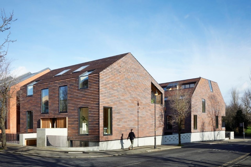
Opposite Peckham Rye Park, further South in the city, stands The Rye Apartments, a series of accommodation units in two blocks converted from a post-war building and four garages. With this project, Tikari Works proposes a new housing scheme with a particular focus on creating a sense of belonging in the community of residents by integrating it into the urban context of Victorian terraces and 1980s social housing that dominate the area. In addition, particular attention has been paid to the sustainability and energy efficiency of the housing units, using reusable materials and integrating photovoltaic panels and solar control glass. Read full article here.
Hackney New School

 View gallery
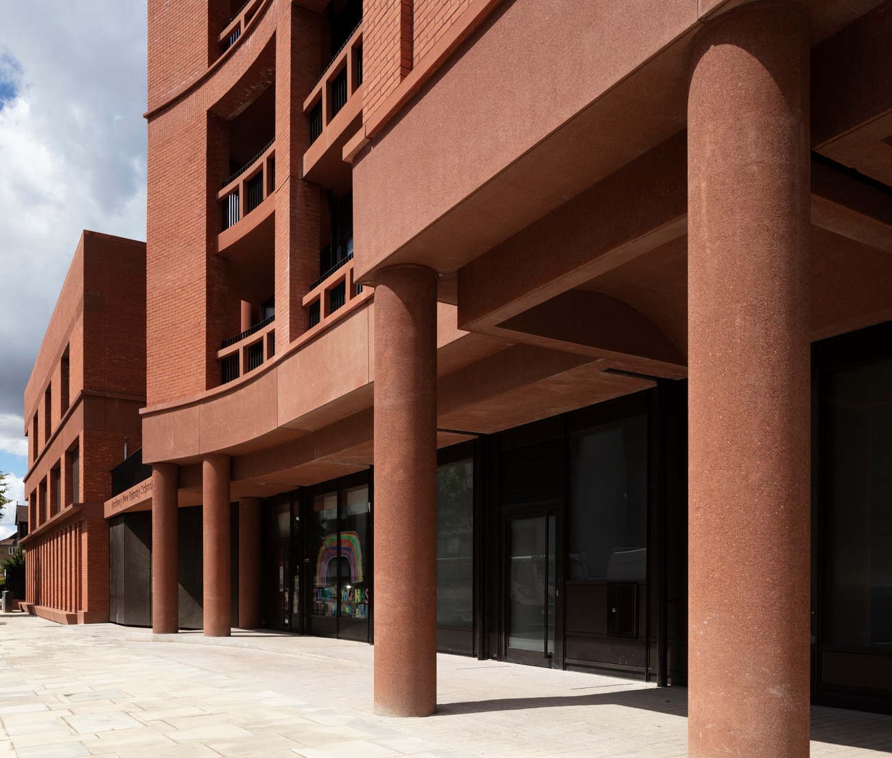
At the end of the journey, we have now reached the East End, the area that more than any other is currently the queen, or victim, of urban regeneration policies witnessing the transformation of neighbourhoods traditionally linked to an industrial and proletarian past into the city’s most hipster areas. In particular, it is worth mentioning a small project in the borough of Hackney that has managed to redefine the neighbourhood community’s identity. Hackney New School is a two-storey red brick courtyard building housing a primary school, accompanied by an eleven-storey tower with 68 affordable homes. Designed by Henley Halebrown, a London-based architecture firm, the project was completed last year and opened up shared spaces to promote outdoor learning, exchanging and playing. Read full article here.
Opening image: The Shard, London Brudge, London 2012. Photo Michael Denancé.


