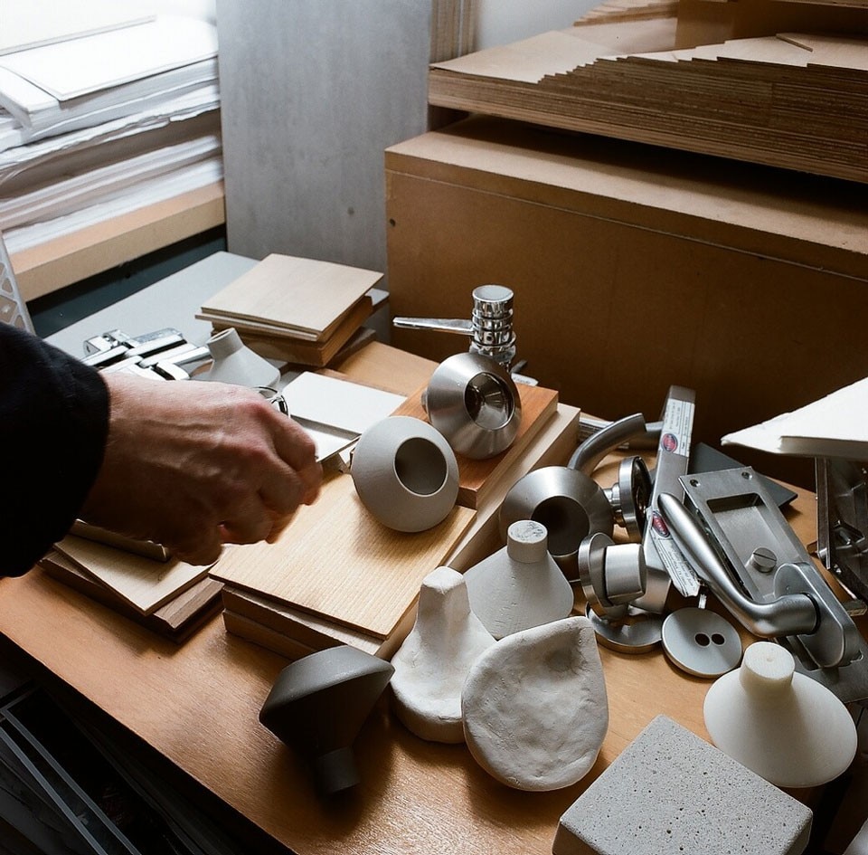
Disillusioned by the redundancy that characterises the wares of building and construction industry fairs, we decided to look at the material libraries of four us architects — Steven Holl, Michael Maltzan, Thom Mayne and Richard Meier — to understand the materiality of their architecture. To our surprise some of these architects had no material library at all, and those who did barely use them. While typical buildings are often agglomerates of prefabricated building products, the architects we spoke with utilise the building industries’ techniques and resources towards the realisation of unique construction elements. These industrially crafted solutions are conceived within the specific spatial, organisational and perceptual effects of the architectural intention. Indeed, the libraries we were seeking only house old solutions, which are unsuited to the specific circumstances of new projects.

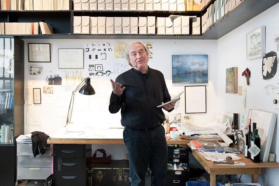
The rich and varied elements of Steven Holl’s architecture reflect his intense interest in continual experimentation. “If I were a chef, I would use every kind of food that I could. I wouldn’t just cook the same pasta every day.” His project descriptions reveal details that resemble the ingredients of a fine recipe: patinated copper, slumped glass, liquid terrazzo, Shotcrete, airentrained aluminium, Cabreuva Vermelha. Senior partner Chris McVoy explains that the “experiential aim” of the office “often demands a yet-to-be-made material assembly, initiating the hard work of finding out how it can be realised technically”. With light as the office’s “primary material”, matter is acted upon in order to control the desired effects of light and how it resonates with atmosphere. For instance, at the Maggie Centre in London, the goal is “to embed colour deep within a translucent exterior wall” to achieve “a blurred ice-light quality”. This led the office and Okalux to a new method of colour printing in an etched-glass assembly with capillary insulation. Other examples include “staining concrete for sheen and hue”; rough-sanding aluminium to “pull the sky-scape across its surface”; and “air-entraining molten recycled aluminium to give a bubbled texture and varied sheen”.


Holl and McVoy show that working on a material at a small scale can also serve as an analogue to larger ideas at the scale of a building. Recently invited to make sculptures out of large blocks of stone from Lecce, Italy, Holl used the quarry’s five-axis cutter to carve in ways that cannot be achieved by hand. The mass-void relation of the carving has since led to ideas of carving space at the scale of a building. The office intends to use similarly carved Lecce stone for a new building at Princeton University. But before they do, the stone needs to be tested to see how it performs in the freeze-thaw cycle of the East Coast climate. Currently 6,000 pounds of Lecce stone sculptures are sitting outside Holl’s house in Upstate New York, showing no signs of misbehaviour.
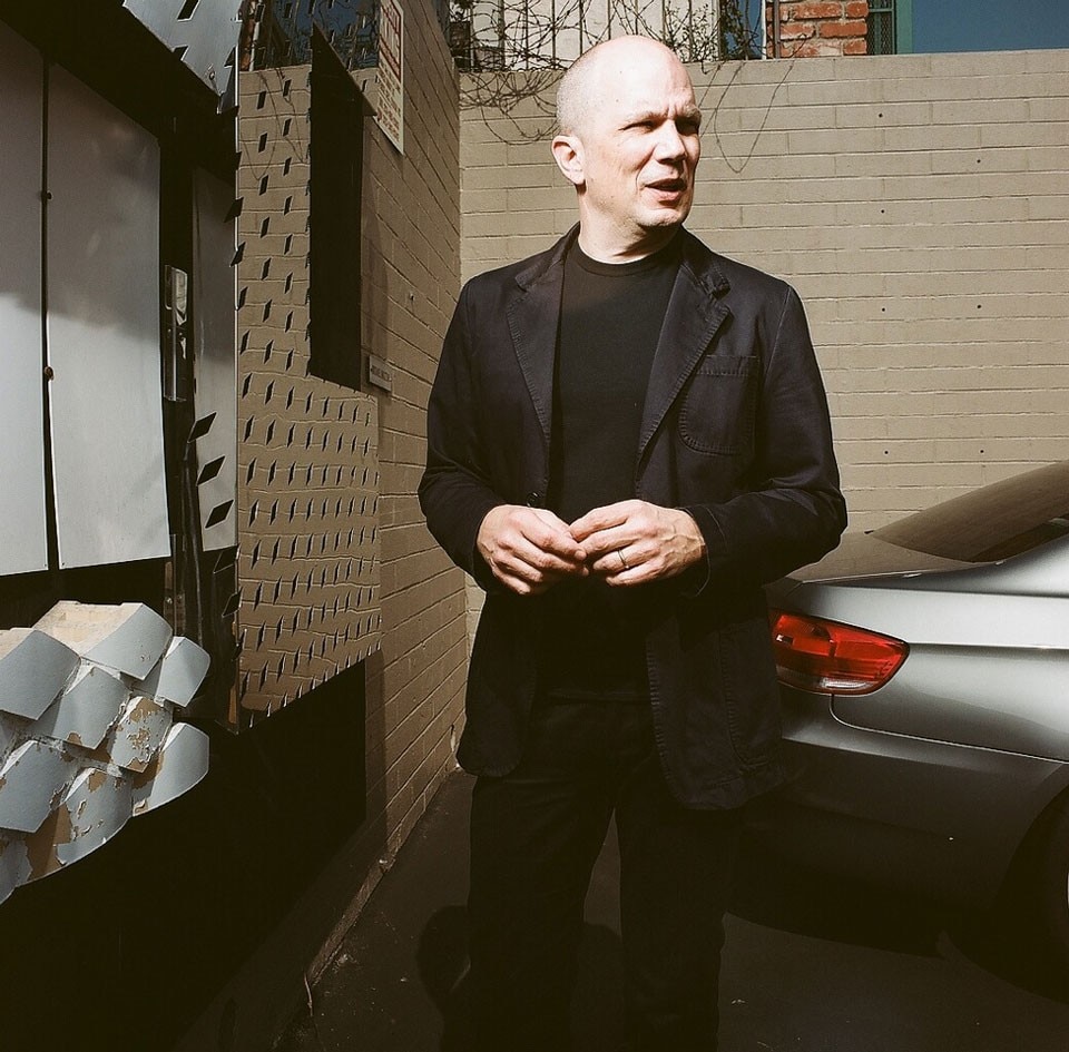
Michael Maltzan is suspicious of the role that materials play in a building. For him the material on the exterior of a form is the definition of a spatial perimeter, not an expression of the material itself. He is deeply concerned with the perceptual effect of that spatial limit, and it varies greatly between his buildings. Some of the effects he seeks are achieved with walls built in layers: perforated panels over contrasting planes of solid material create optical fluctuation, and muralist-painting techniques create depth in thin surfaces. Sceptical of “pre-animated materials”, Maltzan’s interests lie in how materials are animated by their contexts and the physical effect of their forms.
His layered and perceptual approach is perhaps most bluntly visible on the blue facade of the 2002 MoMA QNS building. The Swingline Staple Factory that previously occupied the site was clad in blue glazed brick, which had become a neighbourhood landmark. Maltzan chose to pay homage to the original building with his own façade of painted blue stucco. But this was no simple paint job: several blues in varying sequential layers were tested to find a saturation that was adequate against the New York City sky. The final tone was achieved with a single layer of blue applied over a layer of white, a combination that allowed light to emanate from the topcoat. As a young architect, Maltzan gained respect for the techniques of muralist painters: “Very often when they were trying to get black, they would paint red first, and then they would paint blue, and then on top of that they would paint black.”
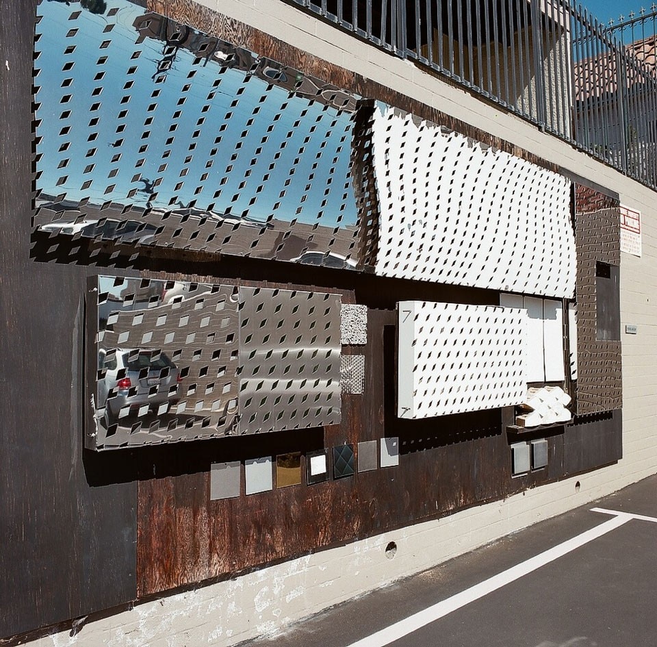
The search for improved efficiency and performance drives many of the material choices at Morphosis

In Thom Mayne’s view, generic materials give prominence to the organisational strategies of a building and reinforce his belief in egalitarian spaces. While Mayne prefers everyday materials — concrete, steel, glass and un-exotic wood — he goes to great lengths to depart from their ordinary use: “We want to use zero from the normative environment. I’m interested in the invention of new products that are specific to the intentionality in front of us.” There is no material library at Morphosis, where Mayne is principle, because of a studio-wide refusal to solve new challenges with ready-made solutions. The search for improved efficiency and performance drives many of the material choices at Morphosis. The San Francisco Federal Building, the Caltrans District 7 Headquarters in Los Angeles and the Cooper Union in New York City all employ skins of perforated metal that give these structures natural climate control and maximise their energy efficiency. Morphosis’s website states “The Federal Building is the first office tower in the us to forgo air conditioning in favour of natural ventilation.” In both the Federal Building and Caltrans District 7, the façades are kinetic and respond to the light, closing to create shade and protect the building from heat by day and opening at dusk. The perforated semi-transparent double skin of the Cooper Union provides environmental control while allowing views of the school’s interior from the outside. Each of these systems was uniquely fabricated for their respective buildings.

Though he is passionate about new processes, Mayne’s approach doesn’t discriminate against old or simple methods. At times even common painted sheetrock is useful: “If it’s white it’s nothing, a non-material; it’s abstract. When Eisenman built in white he was not interested in material at all; it was the pure conceptualisation of an idea. If we want a building material with no reading of material we use sheetrock.” Material is always at the service of the larger, organisational aims of the project.
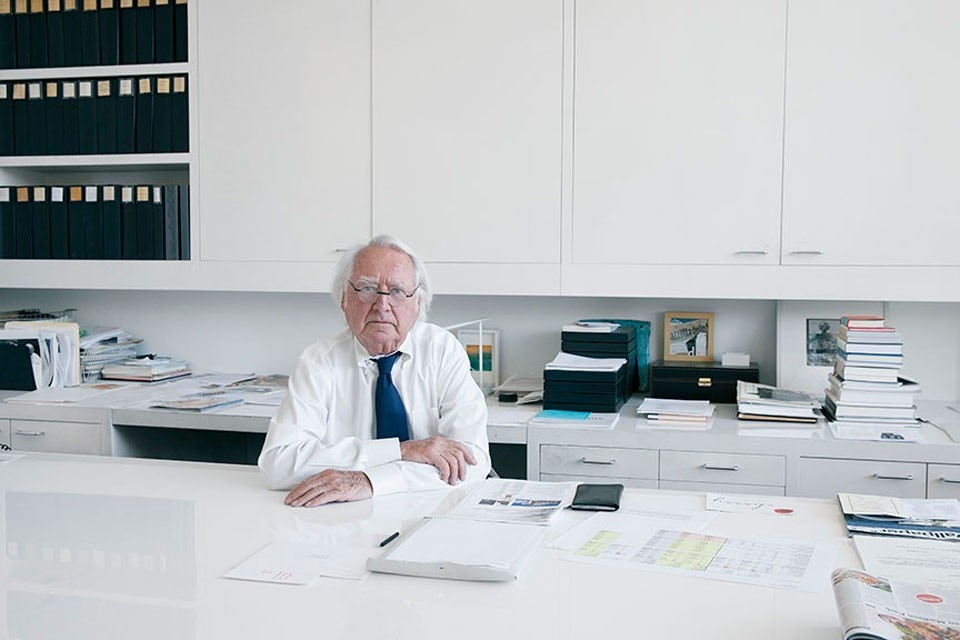
Richard Meier has had a consistent vocabulary throughout his career that has allowed him to evolve a rigorous mode of expression and construction. His interest in pure white and the three-dimensional structural grid led him to be one of the first to develop an architectural language from the metal panel system. The office’s small materials library, with many neutral colours and shades of white, reflects this focused vocabulary.
As performance criteria, Meier typically seeks materials with surfaces that are highly reflective, pure white, resistant to weathering, and will “look just as good 50 years from now as when the building is completed”. Over his career, panel materials have changed from porcelain-enamelled steel to aluminium and painted metal, and most recently to Corian. “I love Corian because it is always going to look good. If there is air pollution, you just hose it down a little bit.” He also notes that “with some of the newer projects, the water drains behind the panel”, minimising water stains.
Another material that meets Meier’s performance standards is “pure-white concrete”, otherwise known as self-cleaning concrete. “We didn’t invent this material. Actually Nervi used it at the Olympic Stadium years ago but it went out of use. No one used it and we were interested in re-establishing a new way to do it.” When the sunlight hits the surface of self-cleaning concrete, photocatalysis occurs, neutralising pollutants that would otherwise result in discoloured surfaces. Staying clean, white and pure, this material is exemplary of Meier’s architecture. He recently completed the research and development centre for one of its producers, Italcementi.

Meier’s highly evolved standard vocabulary is known for subtle differences in material and colour, like a neutralised version of his vibrant collages


