Each mobile phone handset is not a mere product, perhaps like the other products that have traditionally adorned the pages of this magazine—as a chair is, or a lighting fixture is. Instead, each handset is a play in a wider global contest, a node in logistics networks of immense scale and complexity, a platform for an ecosystem of applications, an exemplar of the internet of things, a window onto the daily interactions of billions of users, of their ever-changing personalities and cultures, a product that consumers traditionally consider the most important in their possession, after the keys to their home.
The phone is an intimate device, not simply through its ubiquity and connectivity, its relationship with the body. While objects have long been cultural choices and symbolic goods, the mobile phone, being the most personal connection to the internet, is a device for generating symbolic goods, a vehicle for culture, a proxy for the owner's identities. It is vast business and cultural phenomenon, all at once.
The stakes are high, and the cut-throat battle fiercer than most in design. It's not as if Dieter Rams's 606 shelving destroys the possibility of Nils Strinning's String System. Or that a new chair from Jasper Morrison puts another by Konstantin Grcic out of business. Yet Finland's Nokia has found itself in a battle to the death with America's Apple and Google and Canada's RIM on one side (software), and various Asian handset manufacturers on the other (hardware). This is a dog-eat-dog game; the stakes are so high precisely because phones are so relevant, so meaningful.
Nokia N9 from cityofsound on Vimeo.
It's into this maelstrom that Nokia has pitched the N9 handset running its home-grown Meego Harmattan operating system (OS), and just three months later, effectively superseded it with the Lumia, essentially the same hardware design but crucially, and radically for Nokia, running Windows Phone as its OS. This means that Meego is released, and then immediately replaced, effectively (the N9 will not be made available in the UK or US, or several other key markets).
The N9 and Lumia are being described as the last roll of the dice for Nokia. This is a little odd, as the firm is still the world's largest manufacturer of mobile phones. But this means little when share prices are linked to confidence, and confidence is largely dictated by a technology press based in the US, where Nokia has traditionally had no more than a foothold. The one-eyed nature of much of the American press, unwittingly in thrall to one idea of innovation and design, as exemplified by a Californian Ideology, generally has little time for a European manufacturer from faraway Finland, despite the numbers. So this also may be a battle of ideologies as well as transactions, implicitly at least.
As such, as a user, it's nice to have an alternative. But it's also impossible to talk about the N9 without talking about Apple's iPhone, the product that swallowed Nokia's enormous market share within a couple of years. Although Google's Android operating system is moving faster than either, there is no particular hardware story to discuss there. Yet. This makes it a more interesting business strategy—particularly as the OS is free, yet generates vast revenue for Google—but that's not for the pages of this magazine.
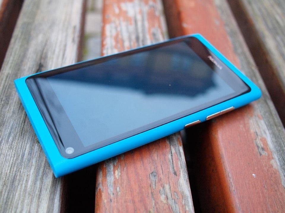
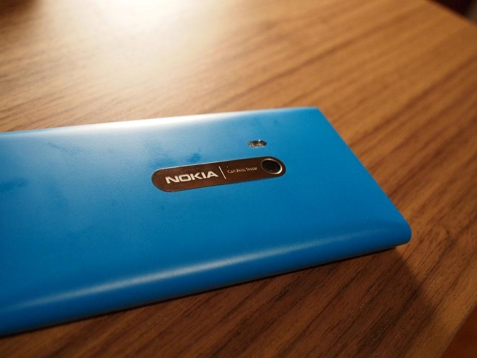
Domus has had the N9 for the last month and thoroughly road-tested it. First things first. It's a beautifully made device, perhaps the finest mobile phone handset design yet. The body is polycarbonate, a thermoplastic polymer. Or a plastic, in other words. It feels tough yet light.
Paradoxically, although the surface gives an impression of lightness, the body feels heavy. But it is exactly the right weight. It is roughly the same weight as the iPhone—slightly lighter in fact, despite being a tad larger. But the weight is right in the hand. It's an example of where Nokia understands hardware, demonstrating that weight can lend handheld devices a perception of quality; see also an Olympus PEN or a Bang & Olufsen TV's remote control.
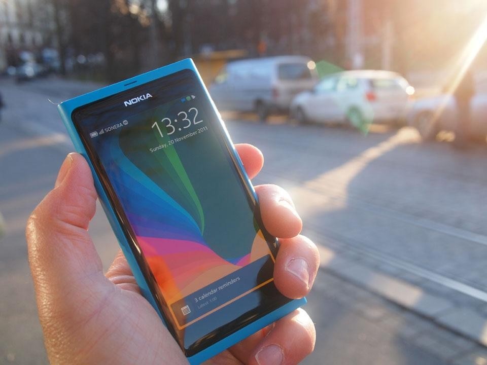
The large glass screen overlaps the curve of the phone's sides slightly, with a perceptible bump, as if the meniscus of a dark pool of resting liquid, poised on the colourful base. This provides a subtle haptic feedback when sliding the fingers across the device, which you do to switch modes—it's a rewarding gestural feature that Apple and Android phones are without.
The phone has a pin-sharp AMOLED display within the curved glass, which is significantly brighter than the iPhone, although the visual design—arrays of simple, colourful icons, like Smarties on black velvet—also helps give the impression that, as Nokia marketing says, "everything appears to come to life right on the surface".
Meego versus retinal art
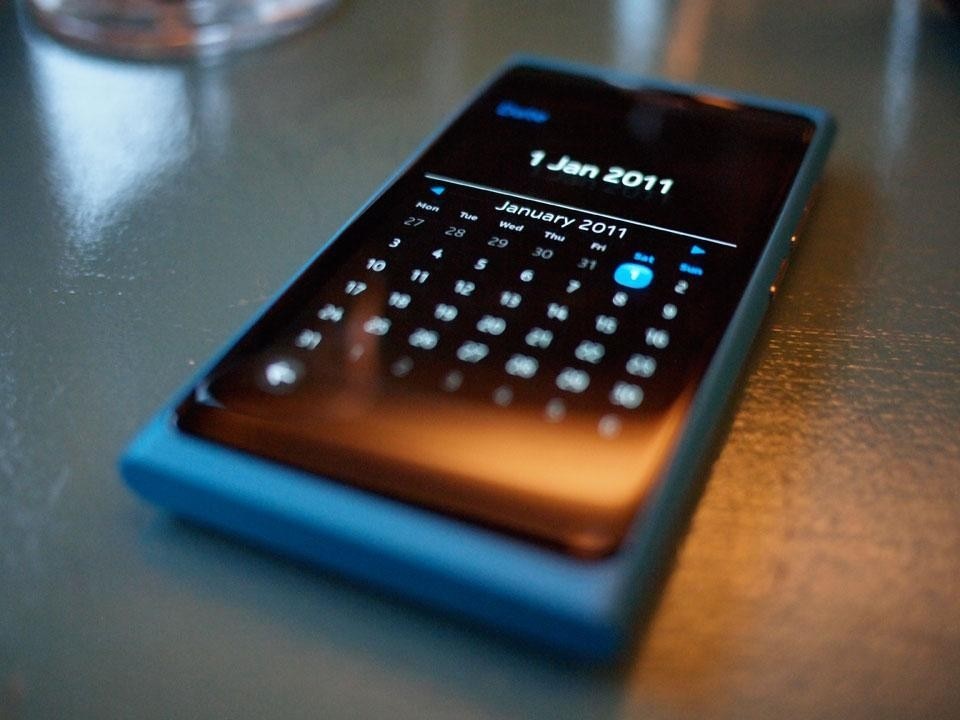
The graphic design in the Meego OS is often quite wonderful. You will never see a more beautiful calculator app, for what it's worth. Similarly, all the core functionality—calendar, contacts, notifications, calls—are bold, confident and clear, and perhaps the most elegant of any phone OS thus far. There is some strong work here.
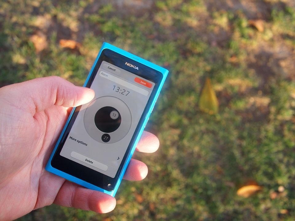
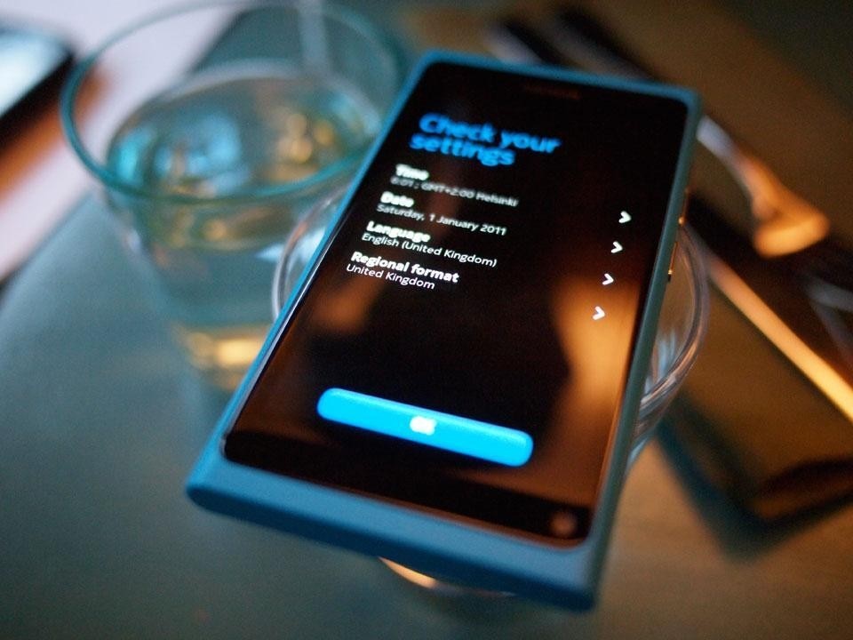
Setting the clock has entailed a redesign of clock-based interactions themselves, which Meego just about gets away with. This brave move indicates the verve that pervades much of Meego, and presents a sharp contrast to Apple's hokey Vegas-slot-machine-style drums for the same function. All the other core phone-related apps, as well as Camera (which is excellent), Gallery, Videos etc., are well executed. Nokia's new typeface, 'Pure' by master craftsman Bruno Maag, is used throughout, and particularly strong at medium and large sizes. At a smaller size, it gives the perception of being slightly brittle, almost a quaint echo of how phones used to display type. The vivid colour scheme—all rich saturated pinks, oranges and cyans, offset by whites, blacks and greys—is in harmony with the phone's physical design and that starless and bible black display.
Overall, Meego's design feels marginally stronger than Apple's inconsistent designs in iOS, which is both a breath of fresh air and some achievement. Steve Jobs believed that above all his firm had "good taste", and placed great sway in that; entire swathes of iOS exemplify this belief, with rock-solid interaction design supported by responsive performance, strong accessibility, clear metaphors and big bold buttons.
Yet the skeuomorphic nonsense that incomprehensibly pervades apps like Apple's own Contacts, Calendar, iBooks, GameCenter, Find My Friends et al—all awkward faux-leather, wood and paper stylings—is is of such questionable "taste" it threatens to damage the overall harmony of iOS with its discordant notes. You cannot derive value from the idle suggestion of such textures on screen; they are physical properties and should be experienced as such, or not at all. Yet Apple's design team will not explore those physical properties, merely sublimating their desire for such qualities into a picture of leather, a picture of wood. It recalls Marcel Duchamp's critique of 'retinal art' i.e. intended only to please the eye.
This has no place in Nokia's design universe, thankfully. The design work here is intrinsically of its medium and pleases the eye consistently, without resorting to cheap imagery, but it also pleases the hand and the ear rather more than the iPhone.
For all the crisp clarity of the screen, the Nokia is a richer multi sensory experience than the iPhone all round. The ocularcentric design approach of other phones becomes even clearer—the iPhone really is all screen; it's all it's got. As an object and an interface, the iPhone is ignoring far more precise senses, such as touch and sound.
In comparison, the N9 excels at these. The keyboard is excellent, as good as any, not least due to the subtle tactile feedback of faux-localised vibration. The sounds for calls and other notifications are both carefully crafted and discreet (Nokia has form here: remember 2005's Nokia 8800 featured sounds by Ryuichi Sakamoto.) Near-field communication (NFC) is built into the device, indicating the potential for more embodied interactions.
'Discreet' is the overriding sensibility in terms of notifications in general, actually, which is another smart differentiator. This is essentially recessive and respectful companion, at least compared to other phones, which is a welcome innovation indeed in an age of social media and internet-of-things. Design director Marko Ahtisaari has also placed emphasis on being operate the phone one-handed, even in your pocket. While such a manouevre might garner the occasional raised eyebrow from onlookers, it is both a gesture based on recognising the urban context of mobile phone use and a reminder of a phone-based characteristic, as opposed to something emblematic of the smartphone.
Nokia's use of colourful plastic for the body is essentially European, following in the grand traditions of the Italian masters—Brionvega's radios and TVs by Marco Zanuso and Richard Sapper, 'the anti-machine machine' of Ettore Sottsass's Olivetti Valentine, Achille Castiglione's Sleek spoons or Spalter vacuum cleaner—whereas Apple's monochrome steel and glass is the language of Miesian skyscrapers and Johnsonian glass cubes, the iPhone 4 a pocket Seagram Building.
Recall the scene in Gary Hustwit's film Objectified, when Jonathan Ive pores over the sheet of milled aluminium that forms the unibody of the MacBook. You get the feeling that the scene might have continued for hours, and that Ive could not have happier than if the laptop was just that slice of metal with a sliver of glass floating on top. Apple's devices are a triumph of reduction, with their industrial design philosophy driven by the desire to disappear the device, perhaps following Naota Fukasawa's notion of "design dissolving in behaviour". While this is laudable, and should perhaps drive much product design, it is not the only design philosophy in town, and certainly not for all circumstances, all markets. Again, Apple's sheer hegemonic power has meant that it has become so. Or at least thought to be so. And again, it would be good to have an alternative.
Nokia have always had a richer palette, in terms of plastics and metals. Recall the sensation of that beautiful 8800, which has rarely been surpassed in the phone-as-object stakes. It still sits in a drawer in my desk, and I suspect I may not be alone in that.
You get the sense that this Nokia design team might explore materials—polycarbonates, stone, wood, metals, fabrics—rather more than Apple's, Samsung's or HTC's.
While objects have long been cultural choices and symbolic goods, the mobile phone, being the most personal connection to the internet, is a device for generating symbolic goods, a vehicle for culture, a proxy for the owner’s identities.
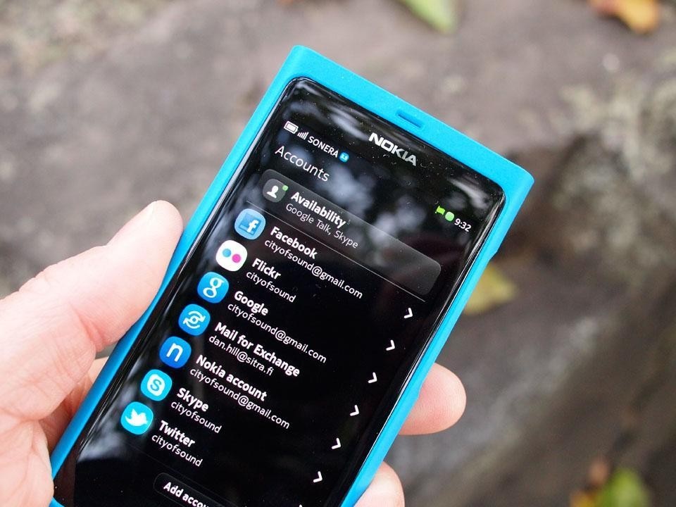
Calls and messages across multiple platforms are combined within the Meego OS. So the phone icon handles Skype, Google Talk and traditional voice calls; likewise SMS sits alongside chat from Skype and Google. Although slightly confusing occasionally, this is a major step forward, and indicates Meego's open stance, with core social media accounts essentially built in (whereas Apple has only recently added system-level Twitter integration).
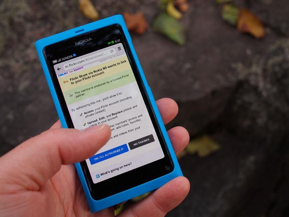
It actually has to do this, as Nokia have no particularly successful applications or application ecosystems (Maps may be an exception; Nokia's work well, though again, it's hard to see them competing with Google Maps or Bing Maps). So they have to borrow existing platforms, such as Facebook, Flickr et al. This is a good discipline for the OS, reinforcing the idea of the more open, cloud-connected device. Nokia can now afford to be a little agnostic about its software allegiances, at least with Meego, whereas for Apple or Google each allegiance is a strategic partner or competitor.
However, the poor applications ecosystem remains a major concern. It simply will not pull the range and diversity of apps that iTunes or Android can. Nokia could pay for the key apps to be made—the N9 ships with essentials, such as Twitter, Facebook and, of course that other purveyor of Finnish soft power, Angry Birds—but this approach is hardly scalable. And somewhat unforgivably, the Twitter and Facebook apps are not exactly best-in-class. Equally unforgivably, the web browser a little undernourished, again lacking the core features, pace and robustness of Apple's Safari.
Similarly, integration with other devices is still awkward, particularly for the many readers here who will be used to the peerless Apple ecosystem. This may change to some extent with the genuine adoption of 'the cloud'; integration might become easier once divorced of the need to transfer information via cables, with the phone instead merely a real-time portal onto cloud-based data, accessed simply by usernames. At this point the seamless hybrid of hardware and software that Apple have so successfully implemented ceases to be a major advantage, and an OS built with the cloud in mind from the ground up—Android, in other words—should be well-placed.
Meego could have been designed in this way, but is still caught in the transition between these two worlds. It may have been the right operating system, but it was in the wrong place at the wrong time: too late to challenge the emergence of iOS and Android, and too early to be built solely around the cloud. There are other issues with the software. The early Meego release oscillates between being very responsive, with barely any perceptible latency, to getting a bit jittery, a little slow to react on occasion.
Yet much of this could be solved by software updates—assuming the software will get updated—and on balance Meego pleases more than it frustrates. It's somewhat idiosyncratic, but this might also be a good thing, reminding us that its role is to exist as a suggested alternative. That is all it can do, at this point in the game, but it does it well.
Resisting hegemonic pull
Back to the bodywork, which is largely bereft of buttons, save for on/off and volume. The N9 is designed to have no 'home button', but instead one simply swipes through three primary modes: a screen listing all applications; another indicating currently running applications as legible 'cards'; and a third, rather elegant screen of notifications. You simply swipe across the device, sliding the thumb over the join of unibody and glass, to flip through these modes, from wherever you are in the OS. It has the clear virtue of simplicity, and of actually working.
This is obviously a clear break from the model of Apple's 'Home' button, which sits between all apps in iOS. Ahtisaari has suggested that Apple's button is akin to having to move from room to room in your house by exiting and re-entering through the front door each time. Although architectural metaphors for interaction design are dangerous territory, this one hits, well, home. In his speech at Copenhagen Design Week, Ahtisaari suggested that dominant models of phone-based interaction have "monopolised our imagination". Indeed, for the iPhone user contemplating a 'conversion', it's slightly disquieting to experience the uncanny muscle memory of the thumb moving to the (missing) iPhone 'home' button at base of the phone. The body as well as the imagination has been altered.
This implies a hegemonic power is being exerted by Apple, within design practice as well as the popular idea of what a smartphone is.
Yet what Nokia seems to be doing with the N9 is reminding us what the phone is. As we have seen, there are odd, probably unintended echoes of phoney-ness in the typeface, in the apps the N9 excels at. Elsewhere in software, there is a smart quick launch bar for phone, camera, SMS and web, accessed by holding and sliding from the bottom of the screen. Alternatively, tap the top of the screen and profiles—"Silent, Beep, Ringing", remember them?—can be selected, alongside networks. Call-quality is crystal clear, and signal strength is good. The shell doesn't interfere with interception, no matter how you hold it (note to Apple).
Again these are phone-oriented features, and very good ones. Perhaps as it mutated into the smartphone, the functionality of the phone itself got submerged somewhat. This N9 reminds us that the phone is still important. Unfortunately, it can currently only do this at the expense of the 'other stuff', which it handles rather less well. This is where, toe-to-toe with the iPhone 4S say, the N9 begins to wobble. It simply handles the smarts less well.
Imagine an inverted pyramid representing the Apple mobile product line, with the MacBook Pro at the top, moving down into the Macbook Air, then down again into the IPad, before miniaturizing further into the iPhone at the apex. Each step down the 'computer-ness' diminishes and the 'phone-ness' increases, yet Apple takes its knowledge of building computers and runs it through the entire stack, with iOS simply a version of MacOS. As a result, the flexibility and efficiency of its software is evident at each stage, just as integration is enabled up and down the pyramid. This strategic alignment has an impact on consistency of functions, interactions and integration, yet also the operational requirements of device maintenance, code libraries, and battery life.
Nokia has been effectively starting at the bottom of the pyramid, the phone, and trying to move up. (To be fair, when they started, there was no pyramid above the phone.) At the turn of the century, say, its software was perfectly adequate, focusing on calls, contacts, calculator, clock, camera, and SMS. A decade later, this phone-oriented DNA is now entirely inadequate, as the computer itself has become subsumed into devices of that size and form, as the smartphone. So here, the N9/Meego combo falls a little short: elements like displaying a PDF attached to an email, browsing the web, playing a wide range of video formats efficiently, never mind the diminished app ecosystem all belie this sisyphean struggle up the pyramid.
But the computer may still be different to the phone, and understanding this may be key to Nokia's future. In a nutshell, Nokia are good at phones, Apple are good at computers. Their products articulate the DNA of each company. If Nokia can continue to make the claim to be the best phone—after all, talking is not going to go away—whilst working with Microsoft to integrate their elements of software into their hardware, they just might be able to stake a claim in the next markets: those who want an alternative to Apple and Google; those who have some loyalty to Nokia or Microsoft; and the few billion who have no particular attachment to any of these brands.
So the N9's very phoney-ness isn't phony at all. It drives the product, the entire design, and it is here that the product is at its best, perhaps one of the best phones thus far.
In previous decades, Apple having a foot in both camps, hardware and software, was seen as a hindrance, with Microsoft able to become the default digital experience through software alone, piggybacking on the hardware of others through hugely profitable licensing. In mobiles, Nokia somehow managed to win the early skirmishes using Apple's strategy, also making the hardware and the software.
Now, however, a more sophisticated strategy is required when facing the serried ranks of Apple, Google, Facebook and Microsoft in mobile. Once it became clear that the internet would effectively reach into every part of our lives, the complexity of our identities meant that each of the major players could find a particular strategy, a particular bias. All these companies make tools, in the form of software, and the bias is betrayed in each.
It's not as if Apple particularly 'get' the internet—their essential strategy has been oriented towards media and cultural production—but this has forced them to engage with the platform like few others. Apple's work in licensing, packaging and discovery/storage platforms like iTunes/iCloud is as key to its success as anything.
Google, of course, sees their mission as to "organise the world's information". Of course media is information, in a sense, but Google has less appetite for the deal-making and packaging implicit in media, and more appetite for the raw software engineering of spidering and aggregating data. Facebook is essentially about people and relationships. It organises media and cultural production around people as 'first order objects'.
So if Apple is about media, and Google is about information, and Facebook is about people, what is Nokia about? It is now clear that it has long since stepped out of this game. And that was probably the right thing to do, even if it was backed into doing so. Stephen Elop, Nokia's CEO, was ultimately left with a clear choice between Android and Windows, with the opportunity to develop its own software as well as its hardware, essentially long gone. Without the clear focus described above, Microsoft may also struggle. Yet Windows Phone may be the best software that Microsoft has designed in years, if ever, and perhaps this will enable them to siphon a critical mass of users from existing platforms while finding new users elsewhere.
This N9 with Meego is a little over-complicated for the latter group. What Nokia had failed to do was make the mobile phone as usable as it now needs to be. Apple's great genius, seen most clearly in the iPad, is to continue to push the idea of 'the computer for the rest of us'. Of course, the great irony is that the most usable (Apple) have traditionally been used the least, whereas the least usable (Microsoft) has been used the most. This changed with the iPhone, at least briefly, yet Nokia, having popularised the mobile phone in the first place, also has a chance to make a device for the people, a real volks-phone. Indeed, it would be a deeply Finnish thing to do.
Having said that, the real opportunity for an operating system partner to open up new markets might have been Facebook rather than Microsoft. An idle strategic thought for another day.
Choice of life-partner was difficult for Nokia. Yet despite its size it simply could not fight on two fronts; it had virtually no option but to move out of operating systems, given its traditional strength in hardware design and the necessary logistics, manufacturing and distribution networks to deliver atoms rather than bits.
It's not as if Finns can't make software for smartphones. After all, the app that defines this initial era of apps—the ur-app, at least for the average punter—is Angry Birds, developed by Rovio, down the road from Nokia in Espoo. An entirely frivolous thing, Angry Birds is also a masterpiece of interaction design, witty experience design and elegant, taut coding, underpinned by an instinctive understanding of how to playfully tweak synapses. 500 million downloads and counting.
However, Nokia have never been much good at software. Even when one slipped open the wondrous body of the aforementioned Nokia 8800, it was the dreaded Series 40 OS that sputtered into life. The early days of mobiles were full of people saying how they preferred Nokia's intuitive interfaces over other manufacturers; the sad truth was that the Nokia interfaces were merely the best of an extremely bad bunch, and they all melted into air as soon as the iPhone emerged. But success in software now requires more than the ability to code. Apple built an ecosystem by manipulating the 'dark matter' of licensing, intellectual property rights, packaging deals and presentation. Apple's lawyers are as instrumental to their success as anyone. This is what enables iTunes, iCloud, and the extraordinary cultural phenomena that is the App Store.
This wrangling of 'dark matter' also includes the ability to manufacture and distribute, which is perhaps the work of new CEO and logistics wizard Tim Cook rather than Steve Jobs. As BERG's Matt Jones pointed out to me, it's not that Samsung can't make an iPhone. It's that they can't make an iPhone. Literally. Apple have the logistics network tied up. This, alloyed to their brilliant and relentless control of media, is what enables the iPhone experience to be so tight.
As globalisation continues to squeeze resources—Europe already imports 80% of all materials across its borders—these strategic issues directly affect the possibilities of materials at the device level. Jacqueline McGlade, Executive Director of the European Environment Agency, told me how Samsung now assesses new device ideas in terms of six categories, of which three now relate directly to logistics and material supplies: What stockpiles exist of a certain material? Can you get it? And how much does it cost?
Nokia is perhaps the only other company with a similar level of experience and capability in logistics and manufacturing mobile devices as Apple; indeed, logistics is arguably more in the company's DNA than mobile phone design is, and has been for over a century. In the long run, it could be that this mobile phone era ends up being no more than an extremely profitable 'blip' for Nokia. Jack Schulze and I once speculated it might find an effective business through exerting its logistics muscle as a platform for others, as a form of high-quality 'app store' for physical products.
But how long does it take to modify the DNA of a company anyway? And how do you do it? These will be the issues concerning the likes of Elop and Ahtisaari. Interestingly, Google's DNA has been able to extend very successfully from code to device, with their semi-open-source Android OS quickly becoming the best-selling for smartphones worldwide. Despite Android having no clear design strategy in terms of hardware so far—which has been a Microsoft-style advantage to this point—its forthcoming Galaxy Nexus intrigues.
There is little to suggest a major leap forward in handset design, though the ability to unlock the phone "by smiling at it" is a form of fully-embodied interaction beyond any of its competitors, more in concert with Microsoft's Kinect than multitouch. You do also wonder about the mischievous fun that Jacques Tati would have had with this idea, his character in 'Playtime' having to squeeze out a grimace of a smile to unlock his phone at the end of another day caught on the wrong side of modernity.
Oddly enough, another 1950s production might offer some insights into why the Nokia N9 remains an important product, specifically Roland Barthes' 1957 essay 'The New Citroën' (from Mythologies) concerning the now-iconic DS 19. The car, and the essay, enable us to place the N9 as a cultural object as well as drawing out its key design elements.
"I think that cars today are almost the exact equivalent of the great Gothic cathedrals: I mean the supreme creation of an era, conceived with passion by unknown artists, and consumed in image if not in usage by a whole population which appropriates them as a purely magical object." (Barthes, Mythologies)
It is of course a stretch, but we might think of mobile phones in the same way. Now firmly embedded in the Internet, it is perhaps the supreme creation of the age, almost a 'purely magical object' in its capacities, affordances and capricious potency, certainly now with that it is imbued with multi-touch, augmented reality, near-field communication and the like. It really is 'indistinguishable from magic', and yet here in the everyday. In that last respect it differs from the Citroën DS 19: the mobile is in fact consumed in usage as well as image. With over 4.6 billion mobile phone subscriptions worldwide, we might now be able to claim that most people use them, from the so-called 'bottom of the pyramid' upwards. They are a cathedral of sorts, but a personal, distributed, intimate version of the same. That is, if a cathedral can be seen largely as a communications device with spirits in the aether and one's immediate communities, which is, I understand, a bit of a reduction.
There is much in Barthes's adoration of the Citroën DS, which was after all also a mundane everyday object, that resonates with the N9. Barthes deconstructed the DS 19 into a assemblage of experiential elements. He wrote that it ".... excites interest less by its substance than by the junction of its components."
These "junctions" are redolent of the screen's 'meniscus' described earlier. As opposed to the way that the black bevel around the iPhone's screen is the same sheet of glass as its display area, the N9 makes a virtue of its glass screen being of different material and function to the polycarbonate shell, just as for Barthes, the windows of the Citroën were a sign that its design was an ultimately "humanized art", as opposed to the smooth, seamless perfection of Christ's robe or the airships of science fiction.
"The DS 19 has no pretensions about being as smooth as cake-icing, although its general shape is very rounded; yet it is the dove-tailing of its sections which interest the public most: one keenly fingers the edges of the windows, one feels along the wide rubber grooves which link the back window to its metal surround. There are in the D.S. the beginnings of a new phenomenology of assembling..." (Barthes, Mythologies)
This assembling is clear with the N9 too; where Barthes runs his fingers along the groove from window to bodywork, the N9's swipe interface is predicated on gliding over the perceptible edge of screen and body. Touch is thus richer with the N9 than most, which sets it apart from the often neutered physical experience of the iPhone et al. The genius of the DS 19 was to transform the love-at-first-glances engendered by its exterior form, the sheer allure of those flowing Gallic curves, into its embodied experience of controls, dials, seats, materials—into its very being—without any loss of wonder along the way. (Conversely, over the last decade car designers have been talking about instrumented exterior bodywork as interface, a movement in the other direction.)
"In the exhibition halls, the car on show is explored with an intense, amorous studiousness: it is the great tactile phase of discovery, the moment when visual wonder is about to receive the reasoned assault of touch (for touch is the most demystifying of all senses, unlike sight, which is the most magical)...." (Barthes, Mythologies)
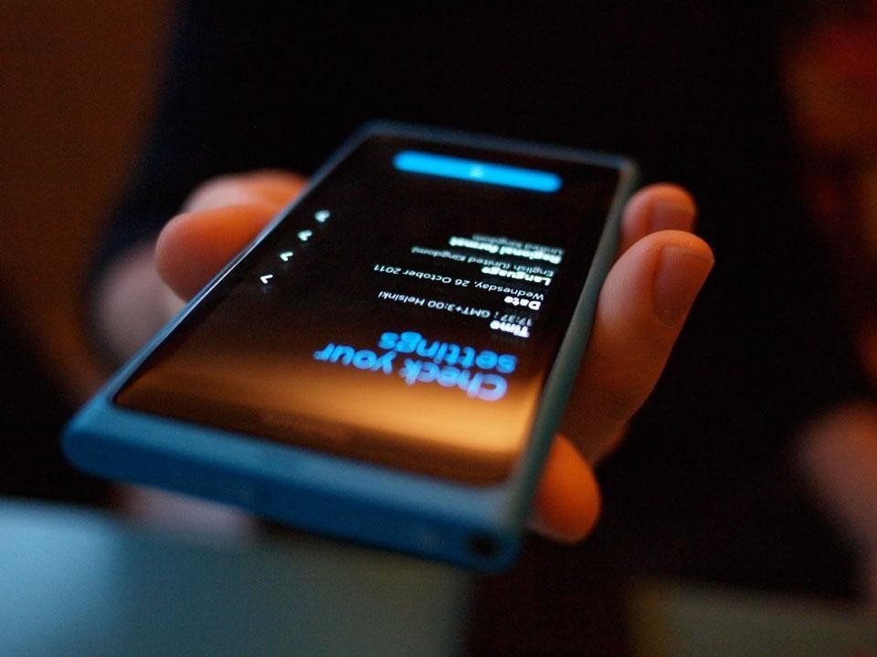
In this one simple move of rejecting smoothness in the connection between glass and body, and in underscoring this by an interface gesture—the 'swipe' from this edge—Nokia have elided physical and digital gestures to suggest a new range of possibilities in handset design. The N9 has thus got closer than any other mainstream phone in realising the value in "the polyphony of the senses", as Bachelard wrote. Combined with many of the new directions in Meego's interaction design and architecture, the N9 sketches some alternative trajectories for the mobile phone.
So the N9 is not so much a product as a pointer. It will soon be impossible, or perhaps pointless anyway, to buy. Meego is a dead man walking and the hardware will live on in a new cloned and cared-for body, as the Lumia. What Barthes couldn't have known, although he perhaps guessed as much, is that the Citröen DS would also not be a mainstream success. As Tony Judt recalls in 'The Memory Chalet', the attributes of the "sexily aerodynamic DS", perhaps the most comfortable, safe and technologically-advanced family car of its time, were more offset by the car's unreliability and idiosyncratic instrumentation.
The Citröen DS was ultimately destined to befall the fate of mummification as a 'design icon' rather than a major commercial success. Numerous beautifully-maintained examples are still just about running, maintained by obsessives who spend their Sunday mornings patching up fuel sumps, buffing white leather interiors and browsing eBay for increasingly rare spare parts.
Perhaps as with the DS 19, the N9 will also end up maintained by an army of enthusiasts, a lost classic filed away in some museum of digital artefacts, an open-source movement supporting and extending Meego as a kind of avant-garde alt.OS, augmented by 3D-printed replacement physical parts or modded components, as with Leicas and Polaroids.
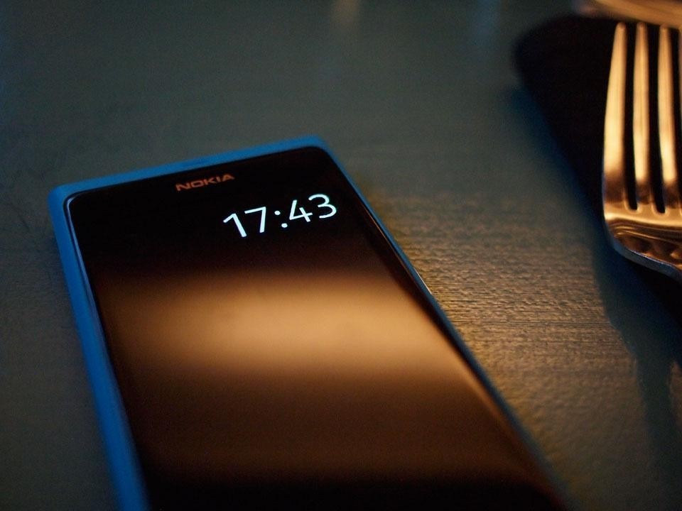
Yet before that fate befalls it, here and now the N9 is a pointer in two ways—towards a richer multi-sensory understanding of exemplary mobile hardware which suggests life beyond Apple's efforts, and an indication that Nokia can still produce such hardware.
It comes as no surprise, though it is a little creepy nonetheless, to learn from his sister after his death that Steve Jobs probably had dozens of the same Issey Miyake black turtlenecks at home. It is this limited range of expression that Apple must address. For all the value in a limited product range—the confidence, the ease of inventory, the simplicity—it cannot be the only way, in all cases. Nokia, with the N9, has quickly indicated that other design strategies are possible, and that they can be good.
In business strategy however, it's a rare and unusual move—to release a product to simply change the conversation around the company, giving the stock price a breather and in effect simply preparing the ground for its successor. The N9 is the platoon told to climb up out of the trench and run through the barbed wire towards the enemy machine guns, trying to take as many with them before the more concerted assault.
Whether that shotgun marriage of Windows Phone and Nokia hardware and logistics can be a happy union remains to be seen, but Nokia have laid down a marker with the N9, a plausible pointer to alternative futures, futures featuring greater diversity of expression in these everyday portable cathedrals of communication, and for that alone they deserve much credit.
