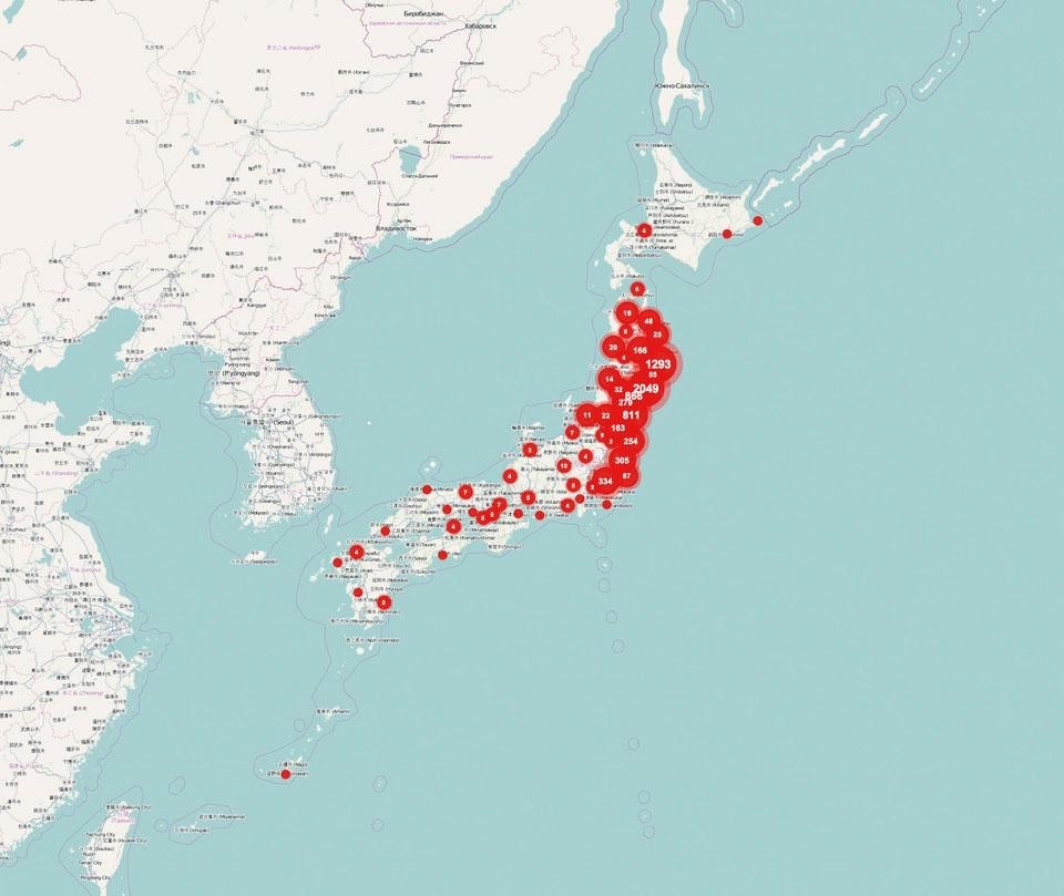
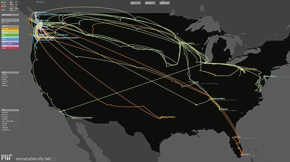
In the past 20 years, design has branched out in many new directions that have galvanised young practitioners, sparked business models, and set the worldwide education system on academic fire. There are many different ways in which one can be a designer today, working for instance on interactions, interfaces, the Web, visualisations, typefaces, socially-minded infrastructures, 5D spaces, sustainability, games, critical scenarios, and yes, even products and furniture. In the coming decades, the rest of the world will catch up and design will be embraced as a methodology and philosophy by politicians, scientists and economists who are willing to have a human, holistic and constructive perspective on the world. With this series of articles, we ponder how far designers have come and how far they still have to go to be ready, one design type at a time.
It is correct to credit the digital revolution with the seismic shake-up that is redrawing the design universe, but many other strong forces are at work. The awareness of the scarcity of resources and of the toll our living habits are taking on the environment are slowly leading us to cut down on physical possessions. Some of the fulfillment and escape we used to attain by giving in to our guilty consumeristic pleasures has been absorbed by the experiences—even consumption ones—that we can have online. And the armies of designers, engineers and entrepreneurs working on the liminal spaces inside our screens rely on their skills and on cognitive science to craft environments that integrate and expand our life on earth. Visualisation design is crucial to this integration.
Visualisation design has existed since the beginning of time, a direct expression of our desire to understand, describe and bring complex phenomena down to human scale. Maps and diagrams are its most obvious manifestations, and the history of modern visualisation design has its well-known milestones—such as Charles Joseph Minard's 1869 schematics of Napoleon's and Hannibal's military campaigns, John Snow's 1854 diagrammatic reading of a cholera epidemic in London (which demonstrated that cholera is a water-borne disease), or Harry Beck's immortal 1933 map of the London Underground—and chroniclers, such as Edward Tufte and Peter Hall. While maps and diagrams are classic examples, visualisation also comes in the form of installations and dynamic narratives, such as Charles and Ray Eames's 1968 film Powers of Ten and their installation Mathematica of 1961.

In the past decade, Ben Fry has set the benchmark against which all ambitious designers need to measure themselves. Fry graduated from MIT Media Lab's Aesthetics + Computation group at the time when John Maeda was continuing the legacy of the great and late Muriel Cooper (the programme's founder), and his undeniably gorgeous projects are visualisations of highly complex data sets. His work ranges from collaborations with scientists on, for instance, protein homology, to speculative analyses of dynamic correlations, such as the one between a website's evolution and its usage, or between the lines of code behind Pac-Man. Fry has single-handedly demonstrated what David McCandless transformed into a motto—and a website and book—which proclaims, information is beautiful, even when it is esoteric. In his quest to provide new tools for talented designers who are unafraid to be elegant, Fry together with his Media Lab colleague Casey Reas developed Processing, an open-source programming language based on Java. Simple enough to be picked up by non-programmers and sophisticated enough to be used for high-level design, architecture, visualisation and animation projects, Processing has already had a significant impact as a powerful and inspiring design tool.
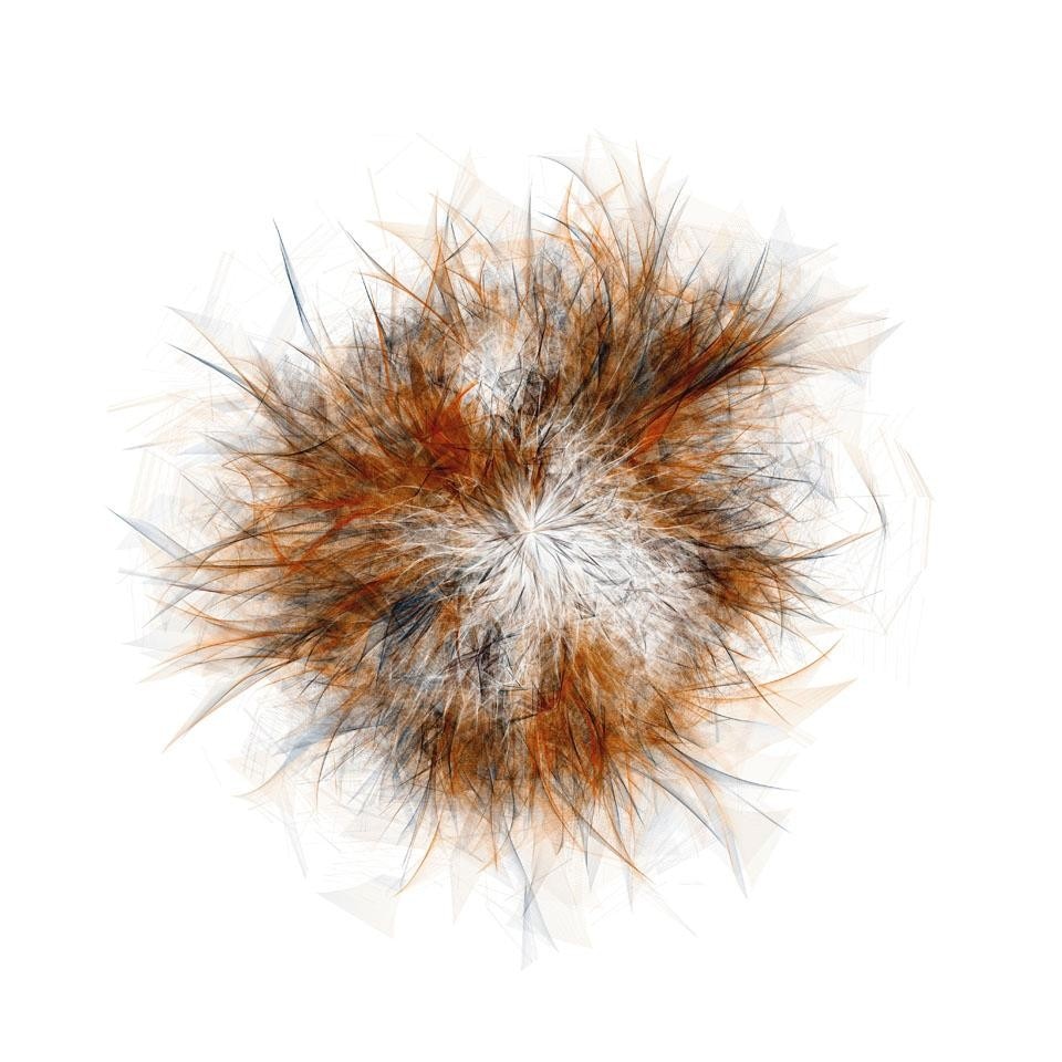
Good visualisation design, one of the most promising and important forms of contemporary practice, helps merge quantitative and qualitative by giving data a sensual, aesthetic and therefore humanly communicative face.
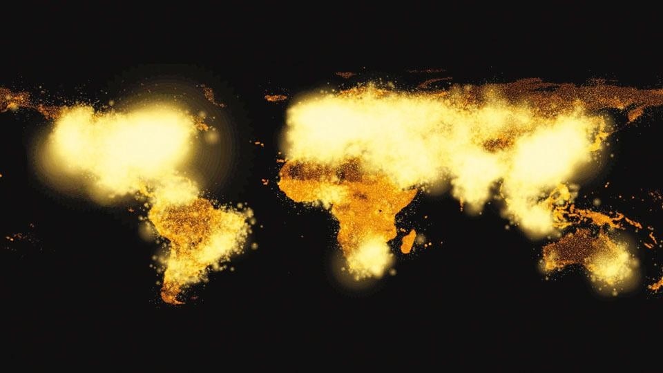
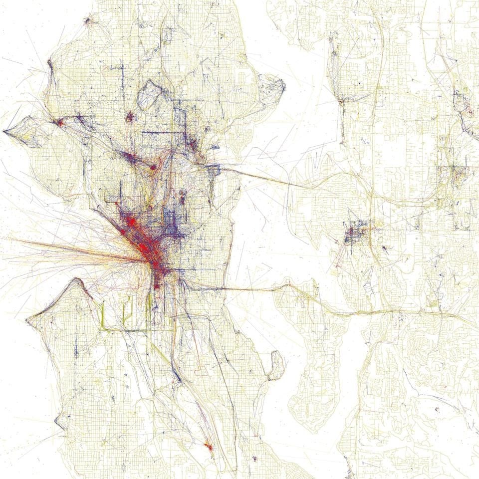
The abundance of interactive and open-source maps has inspired many designers to cull information and layer it on top of them for different purposes, from leisure tourism to emergency management. Here are four notable examples. Locals and Tourists uses geo-tagging data from the photosharing websites Flickr and Picasa to pinpoint tourist hotspots and locals-only stomping grounds in 126 cities—Milan, New York and Salzburg among them. After harvesting millions of data points, Eric Fischer links them by photographer and date taken and then plots them on a city's OpenStreetMap grid. A photographer with many shots of the same city and a long photo history can be assumed to be a local and is represented in blue; someone whose photos are taken within a limited time period is assumed to be a tourist and represented in red.

Paola Antonelli
NOTES [1] Elisabeth Bumiller, "We Have Met the Enemy and He Is PowerPoint," in The New York Times, 26 April 2010.
