For millennia, humans have pursued the idea of perfect memory. It's an ambition that has led to the development of much of our media, from books to the internet. For most of our existence, however, forgetting has been the default and remembering the exception.
Yet when Facebook Timeline was launched in December 2011, it was with the promise of "the feeling of telling someone your life story, and the feeling of memory — of remembering your own life." As ambitious as this sounds, from a historical perspective it is simply the latest attempt at a digital memory can both augment our 'frail' biological memories and supersede our various analogue records. This has been a theme in computer science since the discipline fully emerged after World War II, yet in pre-digital form it arguably stretches back to Ptolemy and the great library at Alexandria.
Facebook Timeline is not quite there. While Timeline really only remembers your activity in social media, and so just a tiny proportion of one's existence, it is interesting for two reasons:
First, it is an exemplary bit of interaction design, balancing technical innovation and business strategy with a narrative sophistication appropriate to an attempt to trigger memory.
Second, Timeline hints at what it might mean to be immersed in systems that capture our every move, and which comprise an augmented memory that may significantly alter our sense of who we are and what we do.
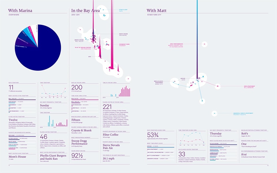
Feltron & Co
To the first point, to provide a new interface for Facebook is a daunting product design challenge: what other single product or service has 800 million users? While there are around 1.25 billion Windows users worldwide, according to Microsoft, this is spread across numerous versions. The ticketing systems for the Indian state railways tickets only have to deal with 30 million daily passengers. The most manufactured car of all time, the VW Beetle, shifted around 22 million units; with re-sales, that's perhaps 100 million users. Mikael Kalashnikov's AK47 assault rifle comes in at around 75 million units, according to the World Bank. If China had an electoral system to produce, perhaps that would be a similar scale of design problem. Currency systems presumably serve more. Tetrapak have a decent claim, at an extraordinary 150 billion packages per year globally.
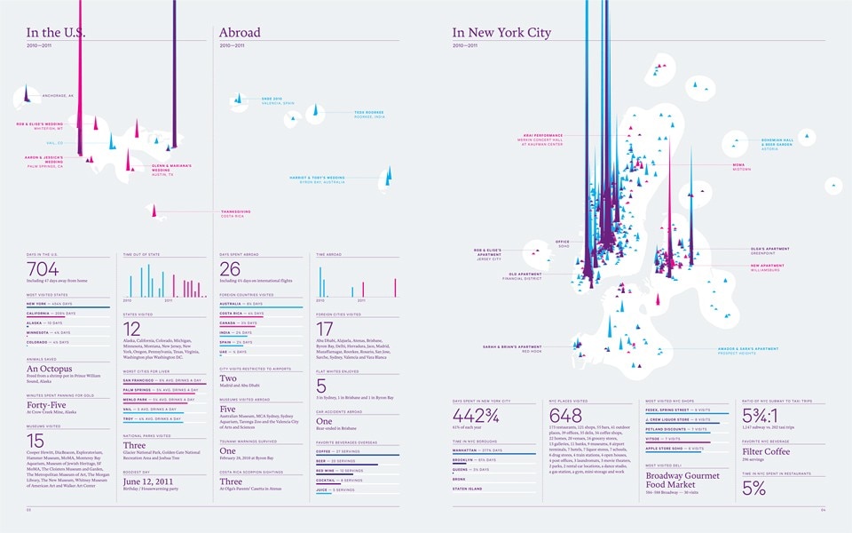
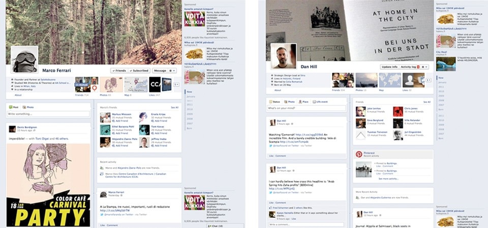
At face value Facebook Timeline does a similar thing. It records and sequences your Facebook-related interactions over time, latest at the top, below a panel of summary objects that convey the user "at a glance". This is a presentation of self in everyday life in a few hundred pixels, and as you scroll down, your life (sort of) unfolds before you. Technically, it's some achievement. The interaction and architecture is far more coherent and discreetly sharp, balancing an increasingly complex set of interactions within a presentation and vocabulary that feels both intuitive and elegant. Felton and team have delivered a step-change in the quality of the Facebook experience, with the last vestiges of Mark Zuckerberg's dorm room finally expunged, save the conservative true blue hue. Where Facebook was once essentially 'un-designed', the most basic of veneers hung over a software engineer's default layout, now it has both the structure and skin of the best web services.
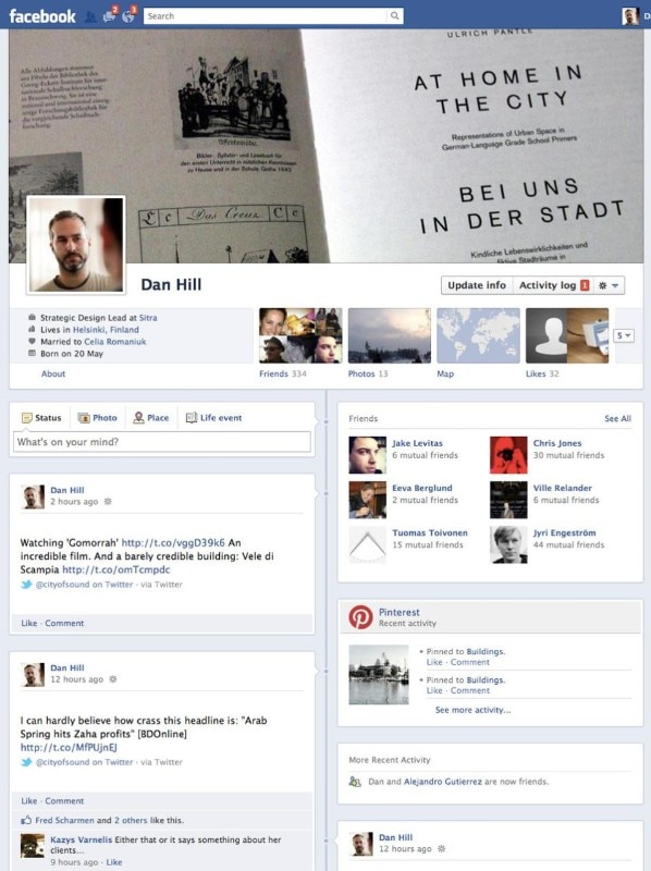
Structurally, the "frictionless apps" that are woven into the Timeline are a big step forward, creating the kind of ecosystem dreamt up during early discussions around the Semantic Web, though hardly in the terms imagined by those doing the dreaming.
Given this easy orchestration of media, apps, games, services, places, objects, people, and relationships — the core social objects of this world — we might even see Timeline as a sketch of an entirely new operating system interface, in which your data, and its semantic containers, is organised over time, rather than by the pseudo-spatial layouts of desktops. (Seeing time as a organising principle in this way would be interesting; you can imagine you might even roll Timeline forwards as well as simply backwards, indicating a new form of calendar or diary, or aspirational planner.) For all its quiet demeanour and apparently "obvious" pragmatics, Timeline illustrates how sophisticated Facebook's thinking truly is.
This wider strategy, of course, actually makes it quite different to Felton's Annual Reports. Timeline doesn't have the same motivation, and so does not carry the same humour or humility. Moreover, the success of the Annual Reports is predicated on the bespoke compositions of editorial design. Design for web has to build flexible composition systems that can handle unforeseen material, balancing discrete elements within an organised canvas. With Timeline, the resolution is necessarily more austere, less playful, and some of the grace and wit that saved the idea of a personal Annual Report is lacking a little as a result. Users of social media look for such grace and wit — or equivalent — in the content rather than the structure, of course.
For all its quiet demeanour and apparently "obvious" pragmatics, Timeline illustrates how sophisticated Facebook's thinking truly is.
The continually unfolding vertical list is an intensely pragmatic form, only reinforced by multi-touch interfaces that mean scrolling has little physical overhead anymore. In fact, it is still essentially the dominant form. The default.
Noting the early computer's delivery of data via vast piles of dot-matrix printer paper un-spooling from sprockets across the air-conditioned surfaces of 1960s laboratories, could it be that the basic mode of displaying digital information is still best served by a long vertical line of shortish chunks of information, one after another? Is this some terrible secret of structural interface design, that at heart, that is all we have to design?
Timeline certainly does not break radically from this mode, save through a single control calibrating the year to jump to. There is no sense here, for instance, of how an interface could explore the horizontal relationship between connected users' timelines, by visually offering horizontal connections to other users.
But for a contemporary idiom, the spatial organisation of time benefits from a long history, stretching back to at least to 264 BCE. The Annals of St. Gall, a Frankish manuscript, was produced during the 8th—10th centuries, and features lists in chronological order with dates in a left-hand column. These are Facebook Timeline's distant ancestors. (Facebook's march into China, and the next billion users, might even be aided by Timeline inadvertently recalling Qing Dynasty narrative scrolls.)
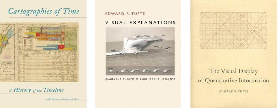
Cartographies of Time, by Daniel Rosenberg and Anthony Grafton (2010), notes how the form has become "one of the central organising structures of the contemporary user interface." Although they suggest that the timeline familiar from Web 2.0 does not "promise an advance", the basic intention of the timeline remains valuable: "to clarify a historical picture—to offer a form that was Intuitive and mnemonic, and that functioned well as a tool of reference." Facebook Timeline is certainly intuitive, and through its sheer simplicity probably fulfils the reference tool criteria too.
Yet the great information designer Edward Tufte has little to say about the timeline in his magisterial quartet of books, save for dwelling on Charles Joseph Minard's data-time-map (1869) of Napoleon's fateful invasion of Russia in 1812 and the "cyclogram" narrative produced by the Cosmonauts Georgi Grechko and Yuri Romanenko on board the Salyut 6 space mission in 1978.
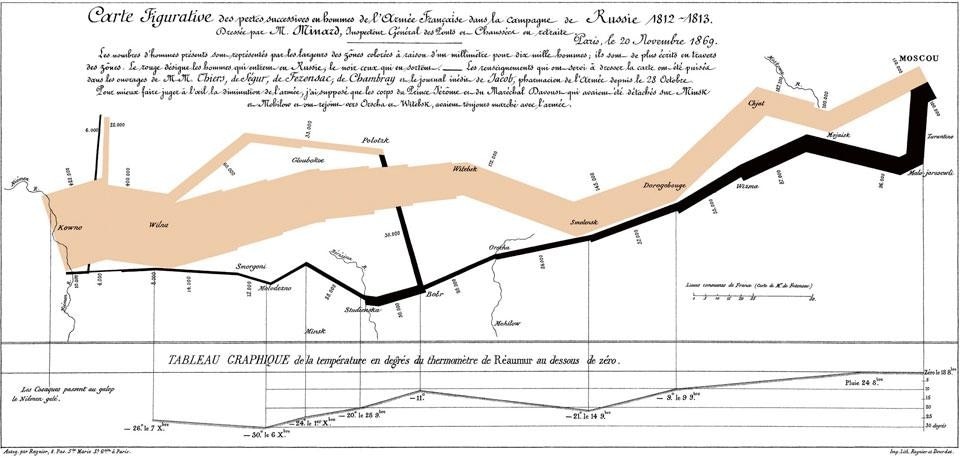
Felton was certainly aware of these precedents, but had to manoeuvre the default horizontal form of the timeline into the verticality of web idioms. He told Domus, "I've found that Minard's treatment fits very few sets of data, but your average horizontal historical timeline was a key reference at a critical point in our development. As we wrestled with how to make the historical relationship of units clearer, Mark (Zuckerberg) suggested that we think of this example rotated 90 degrees and introduce a central spine to our layout. After a weekend of tinkering with this idea, the current layout with units pointing to a time line appeared to be a viable way of solving the chronology problem."
Other than this right-turn, Facebook Timeline does little to advance the basic timeline formally. It doesn't need to. The more profound issues here concern how it might change human memory itself.
Lipstick traces
Memories are most powerfully triggered by sensory stimuli: lipstick traces on a shirt collar, a cardboard box of sticky Polaroids, grains of sand in the bottom of a suitcase, the smell of dubbin, liniment and dried mud on old football boots, the sound of a dusty grandfather clock, the feel of moss and lichen on granite boulder … Or most famously, the taste of a soggy madeleine in Proust's In Search of Lost Time.
Without that sensory richness, for Facebook Timeline the key trigger is photography, and increasingly video. This is partly pragmatic again. Now that more people are carrying cameras around with them than ever, in the form of the smartphone, services such as Facebook deploy photography as Alfred Stieglitz saw it, as "the exploration of the familiar", a series of markers and sensations of everyday life. Annie Leibovitz describes the iPhone as the contemporary equivalent of "the wallet with family pictures in it".
As Barthes put it, cameras are "a clock for seeing", indicating that they are a visual representation at a particular point in time (well-suited to Timeline.) Yet as Geoff Dyer wrote in But Beautiful, his extraordinary book largely constructed from a few images, the photograph implies a blurrier sense of time than the mechanical snap of the shutter indicates: "Although it depicts only a split second the felt duration of the picture extends several seconds either side of that frozen moment to include—or so it seems—what has just happened or is about to happen." So photographs are suggestive of times, rather than pinned in time.
Equally, if photographs are about one's interior life, them becoming the substrate of social media turns this functionality inside out, as interior lives become exterior. Photography is in an transitional mode at this point. Just as we are probably reading more words than ever, we are taking and viewing more photographs than ever, increasingly in the mode of the jiittery auto-capture of late-period Garry Winogrand. It has become a cliché to note that people stand at concerts watching the lens of their phones held aloft. Yet to record life through photographs, and increasingly short videos, seems to be the default, an almost unthinking instinct, an everyday act for everybody on Facebook.
There is a further wrinkle here, thanks to the current vogue for post-shot filtering of mobile phone images. Instagram's default settings overlay a sunny, golden-hued filter over photographs, over-exposed and over-saturated as if a false memory of some Californian childhood. One of Instagram's popular filters is called "1976". Their product promise — "Transform the look and feel of the shot into a memory to keep around forever" — is somewhat ambitious. Can a simple filter transform a photo into a memory? What alchemy is this? But in cleverly aping the style of the Polaroid, which is forever associated with the idea of "instant memories", the Instagram aesthetic is a perfect partner for Facebook Timeline.
But there are other ways that digital media can denote memory, which in their contingency and unpredictability are closer to a moist madeleine than a fake filter.
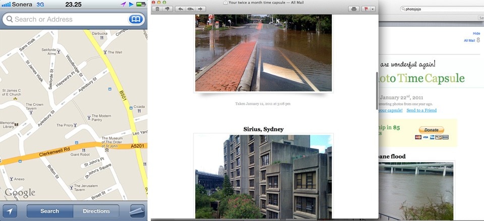
PhotoJoJo PhotoTimeCapsule is a service that emails you five photos every two months, drawn from your Flickr stream of a year earlier. It's a simple conceit, but surprisingly effective, using an essentially looser approach to a timeline that is far more evocative. (As I write this in snow-bound Helsinki, the twice-monthy email arrives reminding me that this time last year I was about to be hit by the Brisbane floods.)
Another example of evocative digital traces: accessing your phone's maps application for the first time since returning from an overseas trip, you find the map application still centred on that foreign place. From your home town of Milan, say, you are briefly transported back to a memory of Hamburg for a stolen moment, represented as a vaguely familiar cached urban form, before an orbiting satellite relocates the app from Hauptbahnhof back to Navigli, gliding across space, time and memory in seconds. These are the grains of sand in the suitcase…
Which brings us back to memory. Viktor Mayer-Schonberger, in his book Delete: The Virtue of Forgetting in the Digital Age (2009), wrote powerfully of the danger in pursuing the 'perfect digital memory'. If only he'd known what was coming.
An earlier Facebook prototype was explicitly called "Memories", yet it's clear that Timeline is a major step forward from that too. Looking at early sketches for Timeline, you can see Facebook's designers toying with alternative categorisations before choosing time as a "universal" organising principle, with Felton saying "I felt strongly that your life should be shown in one long continuum… You gently consume time."
In other words, you gently accrete Facebook memories through your interaction with the site and linked web services. Timeline builds itself as s side-effect. It never forgets by default; a user can intervene to hide, downplay or remove events, but such is the nature of web services that most won't, even given the refined design.
This is a perfect example of Mayer-Schönberger's premise for his book: that remembering has become just a bit easier and cheaper than forgetting. He argues, however, that forgetting is actually a key attribute in human development. Forgetting frees us of past events, in a way, as our memory is a living construct, constantly being reconfigured based on present needs. Mayer-Schonberger quotes psychologist Daniel Schacter, who "suggests that our brain constantly reconfigures our memory—what we remember, based at least in part on our present preferences and needs. For Schacter, our memory is a living evolving construct." We build our episodic memory as we go along, rather than simply accessing some objective truth.
Fundamentally, not forgetting affects our ability to make decisions. Mayer-Schönberger draws from a 1942 short story by Jorge Luis Borges, in which the protagonist is unable to forget anything. The passage in Mayer-Schönberger's book reads: "'To think,' Borges writes, 'is to ignore (or forget) differences, to generalize, to abstract'… Perfect remembering for Borges threatens to afflict its victim with a never-receding cacophony of information from which no clear abstract thought emerges… Whereas human forgetting is the very quality that lets us rise above the particular to grasp the general."
Ironically, we may get little sense of perspective when presented with an endless Timeline of memories. Without forgetting, we are compelled to live in the past, to feel the weight of memories obscuring our ability to live in the present, to act. (This is almost a rear-view mirror of British philosopher John Grey's critique of our obsession with the future. Perhaps both are "failing to cherish the present — the only time that is truly our own.")
For the bulk of social media's content is of course transient, despite Timeline's intrinsic insistence, and a similar social media app, Path, handles this slightly differently. Path's habitus is tied to smartphone, and the smartphone is not really a device for concerted browsing of deep archives. So things "fall off the bottom" of one's "path", and it does not matter. Path innately conveys the ephemeral nature of such material, comprising a thin but meaningful skein of interactions, often in photo and video, between close friends. You can keep scrolling down to view old events on Path — it's just that you wouldn't. It's about now, and a few hours back.
(Path's tighter organisation of its "social graph" — the set of relationships between users — also helps. Limited to 150 "friends", this number is presumably derived from "Dunbar's Number", after the British anthropologist Robin Dunbar, who proposed that there was a maximum number of stable social relationships that the human neocortex could maintain, hovering around 150.)
Path works as a timeline with other people in it; it perhaps suggests that Timeline's interface metaphor could extend to Facebook's News Feed too. You can't see Path developing the overwhelming weltanschauung and business model that Facebook will, but it does seem to understand that much of this data might be only be meaningful at the time.
Yet such platforms should keep ephemeral data. One never knows the future value of something; the BBC deleted forever several hundred episodes of its classic Doctor Who programme in the mid-60s as the magnetic tape was thought to be more valuable than the Doctor. Though someone's status update is hardly the same as an episode of Doctor Who, it might still make sense to keep the data; imagine the possibilities for a contemporary Mass Observation project, if nothing else.
It's making it so effortless to recall that may be problematic.
Mayer-Schonberger's proposed solution is user-set expiration dates, where we pause to consider what's worth keeping. Unfortunately, a suggestion from 2009 already feels outdated, and doesn't scale to the torrents of data, often auto-updated, that a Timeline might be composed of. Expiration would take active calibration of an increasingly large number of feeds, meaning that it will only be done by the kind of people who actually read the Terms & Conditions when installing a new version of iTunes.
It might make sense instead to render ephemeral data a little less obvious to access, and so remember. How can we make such data a little rusty, so that forgetting is cheap and remembering is hard again? (Funnily enough Twitter appears to achieve this "forgetful" condition through consistently poor performance, which is one way of doing it.)
Felton and team approached this through a form of layered recall, suggestive of short term and long term memory. He says, "I'd like to think that Timeline succeeds at representing your history in a way that mirrors personal memory. The most recent section are your freshest memories and are all apparent. As you travel back in time the years become abbreviated and only the highlights are initially visible. For users who have filled out time periods before they joined Facebook, it's witness to what they or others remember about their past and starts to form a collective memory as classmates post their 2nd grade photos or parents tag their children."
The deepest irony here is that Facebook, despite its basis in the trivial, or at least highly personal, seems to have played a pivotal role in both the Arab Spring and Occupy Everywhere. From the utterly banal to the most significant events of our age, on the same platform, using the same interface. Again, we are looking at a new kind of design challenge here, for a genuinely new form: an interface for a shared social memory. Yet with its tendency to preserve all events, it inadvertently celebrates memory without judgement. We really are only looking back through Instagram's sunshine-tinted hues. It's as if that "endless continuum" will just be comprised of happy marriages, fulfilling jobs, uncomplicated births and flirty smiles — "good times".
In her memoirs, Joan Didion challenges the reader to consider the pain also involved in memories: "You have your wonderful memories, people said later, as if memories were solace. Memories are not. Memories are by definition of times past, of things gone. Memories are of the Westlake uniforms in the closet, the faded and cracked photographs, the invitations to the weddings of the people who are no longer married, the mass cards from the funerals of the peoples' faces you no longer remember. Memories are what you no longer want to remember."
Reading Didion, you are reminded that Facebook is a young person's plaything (accepting that there is a substantive difference between memoirs and memories, and the personal tragedies that mark Didion's memoirs in particular.) While it has older users of course, no-one has yet grown up and grown old with Facebook. No-one has as yet been subjected to the sensation of having to deal with the emotional weight of memory described by Didion through such a mundane and public presentation of self. Facebook Timeline is a life laid bare. We cannot know what it will feel like to live with it, running alongside our everyday life like a ever-growing shadow.
While Facebook Timeline is a quite brilliant example of a contemporary interaction design retrofit, it appears unsure of the value in forgetting. Through Felton et al's careful layering and aggregating, older memories are not immediately obvious, but Mayer-Schönberger would point out that they are still all there, and for him at least, that may be building a problem.
The next great design challenge would be to work with the grain of social media, its essential everydayness, while enabling both remembering and forgetting in a way that more constructively supports how we might relate to each other, and better build our representation of self. Nicholas Felton understands that Facebook's "many avenues of self-expression", in his words, offer a unique possibility to explore a mirror of personal memory as social experience; the challenge may be finding the motivation for Facebook, as a business, to do so.
It might be worth focusing some of their considerable intellectual resources on the value in forgetting, however, for the automatic generation of a multitude of personal histories is not necessarily a good thing. As Hegel said, the only thing we learn from history is that we learn nothing from history. This is not necessarily because we can't remember, but because sometimes, perhaps, we shouldn't.
Dan Hill (@cityofsound), strategic and interaction designer
[Read our exclusive interview with Timeline's design lead, Nicholas Felton]


