Pedro Campos Costa's Oceanário

With the addition completed last April, the Oceanário has become one of Portugal's new iconic buildings.

It is the addition to the Oceanário, which is among the most popular places in the Parque das Nações, an area that was completely transformed during the 1998 Expo with projects by such architects as Alvaro Siza, Eduardo Souto de Moura and Santiago Calatrava.

Commissioned in 2008 by the Parque Expo and the direction of Oceanário, the building was completed in record time despite the substantial changes made to the project during its construction. The evolution of the design from the initial idea to its completion saw the Campos Costa Arquitectos office work closely with client, construction companies and scientific advisors, encouraging a dialectical relationship that respected the many needs expressed. The proposal was based on certain principles that guided its development: relationship with context, relationship with the existing building and energy sustainability which has played a fundamental role in Costa Campos' research since his studies.

The new complex, hosting temporary exhibitions, an auditorium and services for the public, is the new entrance to the Oceanário, which was designed in 1998 by the American Peter Chermayeff and to which it is connected by a suspension bridge. It is an irregular prism whose sides are differently inclined serving as a counterpoint to the Chermayeff project and relating to the square and surrounding buildings. It is characterized by refined formal simplicity accompanied by an elaborate treatment of the exterior surface and the creation of dynamic spatial complexity—identifying traits in Campos Costa's work from the Casa não Casa to the competition for Padiglione del Portogallo for Expo 2008 in Zaragoza.
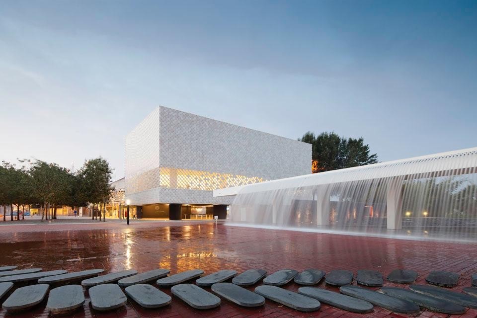
Continuity with the surroundings is enhanced by the structure, suspended on seven concrete pylons, which seems to hover in the air creating a covered public space. The square enters the building ideally highlighting its remarkable urban qualities. The goal is to fit smoothly into a system that over the years has proven its effectiveness for transforming a run-down area into an important place for Lisbon inhabitants and for tourists. The new architecture unfolds on three levels connected by a stair that is one of the most significant elements in defining interior space. Located in the core of the building, it owes its formal evolution to the three height differences that characterize the building. It connects the entrance hall to the basement, where there is an auditorium for 125 people, and with the upper level, which houses 600 square meters for exhibitions and the café/restaurant.
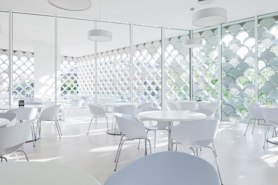
And the cafeteria is one of the best places for visitors. Here space seems to be defined by natural light which enters through the building's exterior surface which, from compact, thins out facilitating the osmosis between the interior and the surrounding cityscape.
The study of light as a design element was central to this project since the first proposal in 2008 which called for a precast concrete structure that 'dematerialized' in correspondence to a series of openings placed in different positions.
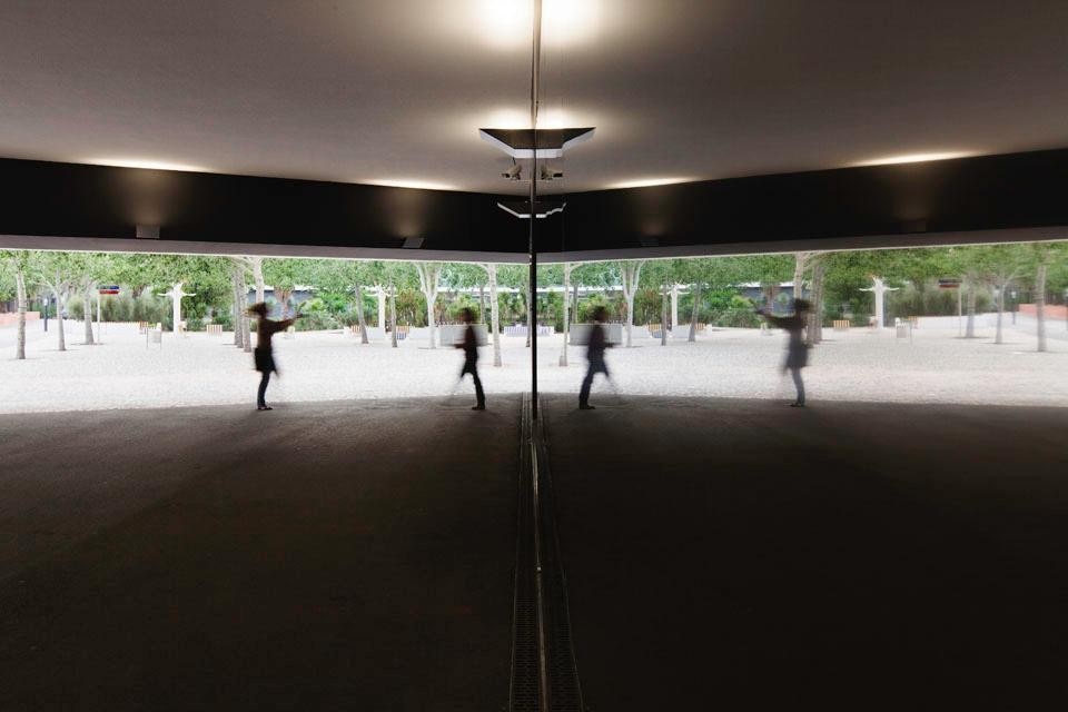
Top image: View of the building with the existing plaza and fountains. Above: the mirrored wall in the building entrance. The projecting volume transforms the entry space into a covered plaza modulating the transition between interior and exterior. Photo © <a href="www.brunecky.com" target="_blanK">Radek Brunecky</a>
Top image: View of the building with the existing plaza and fountains. Above: the mirrored wall in the building entrance. The projecting volume transforms the entry space into a covered plaza modulating the transition between interior and exterior. Photo © Radek Brunecky
The current solution is undoubtedly the most scenographic. The exterior skin is covered with more than 5,000 ceramic pieces distinguished by slight variations in color, like the skin of a fish or the rippling surface of water touched by sunlight. The material, which thins out at the cafeteria to create multiple lighting effects, is the greatest technological challenge in the entire construction process. Created by Ceramica Cumella, prestigious artisanal industry linked to the working of ceramics in all its forms, it is an experimental solution designed together with the architect Campos Costa for the occasion in an attempt to enhance the tactile and material characteristics of the architecture; a unique test of the relationship between producer and architect, in the search for innovative, rather than uniform, solutions.
Continuity with the surroundings is enhanced by the structure, suspended on seven concrete pylons, which seems to hover in the air creating a covered public space. The square enters the building ideally highlighting its remarkable urban qualities.
Top image: View of the building with the existing plaza and fountains. Above: the mirrored wall in the building entrance. The projecting volume transforms the entry space into a covered plaza modulating the transition between interior and exterior. Photo © <a href="www.brunecky.com" target="_blanK">Radek Brunecky</a>
Top image: View of the building with the existing plaza and fountains. Above: the mirrored wall in the building entrance. The projecting volume transforms the entry space into a covered plaza modulating the transition between interior and exterior. Photo © Radek Brunecky
The result is not the usual mechanical composition of standardized elements but a skin with powerful artistic qualities that transform the building into "a luminous, transcendent, wonderful environment."

"What excites me most about my profession as an architect," says Pedro Campos Costa, "is the need to pursue and realize a dream. Basically this is the most trivial and irrational quality that distinguishes us from machines or animals. Our society seems to need to be like an excel spreadsheet but poetry continues to reside in an uncertain place." Emilia Giorgi

Oceanário, Lisbon
Architecture:
Campos Costa Arquitectos
Coordinator: Pedro Campos Costa
Concept: Pedro Campos Costa, Marta Onofre, Ivan Teixeira, Ana Mendes
Execution: Pedro Campos Costa, Duarte Santo, Mário Ferreira, Francisco Lemos, Marta Onofre, Alessia Allegri e Daniela Figueiredo
Consultants: Countant Aquariums
Structure: Betar, estudos e projectos de estabilidade
Specialties: EPPE, estudo prévio, projectos de engenharia
Mechanical Installations: Promee
Acustica: Dblab
Urban solid waste: Laqre
Client: Parque Expo'98 SA and Oceanário de Lisboa
Final construction cost: 3.700.000 euro
Built area: 4000 m2
Main material: ceramics facade (Cumella Ceramics, Disset, Spain)
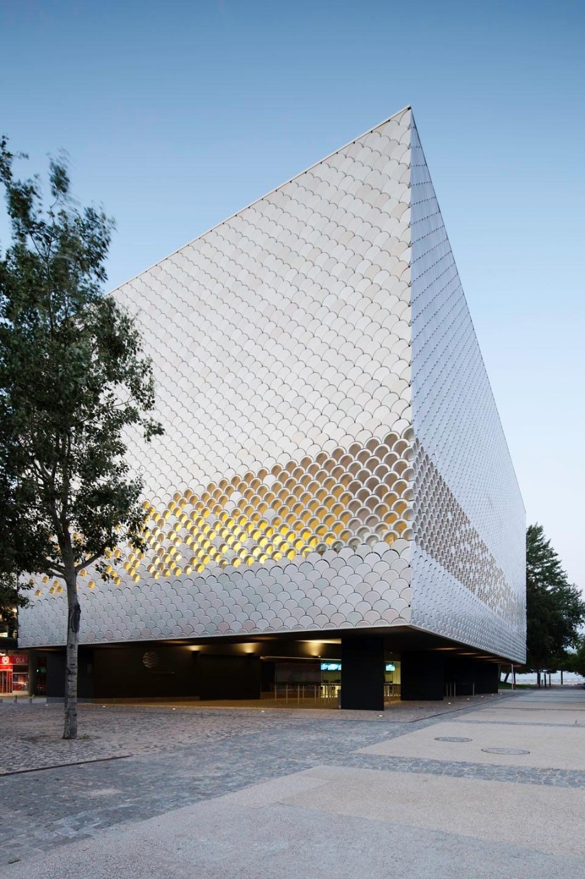
View of the building exterior. Photo © <a href="www.brunecky.com" target="_blanK">Radek Brunecky</a>
View of the building exterior. Photo © Radek Brunecky
View of the building exterior. Photo © <a href="www.brunecky.com" target="_blanK">Radek Brunecky</a>
View of the building exterior. Photo © Radek Brunecky
The cafe/restaurant. Here the building exterior, from compact, thins out filtering natural light and enhancing the fusion between interior space and the surrounding context. Photo © <a href="www.brunecky.com" target="_blanK">Radek Brunecky</a>
The cafe/restaurant. Here the building exterior, from compact, thins out filtering natural light and enhancing the fusion between interior space and the surrounding context. Photo © Radek Brunecky
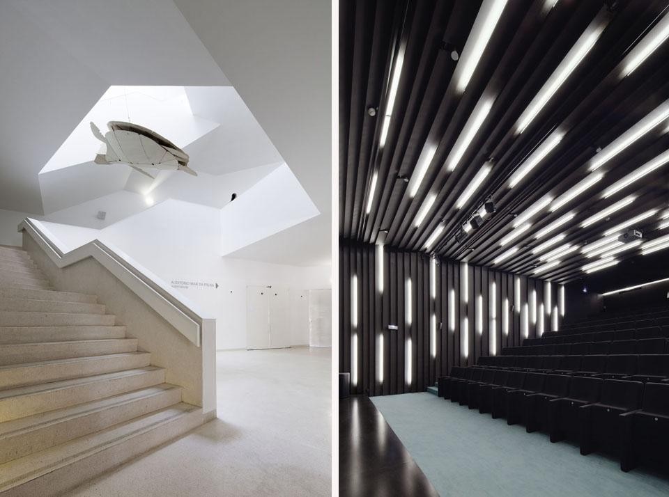
Left: the stair from auditorium on the basement level leads to the entrance hall and exhibition floors. Right: The auditorium has 125 seats and hosts a variety of events from lectures to children's shows to screenings and workshops. The interior surface, in black MDF, is marked by 'cuts' created with differently positioned artificial lights. Photo © <a href="www.brunecky.com" target="_blanK">Radek Brunecky</a>
Left: the stair from auditorium on the basement level leads to the entrance hall and exhibition floors. Right: The auditorium has 125 seats and hosts a variety of events from lectures to children's shows to screenings and workshops. The interior surface, in black MDF, is marked by 'cuts' created with differently positioned artificial lights. Photo © Radek Brunecky

Latest on Architecture

Latest on Domus

Read more
China Germany India Mexico, Central America and Caribbean Sri Lanka Korea icon-camera close icon-comments icon-down-sm icon-download icon-facebook icon-heart icon-heart icon-next-sm icon-next icon-pinterest icon-play icon-plus icon-prev-sm icon-prev Search icon-twitter icon-views icon-instagram